Trend Covers
One book or movie becomes a phenomenon. Next thing you know, practically every book or movie of an even remotely similar genre gets a cover or a poster that ganks the design motif of the phenomenon's. This isn't just new books or movies either. Sometimes old books or movies get a re-release (in the case of movies this means a new DVD) with a new cover that does this.
Sometimes, this is a good thing, bringing new attention to a work that deserves it. More often, it's just pointless. Occasionally, it's downright embarrassing.
Distinct from just pure homage, where the cover is deliberately designed to make the viewer think of that specific work—this is a marketing thing. Also different from tie-in covers, which exist to let movie-goers know that the thing they saw was based on a book. (Even Twilight got those, for some reason.)
Twilight-inspired
Minimalist cover consisting of one symbolic object against a dark background.
- The aforelinked Wuthering Heights cover. They've also done a Pride and Prejudice and Romeo and Juliet.
- The UK covers to the new Vampire Diaries bind-ups
- A new bind-up of V.C. Andrews's incest classics Flowers in the Attic and Petals in the Wind.
- Aprilynne Pike's Wings. The color scheme is different, but let's see here: One lone (preferably floral) image in the middle of the cover? Check. Curly font title? Check. Blurb from Stephenie Meyer? Check.
- Cyn Balog's Fairy Tale.
- Janni Lee Simner's Bones of Faerie.
- Cynthia Leitich Smith's Eternal.
- Lisa McMann's Wake trilogy.
- Elizabeth Chandler's Dark Secrets series and Kissed By An Angel trilogy got bind-up re-releases with solitary symbolic items on a black background.
- Check out the new cover for Marianne Curley's Old Magic.
- Arguably The Warrior Heir cover. Arguable, because it came out only a year after Twilight, before it really hit big.
- In a strange inversion, the 2004 paperback of Holly Black's Tithe looks more Twilight-y than the recent re-design. Perhaps that was intentional...
- Compare the current cover of Blue Is For Nightmares with the original 2003 edition. Though not vastly different, the composition is very clearly Twilight-ish.
- The From Hell anthologies. Of course, Stephenie Meyer contributed a story to Prom Nights From Hell.
- Alex Flinn's Beastly
- Maggie Stiefvater's Books of Faerie.
- The teaser poster to The Vampire's Assistant (based on the first Darren Shan book). Because, hey, vampires!
- Even modern classic theological texts aren't safe! C. S. Lewis' Words to Live By.
- Carrie Adams's The Stepmother.
- Dan Shapiro, Delivering Doctor Amelia
- A tomato flavored spin with Hans Rueffert's Eat Like There's No Tomorrow
- Susan Fraser King's Lady Macbeth.
- Melissa's Marr's book Wicked Lovely and it's sequel Fragile Eternity
- Abra Ebner's Parallel: The Life of Patient 32185.
- Bree Despain's The Dark Devine.
- The various covers from The Immortals series by Alyson Noel.
- Subverted/parodied beautifully with Jessica Valenti's The Purity Myth, which uses a Twilight-inspired cover to draw in the audience who needs to hear the book's message the most.
- Annoyingly, the new Corgi covers of the Discworld novels look like this, even though they started this in 2004, the year before Twilight was published.
- The Buffy the Vampire Slayer tie-in books have been released in new omnibus editions, with covers that look suspiciously like the Twilight collector's editions (white cover, solitary object, red and black detail). Even more suspiciously, they were released at a similar time to the Twilight editions, and have been shoved in the 'Twilight rip-off' sections of UK bookstores, along with the new editions of the Vampire Diaries and Wuthering Heights.
Harry Potter-inspired examples
Cover of a slightly stylized pastel portrait of the hero with the title in a fantasy-ish font superimposed [dead link].
- Debra Doyle's Circle of Magic series not only got a "Sorcerer's Stone"-inspired facelift, but the titles changed too.
- The Charlie Bone books—both the US covers and the UK covers reflect the design of their Potter counterparts.
- Brandon Mull's Fablehaven series.
- The covers for the Spiderwick Chronicles.
- Jack Kerouac wrote a book called Doctor Sax that came out in 1959. Look at this cover for the 2003 audio release [1] [dead link] Also note the Potterian "and the Subtitle" that got tacked on.
- To be fair, the subtitle was Kerouac's. That is an audio adaptation of a screenplay he wrote with that title.
- The covers to the Percy Jackson series.
- Kaleb Nation's Bran Hambric: The Farfield Curse
- The covers for the Erec Rex series by Kaza Kingsley follow this pattern.
- The Tapestry series by Henry H. Neff.
- Now, the first book bears remarkable similarities, but in later books the story shifts away from the Harry Potter franchise.
- Sarah Prineas's The Magic Thief.
- Recent editions of Diana Wynne Jones's Chrestomanci books, for example this.
![[1]](http://en.wikipedia.org/wiki/File:Jksaxsnakebk.JPG\)
"The Other Boleyn Girl"-inspired
Historical fiction of heroine in period dress, partially obscured.
- Other Philippa Gregory examples: The Queen's Fool, The Virgin's Lover
- This article discusses this trope in regards to historical fiction novels starring heroines. "Elizabeth Chadwick, a prizewinning British novelist who writes biographical fiction about the medieval English nobility, found that her sales more than quadrupled after her publisher commissioned a redesign with what she personally termed the "headless bodice" look."
- The Last Wife of Henry VIII
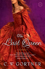
- The Last Queen
- The Alchemist's Daughter
- Her Mother's Daughter
- Has even extended past the Renaissance era royalty/nobility genre. The Widow of the South [dead link]
The Da Vinci Code-inspired examples
- Elizabeth Kostova's The Historian about the "true story" behind Bram Stoker's Dracula.
- And then the subsequent repackage of Dracula was a Trend Cover of The Historian!
- Gregg Loomis's The Julian Secret and The Pegasus Secret, complete with a blurb comparing it to The Da Vinci Code.
- Compare the 1992 cover of J.G. Sandom's The Gospel Truths. And the 2007 re-release...
- Lynn Sholes and Joe Moore's The Last Secret.
- Paul Christopher's Michaelangelo's Notebook.
- David Gibbins' The Lost Tomb.
- Sam Bourne's covers bear a noticable resemblance to the UK edition of The Da Vinci Code.
Comic Book-inspired examples
- Penguin has been hiring respected comic book artists to do covers on their Classics line.
- Web Comic Unshelved noticed this too.
 |
Dewey: Arrggh! I got marketed to!! |
 |
- Charles Burns's cover to Zadie Smith's The Book of Other People.
- Sean Beaudoin's Fade to Blue. Justified in that comics play a role in the story.
- Laini Taylor's novels have cover art and illustrations by her comics artist husband Jim Di Bartolo.
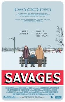
- Chris Ware drew the poster for the 2007 film The Savages.
- The posters to Away We Go, Year of the Dog, and Surfwise all have a cartoonish quality to them. Small wonder, they were all designed by the same company, who also handled the posters for several comic book movies, including ~300~, Watchmen, Whiteout, and Teenage Mutant Ninja Turtles. Ironically enough, those posters do not use comics imagery to sell the film.
- Away We Go always struck me as inspired by Juno's credits sequence, with the markered-up photocopy look.
Other Examples
- Cracked covered the movie/DVD side of this trope in this article, 5 Ways Hollywood Tricks You Into Seeing Bad Movies.
- Check out the poster of the new film Inception as compared to the poster for The Dark Knight. Partially justified in that both films were directed by Christopher Nolan.
- In the Noughties, desaturated advertising images (with heavy shadows and exaggerated blacks) came into vogue, to the point where the effect is being overused everywhere, as of 2011. It became so popular that when Photoshop CS 5 came out, it included a new tool specifically for creating this effect (Image>Adjustments>Vibrance).
- Variation: David Bowie notes in the retrospective book Moonage Daydream that after The Rise and Fall of Ziggy Stardust and the Spiders from Mars hit big, his older albums Space Oddity and The Man Who Sold the World were rereleased with photos of him as Ziggy on the covers. The albums were folk rock and Heavy Metal respectively (as opposed to the Glam Rock of Ziggy), but "All this fuss actually put Oddity in the US Top Twenty, years after its original release."
- The Dreamworks Face was born from this phenomenon.