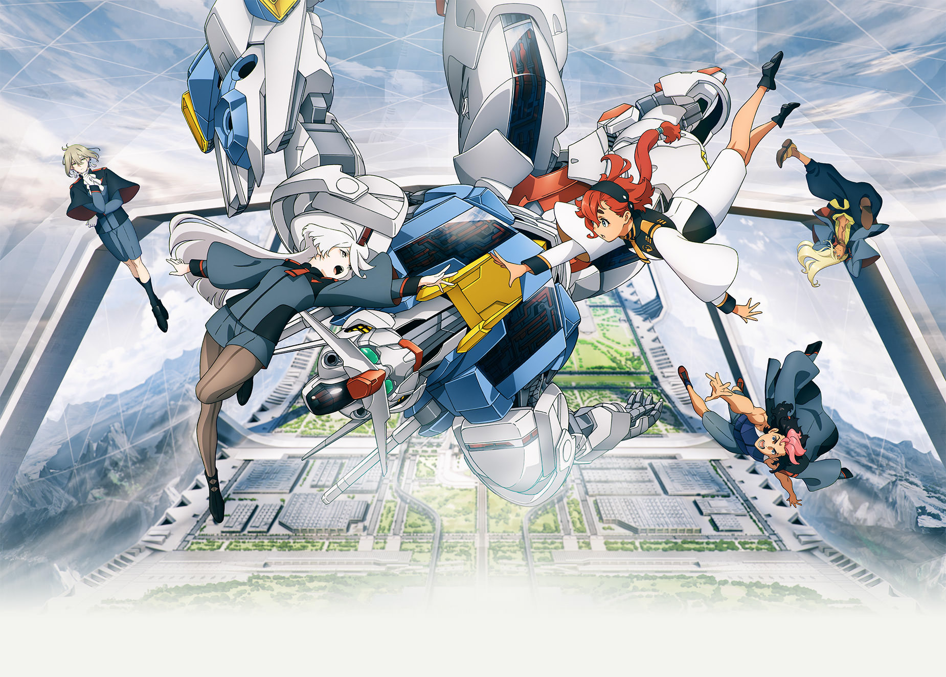
The official site offers two slight variations of the key visual, one for landscape] and one for portrait (which can easily be cropped for a more square image due to the dead space), with slightly different composition beyond their aspect ratio. Which one would be better for the constraints of a page image?
Topic on Talk:Mobile Suit Gundam: The Witch from Mercury
We usually go with portrait, but there's a lot of whitespace in that portrait image...
Speaking as a troper, not a mod, I like the landscape image better.
Voting for the portrait image; I just like it better. I think there's a bit more "structure" going on, leaving you with some space and padding instead of just spamming characters.
I'm leaning toward the portrait image myself. Maybe trim some of the white space off the bottom, but leave it in portrait format. The landscape image on the other hand just seems excessively busy.
I prefer a poster to a key visual, meaning I want some sort of writing on the image telling us that this is, indeed, Mobile Suit Gundam: The Witch from Mercury. Wikipedia has an image which meets this criteria, although it is quite small and difficult to read. The suggested image is essentially the portrait key visual, except the white space at the bottom was filled with the show title. A larger version of the image could be what we need.
For what it's worth, I planned to use the image to ID the characters shown.
Alright, then. That makes sense! Just putting my opinion out there.
Edit: If that's the case, I'm switching my vote to the landscape image, because characters are bigger making them easier to identify.