Minimalistic Cover Art

 |
"It's like, how much more black could this be? And the answer is none. None more black."
—Nigel Tufnel on the revised album cover of Smell the Glove, This Is Spinal Tap.
|
 |
Some people think abstraction is enough to sell.
Sometimes the best way to make something stand out... is to make it not stand out. Amongst a shelf full of angry pink balls, floating heads, scantily clad women and outright lies, some classy Minimalism can work wonders.
In music, the first really popular record with such a sleeve was the Beatles' eponymous White Album, but the mainstreaming of the minimalist design style from the 1980s onward is mostly the fault of Peter Saville's work for Factory Records in the 1970s and 1980s, which set the design tone for Post Punk and much of the eighties (and aughties). He did sleeves for a lot of mainstream bands (e.g. Wham!, Peter Gabriel, OMD, Ultravox), but Factory let him do anything he wanted on international hit records by New Order.
At least one of the things below apply to such covers:
- Complete absence of everything sans the background: Self Explanatory.
- Solid color, simple gradient or just generally unsophisticated backgrounds. Alternatively, a closeup of a material used as a background.
- Single Object Focus, considering the said object exists.
- Lots of empty space for the covers that have something besides the background. Alternatively, the cover would even have an action-packed part that cover only the - say - 5% of it.
- Minimal use (or complete lack) of text.
- Any form of literarist art will do as well.
Minimalism was pretty much the art style of the aughties, that is, whenever people weren't abusing neoclassicism.
Contrast Detail-Hogging Cover, which goes for the opposite strategy.
Anime and Manga
- Studio Ghibli's Japanese Blu-ray releases all come in monochrome cases, a single color background with the title and a silhouette of the main character in white.
- The Japanese Blu-ray releases for Rebuild of Evangelion are a plain single color, with the title on the front in black text.
- FUNimation's covers for some boxsets of Dragon Ball just have the character standing there with a cool pose and a one color background.
- Kurosagi Corpse Delivery Service has covers in brown and one other color, a dramatic difference from most manga covers.
- Drawn & Quarterly's translations of Yoshihiro Tatsumi's one-shot collections have fairly minimalistic cover art.
Comic Books
- Some collected editions of Watchmen only have the smiley face on the cover.
- Some have an extreme close up on it that shows only part of one eye.
- Variation: In some versions of Final Crisis issues, anything that isn't a text cover only a 1/3 of the front cover.
- And the collected edition has a black-and-red cover of Superman holding Batman. While not as minimalist as other examples, it's certainly minimalist compared to other Crisis covers.
- The all-black cover of The Amazing Spider-Man #36 (#477), save for the Marvel Comics header and the logo. This issue is the 9/11 tribute issue.
- The all-white cover for Zero Hour #0 (1994), which implies that the DC Universe was already erased at that point.
- Back in 1968, this Steranko Nick Fury cover was considered almost too minimalist to publish—Stan Lee couldn't fathom publishing a cover that was black and white, and so insisted that Steranko color the title and Fury.
- Superman Vol 2, #100 had an almost entirely white cover, except for the title logo, the S-shield reflected in a broken pair of glasses and the legend "The Death of Clark Kent!" Action Comics #720 duplicated this, only the S-shield was reflected in an abandoned diamond ring, and the legend was "The Engagement Is Off!"
- DC had a horror anthology title in the 80s called Wasteland. Due to one error or another, issue #5 was published with issue #6's cover. When the real #6 came out, it was numbered "the real number six", and the cover, apart from framing elements, was pure white. For a horror comic, it worked quite well.
- The new hardcover editions of some Sin City yarns went for this, with just close ups of their protagonists. However, given the Sin City art style and design, it fits perfectly.
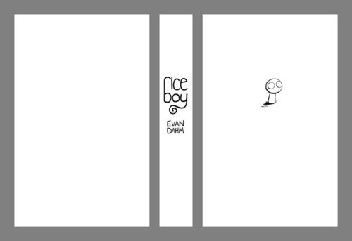
- The new Rice Boy hardcover edition is going to look like this, hiding the colorful surrealistic art inside.
- The Judge Dredd Case Files, a series of trade paperbacks collecting the entire thirty five plus year run of the series have covers that are half solid colour, half black with a logo, plain text title and an image of the Judge himself. In the earlier editions, the image of Dredd was black and white which enhanced the effect. This style has since been carried over to other 2000AD complete collections, including Strontium Dog and Nemesis the Warlock.
- Mad Magazine parodied this more than a few times.
Film
- The poster of the Vincenzo Natali film Nothing only feature the two protagonists on a white background. And the said protagonists don't cover much space there. Besides the title, billing block and the company logos, that's pretty much it.
- Aside from all of that text, the poster of the Children of Men adaptation is all about the fetus.
- Some posters (and covers of few DVD versions) of the Darren Aronofsky film Pi were this.
- Some theatrical posters of the second, fourth and fifth Friday the 13 th movies.
- The theatrical poster of Stanley Kubrick's adaptation of The Shining.
- The Frighteners.
- Some DVD editions of 12 Monkeys were this.
- Oliver Stone's The Hand. Guess what the poster contains.
- There's also his World Trade Center.
- The first two |Poltergeist movies.
- The original poster and the DVD cover of the 1989 Batman movie has the iconic Batman logo on a black background and nothing else. Not even a title.
- Zelig
- On the subject of all things Woody Allen, a good number of his films had theatrical posters that were basically these.
- Malcolm X
- Helvetica, a documentary about an eponymous typeface.
- And from the same filmmaker, Objectified.
- Covers made for The Criterion Collection edition videos[1] are generally very minimalist.
Literature
- The covers of the second and third Twilight novels are black backgrounds with the title and some random object that may or may not relate to the plot. (A flower and a ribbon, respectively.)
- And given Twilight's success, every other YA fantasy novel cover these days has a similar design.
- The torn ribbon may be interpreted to symbolise the tear between Bella's Vampire boyfriend and family and her "Werewolf" friends, who are enemies. However, Meyer has stated she had no control over the flower cover, and it has no relevance.
- The first one's less minimalistic, since it shows its random object on a black background (an apple; I don't know what apples have to do with the plot, but What Do You Mean Its Not Symbolic?) being held in a pair of disembodied hands. But it still probably counts.
- Many, many old (and other hardcover) books are like this, with just a title printed on the spine. Of course some of those could be because the book jacket is missing. It can also be because the original paperback cover fell off and got lost, and the book was rebound in hardcover in a library.
- Faber & Faber's poetry books are often this (example).
- Thomas Pynchon's Mason & Dixon and Against the Day, released in 1997 and 2006, respectively.
- As well as the man's very first book, V.. Suits it pretty well if you come to think of it.
- The first edition of Richard Bachman's Thinner
- Speaking of Stephen King, there's the first edition of Insomnia (unrelated to the Christopher Nolan film).
- Then there's his Just After Sunset anthology.
- Not counting the mylar cover it was packaged in, Madonna's book Sex just has the title in tiny, raised letters on a blank cover.
- About a few of Cormac McCarthy's books.
- The UK/Ireland editions of the Wheel of Time books all have plain black covers bearing the author's name, title of the book, and a line drawing of the Wheel and an ouroboros. These are considerably more popular than the horrid and nonsensical American covers.
- The English-language paperback editions of the Haruhi Suzumiya novels feature a plain red cover with an understated title and a small, easily-overlooked silhouette of Haruhi. The hardcovers, however, bear the original Japanese art, probably on the grounds that anybody buying the hardcover is already a die-hard fan.
- Corgi's new, "classy" covers of Discworld novels, especially the early ones. A mostly black cover, with Terry Pratchett's name at the top, the title half-way down and a grey image with gold highlights in the lower half. Compare the two covers of The Colour of Magic.
- Plentiful of Chuck Palahniuk's work had this on their first (and many later in some cases) editions, especially Lullaby and Diary.
- The Catcher in The Rye. White cover, black text, flat rainbow-colored stripes in one corner. Many of Salinger's books can be found with that same pattern.
- Some of France's publishing houses use minimalist covers for their most prestigious collections. See for instance the nrf [dead link] or les Editions de Minuit [dead link].
- The cover [dead link] for Push by Sapphire is just the title of the book on a red background.
- Incompetence and Fat by Rob Grant have similar covers: A black background with the book's title and a parody of a warning sign (Incompetence has a "no IQ" sign, while Fat has the symbol for men's and women's bathrooms with the man symbol depicted as overweight).
Live-Action TV
- DVD Edition of Chris Morris's Jam had one.
- Buffy's return from the dead was advertised with one.
Music
- The Beatles' eponymous white album.
- Metallica's eponymous black album.
- The Artist Formerly Known As The Love Symbol Formerly Known As Prince's Black Album.
- John Lennon and the Plastic Ono Band's Live Peace in Toronto 1969 has a picture of a blue sky with a few clouds.
- The cover of Benjamin Britten's recording of his War Requiem just has white text on an all-black background.
- As well as Peter Hammill's A Black Box
- Speaking of Peter Hammill, there's Godbluff by Van der Graaf Generator.
- Buckethead's DCK.
- Back in Black.
- So Far by Faust.
- The censored version of Smell the Glove by Spinal Tap is the mother of all black sleeves. (Metallica said they were inspired by it for their album)
- The Songs : Ohia album Ghost Tropic has just the album title on a black background.
- Danger Mouse's The Grey Album is here to balance it out. Especially when it incidentally happens to have sampled The Beatles' White Album, mixed with the vocals of Black Album of... Jay-Z's. Whose black album was less fitting for this trope.
- Beatallica also had a Gray Album, which was exactly what you'd expect.
- Comedy duo Martin/Molloy released an album titled The Brown Album (a parody of The White Album) that had, you guessed it, a completely brown cover.
- Peter Saville's first big splash was Unknown Pleasures by Joy Division. That being early work, he actually put the band and album name on the sleeve (in small print on the back).
- He quickly grew out of this, of course. New Order's first big hit single, "Blue Monday," had the band and song names only as a colour code. The accompanying album, Power, Corruption and Lies, only had the catalogue number, FACT-75, on the cover - as text on the spine and, of course, colour code.
- The cover of New Order's Brotherhood is a a photo of zinc-titanium alloy.
- Saville pushed design well beyond reasonable limits. The die-cut cover for "Blue Monday", meant to resemble a floppy disk, was much more expensive to produce than a standard cover and reputedly lost money on every copy sold ... this became problematic when it turned out to be a hit.
- He also caused many (quite financially important) New Order releases to be delayed because he took so long to come up with the perfect sleeve.
- The sandpaper sleeve of the first pressing of The Return of the Durutti Column was not Saville, but Tony Wilson, the head of Factory. Now you know what level of freedom Saville had there.
- The front cover art of most of The Young Gods' releases are mostly just the band's name engraved on a different background. Their Only Heaven is an even straighter example.
- This trope (or at least one variant of it) would be alternatively be called The Designed Republic, after the late graphic design studio who tended to produce covers like these.
- The cover art they did for Autechre deserves mention. The one pictured comes from their Tri Repetae. And yes, that cover does completely look like that.
- Quaristice.Quadrange.ep.ae apparently seems like a Shout-Out to Kazimir Malevich's Black Square, don't you think?
- Trent Reznor apparently loves these. Special mention goes to the Rob Sheridan-designed ones.
- Starflyer 59 has played with this to various degrees.
- Four of their albums had solid monochromatic covers, with no text: Silver, Gold, Americana (red cover), and I Am the Portuguese Blues (metallic blue cover). The Everybody Makes Mistakes cover was yellow, with small text running along the left margin, and a large 9 as a false watermark.
- The album Dial M doesn't count, but covers of associated releases—the single "The Brightest of the Head", and the Minor Keys EP—just feature blocky white and red text on a black background.
- Side project: The Right Amount by Bon Voyage was a light bulb against a black background. The only text was on a removable sticker.
- Joy Electric's The White Songbook, Hello Mannequin and The Ministry of Archers.
- Speaking of Starflyer 59 and Joy Electric, their collaborative album The Brothers Martin just had a simple line drawing diagram of Earth's magnetic poles as the cover.
- Alternative rap group Giant Robot released an album entitled 33 rpm Robotics. The cover? An up-close photo of cardboard.
- Few of Yes albums are this.
- Close to the Edge made up for its minimalist exterior by having a Roger Dean painting on the inside of the gatefold.
- Do you know Squarepusher?. The guy was incidentally signed to the record label The Designers Republic themselves were somewhat involved on, noneless.
- Cover of Justice's (the French electronica duo) debut album Cross consists solely of the glowing cross on a black background.
- Dark Side of the Moon, anyone?
- The Wall and Atom Heart Mother too.
- Aphex Twin and his 26 Mixes for Cash.
- The cover of the second print of his Come to Daddy is just the white "An image of children chasing after an ice-cream from an Orange? TV commercial advertising Text messaging." text on an orange background. Again, The Designers Republic did it.
- And Chosen Lords.
- Selected Ambient Works 85-92 is just the logo, artist, and album name. Richard D. James Album may also qualify.
- Among some of Swans' stuff, there's their eponymous EP.
- Not counting the band name and album title labels, their Filth don't feature much besides the angry teeth on a black background.
- Their Love Will Tear Us Apart EP has an all-red cover with text only on top and bottom of it.
- Coldplay's X&Y, (plus every single from that album) as well as their only (so far) compilation album.
- Every LFO album has a pretty abstract cover, with Sheath being the most fitting to the trope.
- Orbital's album Middle of Nowhere has a cover consisting of a big "O" and a walking man, with a very small text accompanying some versions of it.
- One edition of Mindless Self Indulgence's If.
- The Church and their Untitled #23
- One prerequisite for this trope has been subverted with Explosions in the Sky's The Earth is Not a Cold Dead Place which cover consists of nothing BUT the album's name written all over and over it (with the band's name written in one place with a red outline) on a white background.
- In Rainbows does the similar "write the titles all over it" thing, with the fancy explosion in the background.
- XTC's Go 2 is another album which the front cover consists of a block of text. The text contains a humorous diatribe on album covers
- A Fire Inside's Sing The Sorrow, especially the U.S. tour edition cover.
- The Pet Shop Boys' albums Introspective, [dead link] Very, and Bilingual. [dead link]
- And for diffrent reasons, Yes and Fundamental.
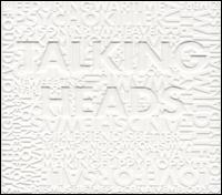
- Talking Heads' Talking Heads: 77, [dead link] Fear of Music, and Brick.
- Italian group Elio e le Storie Tese's album Cicciput. [dead link]
- Russian rock group Kino and their Black Album, released after their lead singer Viktor Tsoi passed away.
- Also, their Blood Type (for abstract art) and A Star Called The Sun (for single object focus/simple black background)
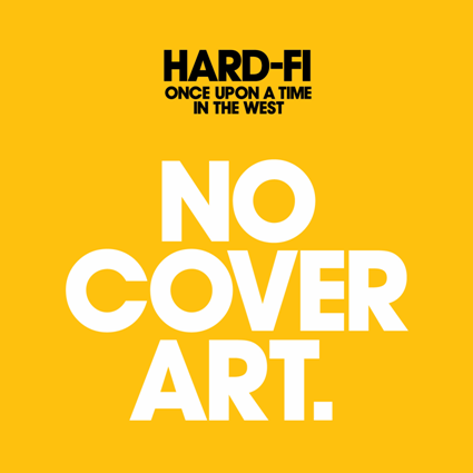
- Both of the two (so far) Hard-Fi albums. The cover for their second album Once Upon a Time in the West (as well as the covers for all [dead link] three singles from the album...and the cover of the promo CD for the first single) goes even so far as to hang a lampshade on itself.
- Portishead's Third.
- Funkstörung's Appendix.
- Radiohead's Amnesiac, even better if you have the limited edition, which is the red book pictured on a front cover of its standard CD release.
- The censored cover of Tool's Undertow is mainly a one big barcode.
- The cover of Pinebender's Too good to be true is mainly a blue grid paper so you can draw your own cover art on it. The album's first pressing even included a pencil into its jewel case.
- Beck's The Information does the same, except that it comes with stickers (perhaps you could always get your own pencil if that wasn't enough).
- Public Image Ltd's Album. Or Cassette. Or Compact Disc, depending on the format.
- The band Flipper called PiL out when they felt the latter ripped off the former's Album - Generic Flipper. Which is ironic considering that the cover of the Flipper album is strangely reminiscent of Gang of Four's untitled EP, commonly known as Yellow EP.
- All the three Soviettes albums.
- The Chicago Transit Authority.
- Some of Low albums kinda fit.
- Slowdive's Pygmalion.
- So far, both two albums by The Field.
- Animal Collective's Merriweather Post Pavilion, although there's a little more to it because it's an optical illusion. When the band made a musical appearance on The Late Show, David Letterman held up their record and joked that it was available "in wallpaper stores everywhere."
- May I note that Animal Collective's albums Summertime Clothes, Strawberry Jam, Prospect Hummer, Hollinndagain, and Fall Be Kind were all also textless.
- Adlib's MCD.
- No Line on the Horizon.
- Are you sure it's not Taylor Deupree/Richard Chartier's Specification. Fifteen? [dead link]
- The Modernist Editions, a series that takes covers of classic albums, like The Beatles' Abbey Road or Pink Floyd's The Wall, and distills them down to a black-and-white pictogram.
- Brakes - Give Blood
- Shinedown's "The Sound of Madness."
- The Hush Sound's first album, So Sudden
- Rush's Hold Your Fire. Also, their self-titled debut, 2112, and Counterparts.
- Susumu Yokotas album Grinning Cat. See it here
- John Zorn's I.A.O. [dead link]
- Coil and their Time Machines.
- Steely Dan's Aja.
- Led Zeppelin's self-titled debut, with the famous image of the Hindenburg explosion. Also, Coda.
- The Police's Ghost in the Machine.
- Death in June and their The World That Summer, Brown Book and Alarm Agents
- Devendra Banhart's Nino Rojo
- Throbbing Gristle and their The Second Annual Report
- Einsturzende Neubauten, as well as their Fünf auf der nach oben offenen Richterskala
- Few Groove Armada albums are this, especially Black Light.
- EP001, the debut EP of Dhani Harrison's (George's son) thenewno2 project.
- Every release from experimental drone band Growing to date have not had any text on the artwork, whatsoever.
- The Boredoms' release "Vision Creation Newsun" consists solely of a picture of a young child in front of a sun glare. The limited edition box set of the album had artwork that consisted of nothing but simple vector shapes.
- The Secret Machines have released several albums with minimal artwork, notably September 000, which is simply a blue circle on a white background, with black text of the band name in the lower corner. The iTunes release of the album did not have the black text, leaving the artwork simply as the large blue circle.
- Brian Eno seems to be a fan of this trope as well, with his Music for Films being the most minimalistic.
- This extends to his collaborations as well, like in Evening Star with Robert Fripp and the aforementioned
Taylor DeupreeU2 album.
- This extends to his collaborations as well, like in Evening Star with Robert Fripp and the aforementioned
- German krautrock duo Cluster also has few albums like this, notable among which is Grosses Wasser. And let's not even mention their collaborations with Eno himself.
- Speaking of, mentioning a King Crimson member seems more appropriate if you consider every single album they've made in 1980-2000. And before that, we had Starless and Bible Black (no relation).
- The Velvet Underground & Nico as well as White Light/White Heat
- Venetian Snares had printf("shiver in eternal darkness/n");
- Both releases of Eminem's Infinite.
- Todd Rundgren’s Faithful came in a plain, beige cover with just the album title and Todd’s name in lowercase letters across the top.
- The cover for the XX's self-titled debut album appears to be a white "x" on black background. Actually it's die-cut and the CD booklet is white.
- Sparks' Lil' Beethoven.
- Dr. Dre's 2001.
- The cover for Kanye West's 808s and Heartbreak features a lone paper heart.
- Yeezus doesn't even have a cover booklet, only a blank CD and a red sticker on the right of its case.
- Several Wizard Rock albums have these, starting with Harry and the Potters first, self-titled album [dead link]: the 2007 EP of the Month Club albums, specially Voldemort's Evil is Sexy and Roonil Wazlib's Putting Fluffy to Sleep, OMG It's Catchlove, VII [dead link] by Creevey Crisis, Gred and Forge's first album, and The Butterbeer Experience's Love Will Prevail: Songs from The Final Battle.
- Oliver Boyd and the Remembralls' full set of House EPs would have been this, had it been completed. Sadly, we only got the Slytherin EP.
- Röyksopp's Senior, contrasting the approach taken from their previous album, Junior.
- Frank Zappa's Fillmore East June 1971, which is about as cheap-looking as you can get.
- Junior Boys's Begone Dull Care fits.... [1]
- Live At Leeds by The Who.
- Works Volumes 1 and 2 by Emerson Lake and Palmer.
- Limp Bizkit's Greatest Hitz, quite unusual considering everything else they have done.
.jpg)
.jpg)
|
Fred Durst: I wanted it to stand out on the shelf and I did not want it to look like every other metal band record. |
|
- Soulwax. The covers for Any Minute Now and Nite Versions will [w:File:AnyMinuteNow.jpg|hurt] [w:File:Nite versions.jpg|your eyes] and make you scratch your head... until you see the hidden text.
- Arctic Monkeys' Suck It And See. [dead link]
- The Dire Straits album Making Movies. [dead link]
- This is an album by The Black Keys. The name of this album is Brothers.
- Which may be a Shout-Out to the cover of Howlin' Wolf's The Howlin' Wolf Album
- Master Of Reality by Black Sabbath.
- After The Rolling Stones' label rejected their original cover for Beggars Banquet (which featured Bathroom Stall Graffiti), they substituted a plain white cover, done up as a mock "R.S.V.P." invitation card. (When the album was reissued on CD in the '80s, the graffiti cover was used instead.)
New Media
- The Goons have once launched a photoshop contest on "classy" literature-influenced covers for various modern Video Games. Some of the entries kinda fit for this trope. Here's the now fourth edition of it.
- This VGBoxArt entry managed to spoof this.
Tabletop Games
- The Hero System 4th Edition cover was four-color comic book action with art done by notable comic-book artist George Perez. By fifth edition, Hero Games couldn't afford that sort of thing anymore. So fifth edition is black on black, with only the Hero Games logo on the cover.
- Now that they have all that MMO license money Hero Games could afford to do that sort of thing again, but chose instead to again go minimalist with a Yellow logo on a Blue background for the 6th Edition cover.
Video Games
- The Designers Republic were involved with earlier Wipeout installments. It shows especially well in case of the third game and its Updated Rerelease.
- The later The Elder Scrolls installments, starting with Morrowind. Each one just depicts a symbol with the title on it, placed on what looks like the cover of a leather-bound book.
- Just about every Quake installment sans Quake Wars. The jewel cases for the first one sometimes go as far as to feature just a game's (and id software's) logo on a gritty background, withouth any text whatsoever.
- The first Half Life (before the Game of the Year edition that has Gordon in it). This carried over to European releases of the expansion packs, as the US releases do feature their protagonists.
- The Collector's Edition of Mass Effect 2 only has a shot of a bloodstained N7 logo set at an angle on the front cover.
- Darker is an obscure PC game set in a planet that is pitch-black in one side. Appropriately enough, its cover art besides the title, logo and the stickers feature a black silhouette of the city with two power plants superimposed on a nearly black background.
- The cover artwork of the Japanese and American releases of the first Metal Gear Solid for the PlayStation consisted of a simple white background with the game's logo. The European release on the other hand, featured an illustration of Solid Snake's face to it.
- As Portal shows, Valve is apparently very fond of this kind of stuff.
- The original version of the cover for The Orange Box was going to be just that: pure orange, with a list of the games. The final version got changed.
- If it's not for the detailed background its cover happens to have, Dead Space would otherwise count, with its focus on that severed hand.
- More fitting example would be Left 4 Dead. Surprise, it's Valve.
- As well as Dead Space 2, which cover is mostly a shot of Isaac's helmet in a dark.
- Limited Editions of some games may be packaged with this kind of cover, notably the 2008 Prince of Persia one.
- Then there's the Halo 3 one. Helps that the "Halo" text isn't even anywhere to be seen, just the "3" enclosed on an "O".
- Most of the front cover of Blood is a hand-shaped splatter on a black background.
- The old PC game Quarantine (completely unrelated to the 2008 movie).
- Beneath a Steel Sky
- Ultima VII: The Black Gate. (Ultima VIII: Pagan and IX: Ascension were originally planned to do the same, in red and white respectively, but that didn't happen.)
- The later US releases of Pagan have the Pentagram removed from the cover for some reason, making the cover more qualifiable for this trope.
- Diablo:Hellfire expansion pack.
- 9 : The Last Resort (no connection to the certain webcomic or the 2009 CGI film) is an Adventure Game with Robert De Niro involved in its production. Its cover - company logos aside - features mostly a monkey holding a card with an "9" on it.
- The European versions of the first MDK.
- The entirety of MOTHER series, sans the American version of the only entry in the series to be released outside Japan.
- The Legend of Zelda had a shield with one section cut out to reveal the cartridge inside.
- The second game had just a picture of a sword on the cover.
- By The Legend of Zelda a Link To T He Past, the game's logo on a gold background was the only cover art these games had. This lasted until the Oracle series, which had rather crowded box art by the series' standards.
- Black and White.
- Non-Game of the Year editions of Return to Castle Wolfenstein.
- The Dark Spire.
- An obscure 1996 adventure game called Animal features this.
- "Vanilla" Neverwinter Nights and it's sequel. Few of their expansion packs count to some extent as well.
- To some extent, the Baldur's Gate series as well.
- Sort of subverted with Baldur's Gate's own Spiritual Successor though.
- To some extent, the Baldur's Gate series as well.
- Internal Selection
- The US cover art for Disgaea 3: Absence of Justice pretty much just has the main character Mao, and the game's title on it. Very minimalistic compared to the US boxarts of the previous games, which at least feature most of the main characters, and extremely minimalistic compared to the JP boxart, which is a character montage featuring all of the main characters, a ton of the generic humanoid classes, and some of the monster classes.
- The Japanese and PAL releases of Final Fantasy games from VII to X originally had a cover with the game's logo on a white background. Examples 1, 2, 3, 4. This actually makes the more complex covers of the American releases look downright odd to people used to logo and white.
- Final Fantasy IV's SNES release also utilized a minimalist cover [dead link].
- Darwinia.
- Front Missions 2 and Alternative.
- The cover for Play Station 3 title Heavy Rain is a simple focus on a piece of wet origami. Unless you live in the US, and then the focus is something else.
- Game covers re-imagined as old books.
- Dark Colony, in certain countries. A big logo "DC", the game's title, a brief tagline, and lots and lots of completely empty brown space. Just take a look.
- The cover for Hellsinker just consists of the game's logo on a white background, as does the loading screen. The opening screen is the logo against a background that starts out totally black and gradually gets filled in with dark blue designs.
- Edge magazine has done some incredibly minimalist covers for particularly massive hardware or software releases.
Web Original
- Designing minimalistic posters for popular works has become somewhat popular in recent years, thanks to increased access to graphic design tools, such as photoshop. For example, this tumblr page collects minimalist movie posters.
- There are many rants on "artsy" minimalist posters. See, e.g. John Brownlee's:
|
You order a cheeseburger, and after waiting for a while, someone comes out and serves you a Lunchables version of a cheeseburger: two Ritz Crackers, a patty of Velveeta, and a swollen puck of saline-injected roast beef. You wouldn't say, "What a clever deconstruction!" or "How deliriously evocative of a cheeseburger!" You'd be like, "Where the fuck is my cheeseburger? |
|
Other Media
- Peter Saville again: The gravestone of Tony Wilson from Factory Records.
- Possibly beaten by the gravestone of artist Patrick Caulfield.
- The infamous Is God Dead? TIME magazine issue. The cover and article were so controversial, they have their own Wikipedia article.
- Also, Newsweek's The Decline and Fall of Christian America issue.
- Esquire magazine's October 1966 issue cover, and the New Yorker's issue following 9/11; voted #8 and #6, respectively, in ASME's top 40 magazine covers.
- News magazine The Economist once ran an article about zero inflation. Apart from the small red-and-white logo the cover just had a big white 0% on a black background.
- Speaking of The Economist, This spoof would be possibly the best minimalistic cover ever if it were true.
- This ad.
- The flag of Libya is entirely and monochromatically green.
- Less so, since the largely successful revolution that ousted the idiot who opted for the green banner in the first place. It's been replaced by a very nice red-black-green tricolour spanish-fess charged with a white star and crescent.
- The Onion made fun of this in their Our Dumb World book: "The flag of Libya represents green."
- Then there's the white flag of
warsurrendering, the red flag of communists and socialists, and the black flag of anarchists. - A lot of flags, especially old ones, are minimalist, usually having two to four colours arranged in rather standard shapes. Notable examples include France (blue, white and red tricolour), Japan (red circle on a white field), Austria (red field with a white stripe in the middle) and similar designs.
- Covering the Hutton Inquiry, The Independent had a blank front page above the fold with just "WHITEWASH?" (in red) and "THE HUTTON REPORT" (in black).
- One issue of Icon magazine was this.
- The 200th issue of Game Informer had eight different possible covers, which were all white with images from iconic games on them. Some were more minimalistic than others.
- Polish magazine Przekroj had a couple of issues with minimalist covers, but the most fitting have to be the 65th anniversary issue [dead link] as well as the issue following the plane crash that took out the president.
- Speaking of the Smolensk disaster, a daily Polish newspaper Metro had one too.
- The French writer and humorist Alphonse Allais (1854-1905) held a couple of "art shows" at the Galerie Vivienne in 1883 and 1884 that visually showcased his literal brand of wit. Here is his 1883 masterpiece "First Communion of Anemic Young Girls in the Snow".
- Doctor Who Magazine Issue 423 (relased after The Pandroica Opens was broadcast) bore a black background with only the logo and The Crack in Time, the cover also wrapped round onto the back.
- The Cleveland Browns football team logo.
- The Sports Illustrated cover featuring the Miracle on Ice celebration is the only one in the history of the magazine to have no other words besides the title Sports illustrated on it.
- After recently[when?] being revived from bankruptcy, graphic design industry journal Grafik has had covers that have a large central image, large masthead and small selection of article titles and that's it.
- ↑ Which are all original cover designs specifically for the Criterion Collection release.