Real Is Brown

 |
"The next time you see some casual gamer tapping away at their Nintendo DS, show them a screenshot of Gears of War. Don't be shocked if they point out your game seems made up of three colors (brown, gray, and muzzle flash). Sure, hard-core gamers know the difference, they know the game is a marvel of technology. The rest of us just want to have fun, or be told a good story." |
 |
Desaturating or heavily tinting a game a single color for the sake of realism, usually to a sepia effect (hence the trope name), but sometimes blue or pure grey.
Giving a game a narrow color palette can make it look gritty, dramatic and "realistic" and stand out from similar titles. Done well enough, a game and its color scheme will always be associated with each other. In practice, this means a world of brown, grey and the occasional red from the blood splatter on the camera.
It's also used to cover up a problem with lighting and shading in modern games, which usually have a very primitive system of real-time lighting - a light shines down and hits an object, and that object casts a shadow. But light also bounces around after hitting an object, in a process known as interreflection. This is very difficult for a computer to simulate and scenes with many bright or colorful objects will look fake without it. Until very recently, the only solution was to "bake" the lighting on a more powerful system. But this means nearly everything has to be static - you can't move scenery around, or else the values would need to be recalculated, which means the game can't have, say, destructible terrain, a day/night system or a snazzy physics engine (This may be one of the reasons why Crysis has such high system requirements, as it tries to do both things at the same time). Again, if everything is tinted one dull color, it's not as noticeable.
Unfortunately, at a certain point your players will take a look outside their window and back at your game, and something will seem wrong. Why are those palm trees brownish green, even though you're supposedly on a tropical island? Brown may be realistic for some surfaces, but not for all of them, and everything is best taken in moderation, otherwise you'll end up with a game that's Deliberately Monochrome.
It's becoming increasingly common for colorful games to mockingly parody this trope, usually by including an optional "next-gen" filter, tinting the whole game brown. This could make Real Is Brown on the way to becoming an Undead Horse Trope.
See here for further info.
See also Mood Lighting, Color Wash. The use of Post Processing Video Effects makes Real even Browner. See also the sister trope Who Forgot the Lights?, which deals with a shortage of light in general. This trope is usually when Color Contrast is deliberately avoided.
Now with a theme song: Resistance 3 - Fade to Brown Music Video.
NOTE: This trope does not apply to a game taking place in an environment that actually would be gray or brownish in Real Life, like a lot of deserts. Unless they're just set in a desaturated environment to make their lack of color look like a deliberate design choice.
Straight
Comic Books
- In general, as comics coloring processes and paper have improved, colorists have used more moody, subtle colors. The introduction of computer coloring in the 1990s (including gradients) resulted in a brief burst of bright colors and rainbow effects, before everyone settled down and started doing more moody shades.
- A recent reprint of Jack Kirby's "Tales of Asgard" stories recolored them with modern techniques. This should have been an exciting juxtaposition of old and new artistic methods... except they made everything brown.
- The Incredible Hulk was gray in his very first appearance, but bright green in the next issue, as the four-color technology of the early 60s couldn't do a consistent gray. By the 80s, technology had advanced, and the gray Hulk returned.
- Other titles of the early 1980s like Camelot 3000 moved away from the four-color model of earlier superhero comics. It helped that comic companies were starting to introduce better-quality paper; Camelot 3000 was among the first to benefit from this—resulting in a hyper-aversion of this trope for the first few issues. Since the colorist wasn't used to working with genuinely white paper, the colors leap off the page at you. Later issues got things under control.
- New Avengers does this a lot. In fact, it seems to have become prevalent in comic books sometime between the nineties and the twenteens.
- House to Astonish refers to "the Vertigo browns": "in order to make us think everything is serious, they colour everything sepia".
- The Flex Mentallo hardcover collection changed the day-glo colors of the original miniseries into Real Is Brown. (Note, for example, the bright-pink moon city, which is now medium gray.)
Computers
- "Human", the former default color scheme in Ubuntu Linux (a distribution who likes to present itself as "Linux for real people") is made mostly by shades of brown. Other -buntu branches have their own default colors, and the main branch had since switched to color schemes based in orange and purple, but you can still find a "Human" theme in the repositories.
Film
- Heavens Gate, especially in some of the earlier scenes. Naturally this doesn't improve the quality of shots where the frame is dominated by dust and smoke.
- O Brother, Where Art Thou? was color-corrected to a shade of brown. In a sort of Inversion, the purpose isn't realism as getting the viewer in the mood: the correction is to sepia tones, which are common in surviving old-time photographs (fitting the setting: rural Mississippi during The Great Depression).
- The last four Harry Potter films seem to have been entirely filmed from behind a blue-grey lens cover, giving it a significantly darker and more monochromatic feel than the previous installments.
- Flashbacks on The Da Vinci Code may seem to give the idea that The Past Is Gray.
- WWII films often depict a war in a grey spectrum. When it comes to the war ending, everything is brighter.
- Spy Game avoided this in general, but during one flashback, holy shit is Vietnam brown.
- The film Winter's Bone is set, and was filmed, in rural Missouri in the winter. As such, there's hardly any color to be seen.
Live-Action TV
- The set of any standard soap opera in the US is overwhelmingly dark brown. The effect is done here to convey the idea of wealth (dark wood like mahogany is more expensive than light wood like pine.)
- The short-lived Criminal Minds spinoff Criminal Minds Suspect Behavior had this look, giving the series a more moody atmosphere. Strange though, given how the original series doesn't use this effect as crudely.
Music
- The office in Taylor Swift's "Ours" video is decorated in a way that makes it look very sepia-toned.
Video Games
Action Adventure
- Many parts of The Legend of Zelda: Twilight Princess do this when the bloom and brown come close together, particularly outside of the Snow/Zora/Forest areas. Most of the background art during the first half of the game is either gray, brown or light green with a brown filter over it; and that's before you enter the Twilight Realm, in which case, the Twilight descends over the scenery, making everything look even more brown.
- Though since these are some of the more surreal parts of the game, it may be a subversion as brown is very not real.
- Shadow of the Colossus could probably be considered the game that popularized the Real Is Brown trend, seeing as it was still a breathtakingly beautiful game, aesthetically speaking, and inspired other games to go with muted colors and lots of bloom. Note that the designers were not actually going for realism, but rather, a very stylized look.
- The game accentuates whatever the prevailing colours are in the area you're currently traversing. For example, when the player explores places of lush green, those colours are picked for enhancement instead of the yellowy brown of the desert or the dark earth.
- Assassin's Creed plays this in a similar level. And if there's nothing to brown-ize (or whatever color seems to be supposedly prevalent in an area), the bloom gets intensified Up to Eleven.
- Tomb Raider: Anniversary is noted for its greys and browns (particularly in Egypt) compared to the bright colors of the original. It makes sense considering most of the areas have been subject to hundreds if not thousands of years of weathering, dirt, and dust.
- The next-gen Prince of Persia seems to be this from preview info. Though it's a thematic choice; as the title character liberates the world from darkness, it becomes verdant and lush again.
Action Game
- Stubbs the Zombie has the tutorial level as full of vibrant colors, but when you start the game proper, the developers added a grainy green filter over everything, to apparently showcase what the world looks like to a zombie. As if anyone ever wanted to know.
- Played with, but generally averted in Heavy Rain. The beginning of the games starts out with such bright lighting and colors that it almost makes your eyes water. After it gets worse, the colors are dark, dingy brown-greens and rusty reds. However, the color later returns, and there's several bright and/or realistically subdued color schemes throughout the whole game.
- Including one very saturated location that looks like it was lifted right from 2001
- The traditionally lavish Musou series (Dynasty Warriors, Samurai Warriors) takes a turn for the dirt with Legends Of Troy (Troy Musou).
- Armored Core 4 is an extremely gray and brown game. It's very jarring compared to the old installments, which were vibrant, almost technicolor-y in parts. Frustratingly, the environments seem to have a bleaching effect, so that bright red mech you just made is going to look just as gray as everything else. Its sequel, 4 Answer, is still pretty brown/gray, but it improves the shading noticeably to avoid the weird, faded out ghost effect of 4. Compare 3 with 4. Even the interface is bleached out.
Adventure Game
- Limbo of the Lost could almost be considered an unintentional parody (or is it?) of this trope; despite almost every background being plagiarised from a wide variety of sources the game still manages to be an unrelenting onslaught of brownish hues.
- On their default graphics settings, Serious Sam HD: The First Encounter and The Second Encounter both look far more washed out than the original versions. Thankfully, the game has a variety of graphic filters to choose from, with "Vivid" being the closest to the original games in terms of color.
Driving Game
- Need for Speed: Most Wanted paints the whole scene brown-orange every time you crank up the Visual Effects; when NFS Carbon was created, they thankfully replaced the gritty brown with modern, cutting-edge blue.
- And then Need for Speed: Undercover went back to brown with too much bloom.
- EA released a patch for Undercover that among other things moved the sun up and away from its position directly at the horizon and in the middle of your screen.
- By contrast, the Forza Motorsport series focuses on real-world colors and shades. However, some tracks (like the Mazda Laguna Seca) are composed entirely of brown, tan, gray, and bloom.
- Split Second, by the virtue of
ripping-offemulating Michael Bay movies.
Fighting Game
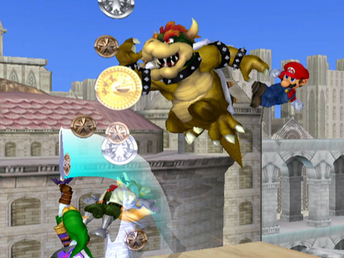
- Starting with Melee, Super Smash Bros. tends to give its character models more realistic details if possible; especially noticeable in this regard are cartoony characters like Mario. Bowser usually is depicted as orange or dark yellow in the original Super Mario Bros. series. In Melee he is just dirt brown, although this has been remedied a bit for Brawl.
- For the most part, Brawl is only a very mild version of this trope. However, the stage "Mushroomy Kingdom" is Level 1-1 of the original Super Mario Bros, but decayed over the years into a realistic brown desert.
First Person Shooter
- Resistance 3, full stop. IGN has posted a video called "Fade to Brown".
- Quake - Arguably a pioneer of this trope in video games. (Although this was due to the limitation of the 8-bit graphics used at the time.)
|
"Which do you prefer, the brown castle, the greenish-brown temple, or the other brown castle?" -- Zero Punctuation |
|
- Any Call of Duty Medal of Honor game, except Modern Warfare 2, which is quite vibrant in places, particularly the Rio de Janeiro levels. Naturally, there were complaints about the game being too colorful; on the other hand, there were complaints about the game not being as pretty-looking as the glossy, colorful first game, or the beautifully desaturated Call of Duty 4.
- Yahtzee of Zero Punctuation satirized this trend in his review of "Clive Barker's Clive Barker's Jericho (by Clive Barker)," describing the levels as, "in order, brown ruins, more brown ruins, brown castle, more brown castle, and revenge of the brown castle."
- Also in his review of Grand Theft Auto 4: "Realism, of course, means seeing the world through a used coffee filter; whatever isn't brown is grey, and whatever isn't grey is too dark to make out."
- The issue has come up a number of other times as well, such as in his review of Wolfenstein, done in limerick form: "There's an active resistance/In need of assistance/And everything's gone greyish-brown."
- Left 4 Dead was predominantly set in dark, greyish settings. So when Left 4 Dead 2 trailers showed that it would be brighter and more colorful.
- For VS mode, players who are controlling the special infected have their whole vision in a sepia tone.
- Killzone, set on earthlike Vekta, had a modicum of (effects-filtered) color, including a green swamp level. On the other hand, man-made installations veered deeply towards brown-grey, and the final level was nearly entirely in monochrome greyscale.
- Killzone 2 runs the gammut of colors with this, earlier levels are a dank sickly green color with mixtures of yellow thrown in while the later ones run a mixture of brown orange and towards the end an almost blood red, though in all fairness you ARE on another planet known for its very harsh conditions
- In a possible subversion, the sky above the clouds is nice and clear.
- Killzone 3 features plenty of the standard blasted-out cityscapes, but also neatly averts this in some wilderness areas that look like the protagonists wandered onto Pandora.
- Operation Flashpoint: Dragon Rising relies heavily on this trope. Granted, the brownish hues were probably a deliberate choice to help make the camouflage more convincing, but it gets jarring when your in-game character and the enemies can easily make out each other over 500 meters away at times, while you're still wondering where the hell are they hiding at.
- The second and third Metroid Prime games were criticized for lacking color variation; in Echoes, the Temple Grounds and Agon Wastes sections were very brown and dreary, which contrasted with the purple hues of the more unearthly dark world. Torvus Bog, meanwhile, was also mostly brown and grey, but with a fair bit of dull green mixed in. Sanctuary Fortress, on the other hand, punches you in the face with neon blue the moment you enter.
- Red Faction has a serious brown problem in its outdoor and underground areas. Unfortunately, those are the only places where you really get to use the game's famous Geo-Mod engine—you can dig holes all right, but you can barely tell what shape they are or how deep they go. Indoor areas have their own problems, but at least you can see where you're going.
- While the Counter-Strike games generally have actually realistic coloring, Global Offensive, the 2012 sequel, is highly desaturated.
- Inverted in First Encounter Assault Recon: a shift to a monochromatic or desaturated palette indicates that Reality Is Out to Lunch.
General
- This is actually Older Than They Think. This can be seen in some 16-bit era games, for much the same reason modern console games used it—a small palette, given a narrow range of colors, could yield a reasonably realistically shaded image. Favored colors were shades of gray and—you guessed it—brown. The title screen of Herzog Zwei uses it, and it can be seen frequently in Front Mission.
Hack and Slash
- Diablo III was announced and early screenshots and interviews state that they want it to have a rich color palette with natural areas with a variety of greens, oranges, and blues. Fans started a petition against this, believing wholeheartedly that Real Is Brown.
- The human world in DmC: Devil May Cry is deliberately depicted like this in massive spades. By contrast, the parallel demon world is full of lively, flashy colors.
MMORPGs
- Some zones in World of Warcraft, including the Eastern Plaguelands. The entire zone seems to be covered in a kind of brown fog. In general, however, the developers averted this trope on purpose, after they tried deviating from the vibrant colors of Warcraft III and it didn't take.
- Any zone that's got a predominantly "evil" presence is like this. The Plaguelands (green/brown), the areas around Blackrock Mountain (red), Darkshore (Grey), Felwood (green), Duskwood (grey), Hellfire Peninsula (orange), Shadowmoon Valley (nigh-radioactive green), and most recently, Icecrown (washed-out blue).
- Feralas, however, is a beautiful, mostly-untouched rainforest that is almost entirely a bright, vibrant green. Players who are new to the region will be pleasantly surprised by the incredibly green environment since the two areas next to the rainforest are desert. Which are, of course, brown and red (Thousand Needles), and Gray. (Desolace) There is actually a Night Elf NPC who lampshades the sudden drastic land change.
- Feralas isn't really a good example because it's so green that it also appears monochrome in its own way. The same is true of some other zones, like Un'Goro Crater, and (to a much lesser extent) Moonglade.
- A non-landscape related example is the orcs. They were originally green, but it was later retconned that their original skin color was brown and the green skin color is the result of a pact made with the demon Mannoroth which put them under a blood curse. However, despite the curse being broken, it seems that baby orcs are still green unless their ancestors were uncorrupted.
- City of Heroes averts this, but City of Villains plays it straight: the Rogue Islands tend to be muted shades of brown or grey, with the occasional patch of vibrant red. And the sky is always overcast.
- Going Rogue's Praetoria averts this even harder. Buildings come in all colors in the first few zones, and even the underground and the industrial zones have a good amount of color.
- Rift suffers from this in some places, particularly the Defiant start zone.
Real Time Strategy
- Heroes of Newerth has been criticised for this, although YMMV.
- League of Legends players claim that Heroes of Newerth looks like a bunch of slightly different shades of mud and that it is hard to distinguish heroes from each other or even the background. Heroes of Newerth players claim that League of Legends looks like the Teletubbies. The world has yet to arrive at a consensus.
Rhythm Game
- Dance Dance Revolution X uses and subverts this at the same time. While much of the UI has an urban look (mainly gritty grey, brown, or yellow-ish graphics and a dark yellow color on the lifebar frame), other parts don't. These include; a bright orange and yellow marquee and title screen, a cloud backdrop for menus, and some stage designs also end up looking the opposite (like a Candyland looking one, a disco, a futuristic silver glowing one with video monitors everywhere, etc).
Role-Playing Game
- Tsugunai: Atonement is an obscure little RPG released in 2001 which pioneered Real Is Brown. The hero goes around in a medieval-esque village apparently in the days before dye was invented.
- Breath of Fire: Dragon Quarter uses this trope rather well. Without making everything consist of the same color palette, the backgrounds (at least most of them) are brown and gray. The characters thankfully give a nice contrast...and help you actually see them. Thank goodness they didn't pass a law against wearing primary colors.
- Dragon Age. Everything is brown. Even the characters' teeth.
- Hysterically lampshaded in Dragon Age II, with correct dialogue options, when Merrill asks how you like the north.
|
Hawke: I miss the cold. And the dirt. Kirkwall isn't brown enough for me. |
|
- 2 had a much more stylized color palette than its predecessor, possibly to avert the problems of this trope. Of course, since most of the game takes place in Kirkwall's dusty brown streets and alleyways, or in caves which are likewise brown, this trope gets played straight anyway. This is only really averted in Mark of the Assassin, which takes place in an Orlesian castle with all the color that such opulence would suggest.
- Mass Effect 3 has serious lighting reduction and desaturation compared to the bright, vivid colors of the previous game. While this is consistent thematically with the apocalyptic Reaper invasion, it can be jarring to see that your own character with face imported from the previous game loses much of the coloration on his/her hair, eyes and skin. The default male Shepard, for instance, has his Perma-Stubble turned into a Beard of Sorrow by the virtue of the new engine darkening all hair tones significantly.
- Mass Effect 2 also makes use of the trope in places, most noticeably with the game's two Crapsack Worlds, Omega and Tuchanka. The latter oneactually gets this trope turned on its head in the final mission set there in 3, where you start glimpsing signs of lush, green plant life, suggesting the planet could someday recover from the hell it bombed itself into.
- 1989's "last gasp of the Cold War" espionage RPG The Third Courier may have been one of the earliest examples of this trope. The game takes place in Berlin before the fall of the Berlin Wall. West Berlin is depicted with fairly bright and colorful architecture, while East Berlin is all gray and brown and forbidding.
- Final Fantasy XII uses a mix of shades brown, green, yellow, and gray. A good portion of the game is in a desert, so it is justified, but areas like plains, forests, or beaches look very bland due to lack of variation in colors.
- Specially noticeable if we compared it with the vibrant and colorful world of Spira from the previous entry.
- One of the major complaint about Resonance of Fate is the sheer amount of brown-ness and colorlessness. Considering the Steampunk-with-gears setting though, it actually works; a definite case of Tropes Are Not Bad. Also averted with the characters' often flashy outfits thanks to the Virtual Paper Doll levels of customization.
- Justified in the Fallout series, what with everything having been nuked to within an inch of its life about 200 years ago. Very little green has returned.
- Interestingly though, the game most justified to be brown, Fallout: New Vegas, actually has very good color variety when you're not in the wasteland or ruins. The Strip in particular is very bright and colorful, Zion while very full of reds, greens and blues it actually matches the real appearance of Zion in reality which has many red rocks and thriving forests, and Mt. Charleston is filled with snow and evergreens. However, it is set in the Mojave Wasteland so there is a lot of brown. But the developers have seemingly made the choice to associate brown with despair, failure, and destruction as the areas in the game that are the most brown are Legion territory, the Divide and the Sierra Madre. Things tend to be brighter in NCR territory and the city of New Vegas proper.
Shoot'Em Up
- 1942: Joint Strike is designed to look like a World War II movie, complete with sepia tones and occasional film grain filter. And the projector winding up and down at the start and end of a level.
- The Shoot'Em Up Battle Garegga does this for the scenery and the bullets, which can lead to many WTF-inducing deaths. The Danish, Chinese, and Sega Saturn versions have a feature that turns some of these bullets into brightly colored, easier-to-see bullets (not unlike many Bullet Hell shooters, such as the Touhou series), though many players prefer the harder-to-see bullets.
- Call of Duty 4 has a similar filter which turns down the contrast quite a bit, everything is suddenly colorful, the grass is green the sky is blue and moonlight turns things a stark shade of blue. Only thing is, the black is also blacker, making it hard to see after hours.
Simulation Game
- Sort of played in the SimCity series, where different zone types follow a different color scheme so the player can easily differentiate them. SimCity 3000, for example, has gray-brown buildings for poor apartments, brick red for mid-class apartments, and white with red or slate gray for rich apartments.
- However, the trope is played annoyingly straight in SimCity 4, in which to make the buildings more realistic and subtle, all colors were desaturated beyond belief, resulting in incredibly ugly and grungy buildings for the poor, boring buildings for the middle class, and not so cheery colored buildings for the higher class.
- Steel Battalion definitely counts with regard to the outside environment, though the cockpits on 2nd-gen and especially 3rd-gen VTs have their fair share of color.
Survival Horror
- Silent Hill plays an interesting variation: true to the intensely creepy and putrid nature of these games, everything there is black, brown, red, and crimson red.
- Don't forget the distinctive graphical effects for daytime, night-time and dark world. Granted, the town's dreariness is very much intentional, and it makes the odd instance where brightly-colored objects or setpieces do appear all the more jarring.
- The town in Pathologic is this most of the time. In its normal state, the town is a drab and depressing array of brownish colors (justified in that the town is in the steppes, where it's naturally dirty all of the time). However, when the disease comes, infected districts will be hit with a green filter that makes everything look sickly, which later gets swapped for a yellow filter before finally returning to normal.
- Played pretty straight in Resident Evil 5. While it did set the overall mood for the game, one Russian modder was so disappointed that he wrote a graphics mod which removes the coffee filter, along with a sarcastic message insulting Capcom for what they did.
- One might be tempted to count Resident Evil 4 as an example, except that the first third of the game is set in overcast daylight and the rest takes place at night, and neither setting really makes colors "pop out."
Third Person Shooter
- Played with in Dark Sector. The opening movie and first level are all in washed out black and white gray tones, and just when you think the whole game is going to be like that, the next level is a rather colorful Eastern European harbor village, with the rest of the game having reasonably bright colors (there is a mild color filter, but it's nowhere near as bad as the coffee filter in GTA4 or Gears of War). Things do get darker later in the game when night falls (it's partially a horror game, after all).
- Red Faction: Guerrilla somewhat averts this. While there are a lot of browns in the land, all of these are justified, being, you know, Mars. Beyond this, the game actually uses colour limitations to its advantage by giving each of the six Martian sectors its own predominant colour—Dust is gray, Oasis is green, and so on. Good idea in principle, but less effective when you're in one sector for a long time, as the game often requires.
- The DLC, Demons of the Badlands, plays the Real Is Brown trope painfully straight.
Turn-Based Strategy
- Advance Wars: Days of Ruin has this on many maps, but it's justified by the plot: with dust in the air blocking out the sun, you couldn't really expect colorful landscapes. The map and combat unit sprites have also been significantly toned down in colour from the previous games and look a lot more brownish. Even in skirmish, where maps featuring grassland and ice appear, they are notably more subdued in colour than the previous games in the series.
- Compare the colors in Fire Emblem: Shadow Dragon for the Nintendo DS to those of the three Fire Emblem games released on its predecessor. Everything is notably duller in the next-gen game.
Wide Open Sandbox
- Gothic games tend towards this trope in many areas. In fact, this trope is so prevalent that many fans mod Gothic 3 and its expansion (which had a lighter color platette) to resemble this trope to fit the motif of the other two games.
- Check out the graphics of every Grand Theft Auto game from GTA III to GTA 4, in order. Save for Vice City's vibrant neon lights, an unmistakable brownish-gray trend emerges.
- San Andreas might justify this by imitating the look of early 90s films set in South Central.
- GTA IV might be closer to "bleached" in the day, but becomes quite vibrant at night. Also, the game includes a saturation bar. Turn it all the way down and it looks like Gears of War. All the way up and it starts to look more like CSI: Miami.
- Both episodic titles for GTA IV approach this trope differently. The Lost and Damned turns it Up to Eleven by using monochromes of brown, yellow, and blue, and desaturated colors. The Ballad of Gay Tony returns GTA IV's color scheme, but mixes in shades of pink and purple in the distant background in lieu with the game's glitzy theme.
- This seems to be the case in Prototype. It's also a case of Real Is Actually Brown, since the developers took hundreds of photos of New York so they could get the setting right.
- This only shows up in the infected zones which is real is red
- The S.T.A.L.K.E.R. series personifies this trope to a T. Compare to the real Chernobyl.
- Not exactly. The colors themselves are quite realistic. It is constant (to the point of unnatural, but this is Chernobyl Anomalous Zone) overcast that makes them look less saturated. On the rare occasion of bright sunlight vegetation looks quite convincing.
- Fallout 3 uses this for The Capital Wasteland overworld you explore. It's intentional though, given that it was scorched by nukes centuries earlier.
- Lampshaded by Three Dog when telling his listeners about oasis:
|
Three Dog: Somewhere out in the Wasteland is a place with lots of trees, a veritable oasis of green in a depressing sea of brown... |
|
- Averted by Fallout: New Vegas; the Mojave is even rather colorful. However, the area around Camp Forlorn Hope is deliberately desaturated to emphasize the bleakness of their situation. If you manage to restore hope to the camp, the colors will slowly return.
Web Comics
Western Animation
- Animator John Kricfalusi observed a similar trend of "pee and poo colors" used to convey a depressing or serious mood in Western feature animations dating back to around 1970.
Real Life
- The universe is Beige!
- Most television sets have their saturation turned way up, so that they look brighter and more lively in the store and when you first turn them on. Entertainment center calibration guides will generally result in a less-saturated and, yes, more realistic image.
- Nintendo changing their lively red logo to a dull grey logo.
- In countries that don't get much sunlight (the U.K., Russia and Finland for example) the lack of sunlight will make the colours look dimmer and more grey.
- Humans come in three main colors: Apricot, light brown and dark brown.
- Cracked.com pointed out in 5 Annoying Trends That Make Every Movie Look the Same that most films (specially the posters) tend to use a color scheme of roughly orange and teal. These two are different enough to have a good contrast and tend to be the most realistic you can use for this sort of thing (the environment usually being teal, such as the sky and things like people, objects, and fire tend to be the orange). They also pointed out that every genre has its own color filter that it tends to use.
Notable Aversions and Parodies
Comic Books
- A Hsu and Chan comic that poked fun at shooters like Killzone and Gears of War included this inspiring line
|
Hsu: That's what I wanna fight for. For our dirt! For our rocks! for our sprawling rusty industrial complexes and every blessed brownish-gray inch of Vetka culture. |
|
Film
- Deliberately inverted in Amelie, where the colours were (over) saturated because the creator wanted to show a "heightened reality," which had a sort of Magical Realism feel to it.
Live-Action TV
- In both the UK and US versions of Life On Mars, the present is shown in harsh shades of white and gray, while the past is decidedly brown.
Software
- The emulator Gens GS had a special release dubbed "S2HD", ostensibly to give the best Sonic2 HD experience ever. So can you guess what the "HD Realism" feature does? (Why yes, it turns one of the most fondly-remembered brightly-colored games in history a drab brown!) Also included is a Lens Flare filter, ridiculously high system requirements (Gens itself has very low system requirements), and a number of questions raised by a few who may or may not have understood the point.
Video Games
Action Adventure
- Cleverly parodied in Uncharted: Drake's Fortune: one of the unlockable Easter Eggs in the game is the "Next Gen Filter", which replaces the game's beautiful and varied colors with shades of brown and adds more bloom. The team at Naughty Dog went to extraordinary lengths to avert this trope in the actual game, though. The sheer variety of colors in each environment is simply stunning. The sequel is even better.
- But used to great effect when Nathan is low on health. The shift to near-monochrome being a stark visual cue to get to cover now so Nathan can heal.
- Enslaved: Odyssey to the West takes place After the End, meaning that its setting is...green. Lots and lots of green, from the plants that have taken over man's natural structures. According to the developers, this was in deliberate defiance of this trope.
- Castlevania: Lords of Shadow is a spectacular aversion, featuring arguably the most beautiful and detailed landscapes since Uncharted.
- However, played completely straight in the necromancer area.
- Okami is bright, vivid, and absolutely beautiful—because Amaterasu, protector-goddess of Nippon, is ranging abroad in the land restoring its lustre. Oh, and she's the player character.
- Deus Ex Human Revolution is often mistakenly identified as a case of this. However, the game does not use desaturated colors to promote realism. Instead, it uses a strongly saturated monochrome of gold colors as both a nod to the "golden age" of its setting as well as the Film Noir genre. Other colors, such as red and greens, serve as a Splash of Color.
- The Wind Waker and Skyward Sword are filled with vibrant mixes of colors reminiscent of Paul Cezanne. The former barely has any brown except on Dragon Roost Island that actually has a volcano. The latter has the entire Lanaryu Desert transforming the brown landscape into lush green fields.
- Skyward Sword was even apparently supposed to be more brown, but was made more bright so that movements would be more visible. Averted indeed.
Action Game
- Averted in Mirror's Edge, which takes place in a totalitarian future that's largely a sterile white and pastel shades, with the occasional splash of bright primary color. The color also works into the gameplay: Since there's no heads-up display, the game tells you how much health you have by desaturating your vision.
- There's also an optional feature that highlights obstacles along your route in bright red, making it much easier to tell which way you should be headed next.
Adventure Game
- Largely averted in Serious Sam 2. There are only few chapters with brownish color scheme (Planet Kleer).
Driving Game
- Mostly averted in the two Need for Speed: Underground games: although the industrial zones are mostly a drab brown, the cars and the rest of the city have all sorts of bright colors, true to the glamour of the street racing scene as codified by The Fast and the Furious.
- Averted in Gran Turismo 5, which is a lot more colourful than the previous games in the series.
Fighting Game
- The Mushroomy Kingdom stage in Super Smash Bros.. Brawl mocks the "brown = next-gen" philosophy by applying it to World 1-1 from Super Mario Bros.., turning the bright stage into a deserted wasteland.
First Person Shooter
- Team Fortress 2 - Originally in the development cycle, Valve fully intended to go with modern realism but trying to make the gameplay equally realistic was proving difficult, so they went with the stylized cartoon look. Although the levels themselves might be found in other next-gen shooters, colors abound in player models, weapons, effects, etc. Seriously, it looks like a really warped Pixar cartoon.
- And now with the Mann-Conomy update, you can buy paint of various colors to make your accessories Rainbow Pimp Gear.
- Evil Genius and No One Lives Forever both nailed the "vivid '60s" graphical style years before, and both have shared TF2's ability to still look pretty despite the onward march of pixel shadery.
- BioShock averts this trope completely by bathing the city of Rapture in bright neon lights.
- BioShock Infinite looks set to avert this even further, being set in broad daylight on a colorful flying city.
- Halo has inverted this from the very beginning. Most Covenant technology is purple, blue or pink, energy shields are mostly bright orange or blue, some high-ranking Covenant wear shiny gold armour, plasma fire is blue or green and the needler's projectiles are hot pink. Environments are also pretty good about averting it. It's also lightly mocked with one of the Forge filters in Halo: Reach (based on one from Halo 3 DLC) called "Next-Gen" with dark, gloomy tones.
- Reach is a subversion: while the game is more washed-out than most Halo games, to give it a bleak feel, it still manages to have more color than a good portion of other shooters.
- Most games built on the Unreal Engine avert it.
- Battlefield 3, despite the game's realistic settings and buildings crumbling to ruins, averts this by using rich and vibrant colors on most of the levels.
- Believe it or not, Doom (which was noted for its "realistic" graphics, back in its day). Sure, plenty of levels go for muddy browns and grays, not helped by the generally dim lighting, but the palette has plenty of very saturated blues, greens, oranges, yellows and reds. The starting position of the first level of the first episode makes the deep blue floor very evident.
- Lampshaded in the Marathon Game Mod RED, which had a level almost entirely covered by sandy brown textures, titled "Jagermeister's Nightmare" as a Take That at a player who complained about the limited palette.
MMORPGs
- Parodied in the The Lord of the Rings Online MMORPG where the vision of your character (i.e. game world) becomes very desaturated and bloomy—but only in state of severest alcohol intoxication.
- A good portion (minus the above examples) of World of Warcraft. Nearly every indoor location has a huge contrast of colors, simply based on proximity to light sources(torches, lanterns, etc.). In addition, they seem to be avoiding this more with recent content—most of Northrend is strikingly colorful. The only exception is Icecrown.
- And now with Cataclysm, Deepholm and Vash'jir are even more vibrant and beautiful.
- Mostly averted in Warhammer Online - some of the areas are delicate shades of mud, specifically the Greenskin zones, but this is completely in character. Other areas tend to accurately mirror their host race's sensibilities (Stone buildings in countryside or snow for Empire, same but with more tentacles for Chaos, stone and metal for Dwarves, black and corrupted for Dark Elves, marble and bright colors for High Elves) in the architecture and often the landscape itself. For example - the area wracked by the Dark Elves' magic is suitable gloomy, purple and lightningy whereas its companion section for the High Elves is brightly lit, with purple trees and hills that appear to be made of sponge cake. Evidently the High Elves are fond of art, music, culture and hallucinogenic narcotics.
Platform Game
- Parodied but not quite in Ratchet: Deadlocked. One of the "cheats" is called Super Bloom, and sure enough, everything is really really bright.
- Eversion. The topmost layers of the worlds are delightfully colorful, bright blues and reds and magentas. Once you start to evert, those colors get progressively muted and brownish. At least, until things start looking downright creepy. The blood is bright red, though. And copious in abundance. Real Is Brown trope is most visible in world X-5 and after that, the colors start to get more vivid again.
- Since Eversion never bothers to say the middle layers are realistic in any way, it's less "Real Is Brown" and more "Brown Is Ugly".
- Bionic Commando Rearmed averts this by giving all the characters and objects the same bright colors they had in the original game.
Role-Playing Game
- In EarthBound, there exists a town called Happy Happy, home to a cult whose members believe everything is to be painted blue. So the town -as expected- uses a palette of only blue or blue-related colors. When the cultists change their ways the town takes up a more natural look.
- Completely inverted in Fable, which features extremely lush, painterly, stunningly beautiful scenery ablaze with colors that are just as totally unrealistic as the next-gen brown tint.
- Later SaGa games look as if someone drank a couple pints of Rustoleum and barfed it up on a pre-Raphaelite painting.
- The World of Mana has not lost its colorful, soft pastel palette in the move to 3D. Say what you like about Dawn of Mana, but damn does it look pretty.
- Final Fantasy XIII, which was intentionally designed to be the opposite of what Final Fantasy XII presented, punches you in face with color as soon as you start up the game. Even the most color-drained area of the game, the Gapra Whitewood, is an intense shade of white and blue, with red elements.
- Final Fantasy VII had Midgar and the surrounding area in tones of very bleak brown and black, which was a sign of the city's extreme usage of the Lifestream. Aeris extremely hates that fact, with her being a Cetra, and the opening mission in the game is to destroy the cause of the saturation, which are the machines that harvest the Lifestream.
Simulation Game
- Averted in Freelancer, where the backgrounds, despite having a dominant tone, run through a wide range of tones. The backgrounds are also color-coded: Liberty gets mostly dark blue, Bretonia gets purple and orange, Rheinland gets orange, Kusari gets light blue, the Border Worlds are usually white with blue, and the Edge Worlds are green.
Third Person Shooter
- Gears of War sort of qualifies as a subversion at least as the series progressed, it never got pastel bright mind you but starting with the second game much more diverse areas began to surface such as snowy mountain environments and caverns filled with luminescent organisms or the red and squishy belly of the giant worm. The third game appears to take place largely in a very green jungle. What many copycat devs may have failed to see was that Gears 1 wasn't brown for the sake of brown, it looked like that because it took place almost entirely in the ruins of a city that had been pounded by superweapons.
- In many ways, Warhammer 40,000: Space Marine is designed and marketed as the anti-Gears of War. As such, although the environments are Deliberately Monochrome (being a Forge World and all), they serve mostly as a backdrop for the vivid colors of the various character models.
Wide Open Sandbox
- Narrowly averted in Spore. Original in-progress videos had the game with a darker, bloomier, close-to-one-color style, while the game was still taking a realistic approach. However, this was changed for a cute and cuddly feel, and even more color than in real life was added. Expect to see bright pink creatures around the place.
- Later parodied. A patch (v1.02) included new Style Filter commands, changing how the screen is displayed. One of these is called "Next Gen". Take a guess as to what it does.
- Also averted in Grand Theft Auto: Vice City, where true to its "fabulous Eighties" feel, Vice City is plastered with bright colors, white sunshine and the great blue ocean all over the place.
- Borderlands was originally supposed to look very gritty and realistic, but halfway through the development, the development team noticed how the artists used cel shading and other bright colors in their concept art, which caused the team to like it and change the entire game to reflect it. Even though most of the game takes place in areas with tons of garbage and sand, the colors are very vivid and the sequel is stated to be even more colorful.
- After bad reaction to this in their first trailer, Gearbox decided to turn Borderlands cel-shaded.
- And the first game is still overwhelmingly brown, although the Space Western theme justifies it.
- While the resort and jungle in Dead Island are very colorful and lush, the slums are overwhelmingly brown and grey.
- Enthusiastically averted in Subnautica. Just about about the only brown things in the entire game are a couple of rusted habitats and your character's skin.
Web Comics
- This Subnormality strip spoofs it in a workplace setting.
- The Alt Text of this Level 30 Psychiatry comic makes reference to this trope when talking about Dr. Gardevoir's split persona's dull color scheme.
|
Apparently hallucination have the same palete as third person shooters. |
|
Web Original
- This parody image shows a rock through the filter of various videogame graphics.
- "Expect saturated colors to be the new brown".