Depending on the Artist

 |
As is obvious, different artists interpret the character differently. Some artists see Marisa as having small breasts, and others see her with even smaller breasts.
|
 |
Every artist has his own take on the characters he or she draws. Sometimes that take is jarringly different from previous depictions.
That's when this trope comes in: it's what happens when an incoming artist willfully changes a character's basic appearance, giving the character a significantly different height or build, less (or more) prominent deformities, a different apparent age, a radical, unmotivated costume or hairstyle change, or even a Race Lift without in-story justification.
This is common in comics, where it often involves incidental parts of a character's outfit being either exaggerated or downplayed. For example, this is how the Superman symbol evolved to the familiar diamond-shape from the more triangular one of his first appearance.
Note that this trope is only about deliberate, unexplained changes; it does not apply to changes caused by story events, nor to very slight variations caused by differences in art style. (The acid test might be this: If the character were a real person of whom many color photographs existed, would all the drawn portrayals still make sense?)
Many cases of Progressively Prettier and more than a few aversions/examples of the Most Common Superpower depend on the artist.
Compare Off-Model, Historical Beauty Update, Adaptation Dye Job, and Depending on the Writer.
Anime and Manga
- Noein alternates style every other episode.
- In the Warrior Cats manga, since all the art styles are radically different, seeing cats appear in two different styles is quite jarring. This especially applies to Scourge and Tigerstar.
- Probably "Depending on the Colorist", but whether Misty has Blue Eyes or Green Eyes is this in the Pokémon anime. In the games she has Blue Eyes though.
Comic Books
- The original penciller for The Sandman, Sam Kieth, depicted Justice League villain Doctor Destiny as completely bald and with horribly rotting, seemingly dripping skin. When Mike Dringenberg took over pencilling duties, Doctor Destiny acquired side hair and lost the rotting skin.
- In Arkham Asylum: A Serious House on Serious Earth, which predated Doctor Destiny's Sandman appearance, Grant Morrison and Dave McKean made him similar to Kieth's depiction but they also had him in a wheelchair. The appearance Destiny has outside of Arkham Asylum and Sandman? Despite Destiny predating Skeletor, you can be forgiven for easily getting the two mixed-up the majority of the time.
- The Sandman. This does make a bit of sense, considering it's stated early on that everybody who perceives the Endless see them a little differently. However, the way this attribute works is sometimes inconsistent. In the first volume, when he meets Nada in Hell, Dream still has his trademark chalk-white skin, only with African-style facial features. When they meet again in volume 4 he suddenly becomes black.
- Runaways has this. The more recent comics have a very different looking Chase, for instance, due to a change in artist.
- Runaways in general features some running variables:
- Is Gert genuinely chubby, (Adrian Alphona) or just not quite as slim as Nico or Karolina? (pretty much every other artist)
- Or how Karolina's glowy form is drawn?
- Runaways in general features some running variables:
- X-Men:
- Rogue:
- Her white streak started as a pair of streaks on her temples, moved to the center of her head, and then to just her bangs. They can't make up their mind whether it's natural or bleached in, either. (In The Movie, it was a result of dealing with Magneto's machine).
- Rogue was often drawn, early on (Avengers annual 10, her Dazzler issues), as middle-aged; with greying hair at the temples and visible crow's feet around her eyes.
- Marrow:
- Also of the X-Men, has had wild variations in skin color, from extremely pale to olive complexioned to slight purple tint. Her hair has seen similar difficulties; Pink? Red? Light brown? Purple?
- Marrow's physical deformities are depicted entirely differently from artist to artist also - does she have bony ridges around her face or actual bones sticking out at odd angles from her forehead and shoulders, etc.? At least twice there's been an in-story explanation for this (her powers get altered) but at one point she was appearing in two different X-Men books that were supposedly taking place more-or-less simultaneously with appearances so different you could not have guessed it was the same character except through dialogue and process of elimination.
- Rogue:
- Wonder Woman:
- Her costume's Stripperificness depends on who's drawing her today, particularly her shorts. This doesn't only apply to formal costume changes—it also happens in comics supposedly taking place at about the same time.
- Her nemesis Cheetah also varies on whether she actually has fur or just a cheetah pattern on her skin. Also in just how bestial she looks; she may be a sexy catgirl, a snarling, spitting were-beast or somewhere in between.
- Batman
- The length of the ears on his mask is never, ever consistent. Ever. You would not believe the disparity here.
- There are lots of variables in Batman's costume: the color (gray vs. black vs. grayish blue, blue highlights or no), eyes (full white vs. actual eyes), and chest symbol (yellow oval with a bat in it vs. none vs. black back silhouette on an otherwise solid-gray chestplate) are just a few. Some are cyclical features (especially the colors), while others are done to match media portrayals (the all-black 90s costume is intended to match the Burton films). Plus, certain artists give him specific features: Howard Porter's Batman has elaborate "hooks" on the shoulders, for instance.
- Don't forget: The storage system his belt uses (cloth pouches vs. rigid capsules vs. both), the fastening of his cape (under the neck vs. at the shoulders), the fins on his gloves (the length, shape and number of them vary wildly), how much of his face is revealed (The Dark Knight batsuit has a noticeably smaller opening, while Dick Sprang's drawings will have the entire lower half of his face showing), his size (ranging from a fairly normal height and build to the 7-foot-plus that was Frank Miller's Batman in The Dark Knight Returns), whether or not he has stubble, whether or not his fingertips have "claws" (fairly uncommon, but not unheard of), the length and shape of his briefs (range from nigh-thong to short shorts), whether or not the bat-briefs are separate from his tights or sewn on, the shape of his cape (ranging from an even bat-wing pattern to a tattered and torn look), how much of his facial expression shows through the mask, the shape of the eyes (occasionally look like triangular slits, seen in Year One and The Animated Series) and the exact structure of his boots (whether they're smooth and tight like the rest of his costume or bulky and thick like combat boots). Batman truly is the most versatile superhero, visually, due to the large amount of detailing on his costume and the simple motif.
- The yellow circle seems to be gone temporarily though; you only ever see it in flashbacks now. Its coming back for Bruce Wayne's new Batsuit. He traded in the black trunks.
- The length of his cape is also inconsistent. A book on how to draw DC characters admits that this can sometimes be intentional; in an issue where he is going to be doing a lot of fighting, it is fairly short and moves easily to make his movements look smooth and dynamic. If however he is going to be standing around or posing on rooftops it is much longer and heavier, often long enough that it would drag on the floor without the dramatic wind.
- Then there's how much of his costume is "armor". Sometimes it looks like traditional superhero tights, other times there seem to be interlocking plates, and more rigid sections. Sometimes the armor is worn under the tights. Kevlar is canonically an important feature of his costume (especially around the chest), but plenty of times he has been seen removing his "shirt", with no evidence of any armor underneath or within it.
- Gotham City itself varies a lot on the artist. It's managed to look like New York, Chicago, Detroit, Budapest, etc. Sometimes it's a realistic looking city, sometimes it's a stylized city, sometimes it's just flat out dark fantasy. That's not even getting into its Geographic Flexibility and location...
- Arkham Asylum seems to change design and location depending on what era, artist, and book you're reading. One of the biggest lampshadings about this is during Animal Man, when Buddy sees almost five buildings in the same place, all looking radically different.
- The Flash:
- Similarly, the lightning bolt earpieces on the side of the Flash's head are more or less prominent depending on who's drawing him. To clarify: they're either thunderbolts (usually Wally, almost always Bart), Hermes wings (usually Barry, always Jay, as he wears a helmet), or T-shaped earpieces (seems to be a Scott Kolins quirk).
- Speaking of the Flash, how Bart's hair is drawn also fluctuates wildly. As Impulse, it's generally big and bushy; as Kid Flash, he apparently cropped it a bit for some reason (please, let it grow out, you look much more dashing with long hair). Three words, artists: long auburn hair.
- Bart's hair is NOT red, despite what an alarming amount of artists seem to think, most likely confusing him with how Wally looked as Kid Flash because it only started after he became KF.
- She Hulk:
- Where Southpaw's supertech gauntlet is incredibly large (with any given finger being wider than her head) with one artist and looks like a relatively normal glove with another.
- As mentioned in the Progressively Prettier article, She-Hulk herself varies in appearance from merely lean and athletic to being almost as musclebound as her cousin.
- In fact, this strikes a lot of that series' supporting cast. Particularly, Stu Cicero goes from chubby to scrawny depending on which artist is drawing him (and the series regularly, sometimes several times in one issue, switched between two artists for effect, making this especially noticeable.) Similarly, Anthony Pugliese is bulky, brawny, and broad-shouldered with one artist and almost entirely generic with the other.
- Llyra - the daughter of the Hulk and Thundra from a possible future - was drawn (and written) as very clearly an adult (basically She-Hulk with red hair) when she appeared in her own limited series. When she joined Jennifer Walters for the She-Hulks series, she inexplicably became noticeably younger and entered high school in her human form (the age shift was more a writer decision than an artist one, but there's no reason she couldn't have changed between a high-school aged human and the adult-looking She-Hulk appearance she'd previously had). The fact that this made her limited series - in which she'd come to the present to get pregnant with Norman Osborn's DNA - ridiculously creepy was entirely ignored.
- Odds are you don't know that Superman traditionally has another S symbol on the back of his cape. This is because most artists (except in his own series—usually) either simply forget about that or honestly think it's unnecessary.
- Similarly, the S-symbol on the front is either a small emblem on his chest or large enough to cover his entire torso.
- It was especially bad the first 15 years of his existence when the artists could hardly agree on any details of his costume beyond the basic cape and tights with an S on the chest. The original chest emblem was a triangle with a simple bold 's' and his boots were laced up "sandals." You can even see some early merchandise where his tights are yellow instead of blue.
- The biggest variable in modern depictions is his musculature which fluctuates from a lean runners' build up to Olympic bodybuilder. Really, most male heroes go through some of this.
- Heroes: This is an odd use of the trope in a comic series based off of a live-action series. Claude's facial features tend to change depending on who's drawing the comic: when he first showed up in a storyline, he looked like Alan Rickman; the second time, he looked exactly like Christopher Eccleston, as he should; the third time, he and everyone else in the comic looked pretty generic.
- Deadpool has been drawn with various skin colors—gray, brown, red, flesh—and with various skin textures—looking like gravel, like a burn victim, like a fairly normal person covered in tumors, like he's been sculpted out of pudding—and his ugliness is majorly played up on his date with Big Bertha for the sake of a gag. Somewhat justified in that the nature of his healing factor means that his form is liable to change from time to time.
- Less justifiable is Deadpool's pal Weasel, who might be broad, square-jawed and big-nosed in one book and scrawny, pointy-chinned and narrow-nosed in another. He also appears to have quite a collection of glasses.
- The eyes on Spider-Man's mask change sizes quite frequently, even allowing for expressiveness. As do the sizes of the web nets under his arms, ranging from connecting elbow and waist to literally nonexistent. The spider emblem on his chest has gradually become less and less goofy. In some cases, some artist even drew the suit as red and black instead of red and blue. And don't even get started on what colour shading the symbiote suit is supposed to have...
- Ditko's early work suggests that Spidey's costume was originally red and black; black was often shown with blue highlights back in the four-color days. As the series progressed, the "highlights" slowly became the base color; John Romita's advent on the book entrenched that as canon.
- Spider-Man's appearance in his red and blue costume was standard for years, based on the John Romita Sr. version. Then when Todd McFarlane became the artist in the late Eighties he made the eyes bigger, brought back the black base color and made the weblines look like spaghetti. Even after McFarlane left this remained the look for most of the Nineties.
- There's also the question of whether or not Spidey has weblike membranes under his arms. He did in his first appearances, and almost never does anymore. In between, it varied depending on whether or not a given artist remembered - or was aware in the first place - that they were supposed to be there.
- Ditko's early work suggests that Spidey's costume was originally red and black; black was often shown with blue highlights back in the four-color days. As the series progressed, the "highlights" slowly became the base color; John Romita's advent on the book entrenched that as canon.
- "Cat Beast" (that is, the version of Beast from X-Men that is cat-like) has a tendency to look like a different animal depending on who draws him. He's been a grizzly bear, a baboon, a lion, and sometimes looks closer to the older version, "Ape Beast".
- Barbara Gordon has an infinite variety of glasses between appearances in different books.
- She also has a wide variety of wheelchairs. Some artists remember she's extremely independent and still a practicing martial artist, and give her a chair that reflects that (low sides so she's got room to turn, no handles at the back). Others just draw a generic wheelchair.
- Everyone is agreed that the Martian Manhunter has red eyes, but their appearance varies depending on the artist. Most of the time they are pure red, with no iris, pupil or 'whites'. Sometimes they have these structures, but coloured in subtly different shades of red. Very rarely they will look like human eyes, but with red irises. Of course, this variation can be explained by the fact that J'onn is a shapeshifter, which lets the artist off the hook.
- The Brazilian Mega Man comic Novas Aventuras de Mega Man suffered from this trope especially hard, as it had a different artist for each issue... and sometimes had multiple artists within one issue. Characters could be drawn Super-Deformed in one issue, and with human proportions in another. Of course, this was the least of the comic's problems.
- Super Duck has been subjected to this, most obvious in his girlfriend Uwanna, whose depictions range from prime fetish fuel towering over Super Duck himself, to a loli the same size as him.
- The color of The Phantom's bodysuit varies greatly depending on which country the comic is published. In some it's grey, or purplish-blue, or green, or red. That's right, the Ghost who Walks sneaks up on his foes in a bright red body stocking. Ninjas have nothing on his skill.
- Lex Luthor: While everyone manages to get the "bald" aspect down, the guy's body structure ranges from emaciated to Kingpin-esque levels of girth. And on rare occasions, he's almost as jacked as Superman!
- Fun fact: in his first couple of appearances, he was indeed depicted with a full head of red hair. So not even the bald aspect is safe!
- This sudden shift was parodied in Supreme by Original Dax, the first incarnation of Lex Luthor Captain Ersatz Darius Dax to be revised and sent to the Daxia. He remarks with bewilderment that as more Daxes showed up, he notices all of them have hair and no beard, unlike him; he theorizes that some kind of higher power just decided it was better that way.
- Luthor's bout with obesity was not an art inconsistency. The character was reimagined as a Corrupt Corporate Executive in 1986 and stayed fat till 1991 when he died in a plane crash. His subsequent return to a more fit appearance was the result of a literal deal with the devil.
- Pre Crisis, there was no mystery to it. The dude successfully lost weight and got in shape. Granted that continuity-loving writer E. Nelson Bridwell was probably the only one to bother lampshading it, but he did. Then the Crisis came, and John Byrne made him fat again.
- Bizarro: Is his skin crystal-like, or just gray? Or white? Is his costume the same colors as Superman's, or does it have a slightly skewed color scheme?
- In the Star Wars comic crossover series Vector, main character Celeste Morne went from looking like This in the first issue of the series, to looking like this in the final issue.
- The first book of The Thrawn Trilogy, Heir to the Empire, was adapted to a comic and, after its success, so were the second and third books of the trilogy but with a different art team. The art teams for the two do not agree on many details, to the point characters original to the trilogy that don't appear in other visual media will differ in basic coloration between the two.
- The extent of Jonah Hex's scarring varies greatly between artists. He's always got the mouth-string, bug-eye and perma-sneer, but some artists draw him with only those, most artists add some burn scars (The Movie seems to be going this route) and some artists take it Up to Eleven and turn him into Two-Face in a cowboy hat.
- This trope is quite evident when flipping through Archie Comics, with the characters changing appearance almost from short to short.
- It's probably most prevalent with Midge and Ethel. Ethel is portrayed as being Repulsive, yet there are some times where this supposed "ugliness" goes into Informed Flaw. Midge likewise is considered very attractive but she's often not portrayed any differently than background girls are, making this more of an Informed Attribute.
- The Penguin's weight is another Batman example: he varies from being just kind of chubby to being so fat he literally waddles.
- And The Joker ain't far behind. Originally, he was a relatively normal-looking man, with his skin and hair color (white and green, respectively) being the only things to make him stand out. Since then, artists such as Jim Aparo and Neal Adams have portrayed him as being extremely tall and thin, with a rather long, pointed chin (probably to contrast with Batman's Lantern Jaw of Justice). People such as Marshall Rogers, on the other hand, portray him with a more squarish chin; Rogers also believed the character was physically incapable of not smiling. And let's not even get into Jim Lee's... highly controversial design.
- The Joker sometimes is drawn as though he were wearing makeup as well, even though his appearance is canonically the result of a chemical accident. In The Dark Knight Returns he permanently has the pale skin and green hair, but he enhances his lips with lipstick that is somehow poisonous to everyone else but not him. Oh, and does he give it a workout.
- Also, has anybody noticed that sometimes the Joker looks kinda (or exactly) like Beetlejuice?
- Mr. Zsasz can be either a dangerously skinny smoker with vacant eyes, or a Henry Rollins lookalike with crazy eyes.
- Nobody can decide whether Killer Croc is a big strong guy with a skin condition or a crocodile man anymore. It's 50/50 that he'll be depicted either way.
- Similarly, Marvel's Tiger Shark keeps alternating between costumed guy with shark powers and more shark than man because people don't care enough to keep track of what he's supposed to look like. Frankly, it's amazing that people ever remembered something like the Beast becoming a blue gorilla; You can be sure that if something like that happened now, it would never last.
- Bane's mask varies between luchadore and S&M.
- Also, does it only have eyeholes or have an opening for his mouth and/or nose?
- If it has an opening, is it zippered?
- Poison Ivy's skin tone ranges from normally human, to slightly olive, to bright green, to white as snow depending on who's designing her each time.
- For some reason Jim Lee draws her without toes, making her look rather like a green painted Barbie doll.
- Ivy's degree of stripperificness varies a LOT; one issue it's the traditional green leotard, the next it's a bikini made of leaves, the next it's nothing but a few vines covering her naughty bits...
- Similarly, you're lucky if Two-Face's skin color and hair on his damaged side are consistent throughout a single arc.
- The Riddler started in a wacky green body-suit, until the actor playing him in the old Adam West series decided he hated it and made his own costume, which came to be the standard depiction: a nice suit with a bowler hat and a question-mark on the tie. That's more-or-less his DCAU depiction to this day, although he often looks a lot like Art Carney. But back in the comics, compare the Riddler in "The Long Halloween"—a lanky old guy in a loose suit—to the Joker miniseries by the guy who did "100 Bullets": the Riddler looks like a young, club-footed pimp with Elton John glasses.
- And let's not leave Scarecrow out of this mess. Dare to compare the versions where his head/mask is just as thin as the rest of him with the versions where his head/mask is oddly bulbous and probably the roundest part of his body. And then there's the debate about whether or not his mask is even supposed to have any eye and/or mouth-holes... and the oddly popular "noose necktie".
- ^ And that's just when he's in the mask. When it's off, these questions arise - is Crane's hair blond, brown or red? Also, is he simply an average-looking guy or "dear God keep the mask on Scarecrow"? And exactly how old is he? (The last probably overlaps with other factors.)
- And The Joker ain't far behind. Originally, he was a relatively normal-looking man, with his skin and hair color (white and green, respectively) being the only things to make him stand out. Since then, artists such as Jim Aparo and Neal Adams have portrayed him as being extremely tall and thin, with a rather long, pointed chin (probably to contrast with Batman's Lantern Jaw of Justice). People such as Marshall Rogers, on the other hand, portray him with a more squarish chin; Rogers also believed the character was physically incapable of not smiling. And let's not even get into Jim Lee's... highly controversial design.
- Possibly the king of this trope is X-Men villain Abyss, whose appearance has widely varied within the the same story arc. Made of wispy thread things vs. Nightcrawler-like furriness.
- In the DCU series 52, every issue had pencil layouts done by one artist, Keith Giffen, in order to keep this trope to a minimum. However, there were still a few minor slip-ups, the clearest example being Renee Montoya and Kate Kane. They were well-endowed but realistic when they first spoke to one another (They were still gorgeous, of course, but it was manageable), but when they met in the park in the next issue they were both, quite literally, bulging out of their tops. The commentaries usually passed it off as exactly this trope, and not a deliberate attempt to titillate readers.
- Kitty Pryde is usually flat chested, but damnit if Frank Cho can't draw women as anything but hypervoluptous, hourglass shaped glamour models.
- Power Girl shares She-Hulk's "varying musculature" issues; Alex Ross drew her as fairly muscular (but still curvy) in Kingdom Come, and it seems that's been either downplayed or exaggerated (I'm looking at YOU, Jimenez!) by most every artist since then. Her famous boobs also vary a bit; she's always at least a DD, but some artists go bigger. This can be applied to most any superheroine, though.
- PG in the white and gold outfit of the early 1990s was slim, athletic and of average height, sometimes. Recall Wally Wood originally drew her short (about 5'), zaftig and narrow-waisted.
- Another big variant is the size and shape of her boob window, which comes in a variety of sizes and is either round, square or shield-shaped.
- In The Lightning Saga, a Justice League and Justice Society crossover, the second Wildcat suffered heavily from this trope. When drawn by the JSA artist his musculature was defined but lean, especially when compared to the body of the first Wildcat (his father and a heavyweight boxing champion). But whenever the JLA artist drew him he would suddenly have huge muscles that easily rivaled or even surpassed his father's. This actually becomes kind of funny when reading the trade paper back, since the artists alternated on chapters and make it look like Wildcat II is constantly expanding and contracting.
- Jarvis, the Avenger's butler, is always depicted as a tall lean man. Except when drawn by John Byrne, in which case he will be short and pudgy.
- Sinestro's skin; Purple? Reddish? Magenta? Pink? DOTA. And to a lesser extent, whether or not his ears are pointed.
- Not just his ears either, but also the shape of his head. Some artists (and animators) give him a normal "human"-shaped cranium, others endow him with an exceptionally tall forehead (like a less-extreme version of Hulk villain The Leader) that goes straight up, while others still depict more bulbous proportions, with a subtle outwards flare. His resulting hairstyle varies as well, from nondescript short hair, to a pronounced widow's peak, or even a flattop (in Emerald Dawn II). From the advent of forming his own Sinestro Corps hes's been sporting a much shorter hairstyle with a shaved undercut befitting his "fascist" look (note the Naziesque armband), to which most artists have since adhered.
- Curiously enough though, other Korugarians are almost never drawn with non-human ears or cranial shapes, including his direct blood relatives.
- Although fellow Korogarian (and Sinestro's daughter) Soranik Natu usually stays a pretty steady shade of pinkish-purple. This is probably because she (a) hasn't been around nearly as long and (b) only really appears in the Green Lantern books.
- Does Larfleeze look more like a pig, or more like a horse?
- Not just his ears either, but also the shape of his head. Some artists (and animators) give him a normal "human"-shaped cranium, others endow him with an exceptionally tall forehead (like a less-extreme version of Hulk villain The Leader) that goes straight up, while others still depict more bulbous proportions, with a subtle outwards flare. His resulting hairstyle varies as well, from nondescript short hair, to a pronounced widow's peak, or even a flattop (in Emerald Dawn II). From the advent of forming his own Sinestro Corps hes's been sporting a much shorter hairstyle with a shaved undercut befitting his "fascist" look (note the Naziesque armband), to which most artists have since adhered.
- Traditionally Gambit from X-Men has eyes with black "whites" and red irises and pupils, but other colors turn up all the time.
- The Punisher's skull symbol is always different between artists. His clothing also varies from being a full body costume to just being a shirt with a skull on it.
- In the X Wing Series, Huff Darklighter is a large, clearly overweight older man, balding but with long straight hair, also argumentative and contrary, particularly with the Rebels. In Darklighter, Huff is a slim older man with a full head of curly hair, a neat beard, and a decidedly more Rebel-loving bent.
- In the first set of The Thrawn Trilogy comics, the Noghri, alien commandos that can and have passed as Jawas or children, are depicted as hulking behemoths. The other comics promptly changed back to how they were described in the novel. And in that first set, Wedge had black hair. Everywhere else, it's brown.
- In the X Wing Series, is Fel's build massive or slim? For that matter, what's his chosen formalwear, New Republic or Imperial with Rebel crests? Is 'Doc' Ceresi big and stocky, or your standard tiny female Twi'lek? Is Plourr a Hot Amazon or not? Is Isard young-looking or not?
- Justice Society of America features a couple. Cyclone's costume is pretty hard to draw, so various artists raise or lower the slit on the side (or remove it entirely), alter the amount of strips on the leggings, change the size or colour of her emblem, and change how baggy or large the overhanging pouch is.
- While the amount of cleavage shown in a superheroine's costume is always a variable, one character that tends to get hit very hard with it is Donna Troy, whose cleavage varies from modest to absolute from artist to artist.
- Vixen from the Justice League has an odd one in how her powers are presented; she has the ability to take on the abilities of any animal, but DOTA, there may or may not be an aura looking like said animal around her when she does it.
- The Transformers are constantly switching between designs - be it the cartoon design, the model they were supposed to work from but tweaked, or art based on the toy but one artist using a different version. Sometimes, UK-written stories have slightly different color schemes from the US-written ones. The most Egregious recent examples are All Hail Megatron (Transformers Generation 1 designs vs designs based on newer toys vs the designs used in Simon Furman's books) and the movieverse version of Arcee (goes from looking like her unused Movie 1 design to looking like Transformers Energon Arcee and back, until Revenge of the Fallen gave us a new official design.)
- The post-AHM Transformers comics are an even better example. In the ongoing series, Bumblebee had his E.J. Su design with Don Figeroa's current movie-inspired high detail style. But in the Bumblebee mini-series, running concurrently with the main book, Bumblebee is drawn with his G1 cartoon character model. Blurr is shown to have adopted an terrestrial vehicle mode in the ongoing series, but in a continuation of the very same scene at the beginning of issue 2 of the Bumblebee mini-series, he's shown with his Cybertronian vehicle mode! Artistic license is one thing, but swapping character models is going a little too far. It's gotten into They Just Didn't Care territory, where each artist uses his preferred look for the characters, and to the Pit with what they looked like last issue.
- Of all the Marvel characters, the Hulk has probably the greatest variety of appearances. He started out looking like an 8-foot beefed up version of Frankenstein's monster (probably not accidentally, as Universal's Frankenstein film was one of the inspirations for the character), but now varies tremendously from artist to artist: facial features resembling anything from a human brute through to a full-on caveman, how muscular he is, how big he is, his hairstyle, the amount of veins visible,the length of his limbs in relation to each other, the length and color of his shredded pants, etc. And that's just the Savage (green) Hulk, never mind his other personas...
- Note that it's common for comics to have several artists in the "assembly line". Here you can see 4 different versions of the same 1982 pencil of the Incredible Hulk, from different inkers. And then it gets to the colourist…
- What's more, the Hulk's appearance will vary with the same artist. Each artist will usually keep the face consistant, but his overall size and proportions will vary from panel to panel.
- In fairness, Bruce is a shapeshifter whose appearance is a direct reflection of his current psychological and emotional state. It's not unreasonable that the Hulk would morph a fair bit, based on the state of Bruce's neuroses on any given day.
- Other variables; Hulk's eyes. Green or red? Blood; green or red? His third wife, Caiera and their son Skaar also have variable eye colors, from blue to green.
- Judge Dredd - in Carlos Ezquerra's original strips, he had a rather sleeker, more police-like uniform; the modern, chunkier, big-booted look was created by Mike McMahon. Throughout the comic, his chin varies between prominent and ridiculous. In recent strips, as he's been getting older, his wrinkles have also been subject to artistic interpretation; while Colin MacNeil draws him with fairly smooth but weathered skin, Leigh Gallaher makes him look like a truly old man.
- For DC's Hawk and Dove, Hank Hall/Hawk's build has varied from being simply brawny to full-on Liefeldian beefiness (it doesn't help that the '80s mini-series was drawn by Liefeld to start with). Artists also waver between showing Hawk and Dove's eyes through their costumes or doing a full-on Batman effect with whiting out their eyes. Dawn Granger/Dove II started out as an average-height girl who would magically grow to become taller as Dove, while her shorter blonde hair would change to become long and white. In recent years, artists often forget this and portray her height as being the same in both forms and her hair winds up often being colored white in civilian mode too.
- Holly Granger/Hawk II: A shorter woman with an average-sized chest or a practical Amazon with large breasts? Was her hair super short, shoulder-length, or was it down past her waist? Her hair color was another variable: Originally Geoff Johns and Mike McKone considered her as a blonde, but changed their minds and had her with pinkish-red hair in her debut (though the colorist forgot to recolor her hair in one panel, leaving her as a blonde). Johns' official profile for her in a Secret Files issue then stated that she had brown hair, yet his draft for the first One Year Later Teen Titans issue described her as a redhead. In her sporadic appearances during her tenure as Hawk, colorists seemed to shift between all three of those colors for her hair, sometimes even in the same event (World War III).
- Storm is practically infamous for this in regards to both her general appearance and costume. Storm herself varies from being 'somewhat asian' to 'heavily african'. When the X-Men returned to wearing super-hero uniforms, Storm went back to wearing her 'the Twelve' outfit. However, practically every single artist who drew her interpreted her outfit differently; changing the colour scheme from black/gold to black/white on a whim, giving her boots and making her costume stop at the thighs etcetera.
- Her own physical appearance also varies, and this happens with a lot of black and non-white superheroes. Her skin tone varies greatly, as do her facial features.
- Astonishing X Men member Hisako Ichiki (AKA: Armor) has the ability to generate Psionic Body Armor, the shape of which differs from artist to artist. Where John Cassaday would draw it as shaped like Samurai armor, other artists range between that and ginormous bubble suits, and this isn't even going into the color of it.
- Hisako also suffers from this regarding how old she looks. Cassaday originally drew her looking like she's in her mid teens, but later artists make her look anywhere from a 9 to a 19 year old.
- The, eh, black mask of the Batman villain Black Mask either looks like a fat slob or a rather more respectable skull. But everything varies; are his eyes fully visible, or just white spaces in the mask; is it permanently set, or can it make a surprisingly varied number of expressions?
- New Mutants member Sofia Mantega (Wind Dancer) is Venezuelan but she's drawn in a variety of ways, ranging from fairly dark skinned with South American features to Ambiguously Brown to very Caucasian-looking with blonde hair. Most commonly she appears somewhere in between.
- Hepzibah, a member of the Starjammers from the X-men setting was an anthropmorphic skunk complete with pheromone powers then someone decided to that they just thought she'd look nicer or had a thing for white furred elves with tails leaving a character that's pretty much 'In Name Only' in common with the original. It doesn't even have the same quirky speech pattern!
- Another notorious entry for Ambiguously Brown; Green Arrow II, Connor Hawke. He's supposed to be 1/2 white, 1/4 African-American and 1/4 Korean. Good luck finding an artist who can draw it.
- The skin color and musculature of recurring Daredevil enemy Turk varies wildly. This necessitated the eventual Hand Wave that he has vitiligo and gets prescribed steroids to keep it in check.
- Iron Man's situation is complicated in that all his different armors tend to look sort of alike, and the devil is in the details. A painful example is the 'Extremis'-armor: it does look different from the one immediately preceding it, and it is pretty important to remember this, because the in-story differences are pretty radical. And yet, many artists just kept drawing him with the Model XXIX while he had switched to the Model XXX long since! And this is not even taking unto account the many, many instances where artists just drew whatever they felt.
- Fin Fang Foom sometimes wears incongruous purple pants and is sometimes a case of Nonhumans Lack Attributes (sometimes both).
- He was also orange instead of green once, but that was really the Midgard Serpent in disguise.
- In Sonic the Comic, Johnny Lightfoot and Porker Lewis sometimes wear gloves and shoes and sometimes don't (once they wear clothes at all, anyway).
- Damian Wayne (Robin V) had been getting a lot of this, to where some of his fans debate on who draws the best version. His height and build stay similar, but other things aren't as consistant such as:
- His skin tone can be as pale as most of the other memebers of the Bat-Family, or slightly more tan if the artist remembers that he's half Armenian through Talia. Sometimes he even looks a bit Asian.
- Eye shape varies wildly, as does what shade of blue (most of them are darker shades lately)
- How spiky his hair is and how many blue undertones it has (in the first 6 issues of Batman and Robin it was stright black or only had a few blue bits due to lighting, but in issues 10-12 it was almost completely blue no matter what the lighting).
- The size of his mask changes at times, from small to DEAR GOD IT'S EATING HIS FACE!
- Iceman of the X-Men arguably owes his current status-quo to this phenomenon. It used to be that he just coated himself in ice (originally snow) during combat. His inclusion on Spider-Man and His Amazing Friends lead to a generation of kids that knew what he looked like but didn't really know anything else about him and it became a common misconception that he actually turned into ice (which is the most logical way to interpret his powers going on appearance alone). Eventually you started getting artists who Did Not Do the Research actually drawing him as transparent when in "iced up" form. Eventaully turning into ice was just made part of his power spread. Now, not only does he turn completely into ice, but no two artists can agree whether he looks pretty much the same as he used to, or like a normal person made of ice, or like some spiky-headed mosntrosity.
- Nocturne of the Exiles is the alternate-reality daughter of Nightcrawler and the Scarlet Witch, and there's a surprising lack of agreement on how much of her father's physical quirks she inherited. Sometimes she has five fingers per hand, sometimes three. Sometimes she has normal feet, sometimes not. Artists can't even agree on whether or not she has a tail and really, at that point the editors should be stepping in (or at least giving them an official character model to work with). About the only thing they can agree on is that she's blue.
- Nightcrawler himself suffers from a bit of this. Sometimes he has pupils, but usually his eyes are solid yellow; sometimes his eyes are always in shadow, other times his forehead is lit naturally; at least one artist for some reason decided his hair should stick up like Count Chocula's. The most frequent point of dissention is his feet: they always have two oversized toes in front, and should have a third in back to let his feet grasp like a bird's talon but many artists draw him with normal heels, and some have shown him wearing normal shoes when going in public in a Conspicuous Trenchcoat, which should be impossible.
- They actually decided that Nocturne's tail was actually retractable, complete with one of her teammates commenting on how freaky that was after watching her retract it.
- Loki seems to have a new look every time he shows up. The basics stay the same, but lots of other things change:
- He always has a head piece with horns. Whether it's a helmet or a headband, or how curved/long the horns are is DOTA.
- The only really consistent thing is that his eyes are almost always a bright green. Everything else is up for debate.
- And now with Kid!Loki the artists can't seem to decide on his physical age. His main book (Journey Into Mystery) draws him around 10 years old, the other Thor book puts him closer to 12, and the Fear Itself tie-ins where he's featured have him look more like a young teenager.
- One memorable cover with him, Hercules, and Juggernaut had him look 16-17 and fairly ripped.
- Not as much since the movie's out now, but some more casual readers used to think Loki was blonde, since his traditional costume (until he took Sif's body in 2005) had a blonde ponytail hanging off his helmet...even when it wasn't a helmet but a cloth head-covering (it was however just an ornamental attachment). In his last adult-male drawings, the blonde hair was changed to gold ribbons, presumably to avoid this. He was just so rarely seen without something covering his hair that some people didn't even know (much like the symbol on the back of Superman's cape).
- Just about all the older characters in The Beano have outlived their original artists by some time, and succeeding artists have often made major changes to the character designs.
- In the Beano and The Dandy favorites from the Forties there are two pages devoted to showing how Pansy Potter's appearance differed depending on the artist.
- Subverted with Minnie the Minx in the 2000s. Long-serving artist Jim Petrie retired in 2001, and over the next few years a succession of artists all tried their hands at the strip, sometimes radically changing Minnie and/or her family. Then, when the editors finally settled on Ken Harrison as regular artist later in the decade, he undid not only the previous artists' changes but even those of Jim Petrie, taking Minnie all the way back to how her original artist, Leo Baxendale had drawn her in the 1960s.
- Spider-Man's Carlie Cooper falls victim to this a lot-to the point where fans aren't even sure what she's supposed to look like beyond "White and has glasses". Most notably is ever changing hair style and color which have NEVER been consistent between two issues. Ranges from pixie cut and light brown to past the shoulders and red-ish to just above the shoulders and more of a blondish to literally anything else. A lesser example is that intially colorist couldn't figure out how dark Lilly Hollister was supposed to be.
Film
- This is discussed in American Splendor, when Joyce isn't sure what the real Harvey Pekar will look like, since some artists have him looking like a young Marlon Brando while others represent him like an ape with stink lines.
Literature
- Before a muppet version of Grover's mom was constructed for Sesame Street, artists drawing for the books apparently don't agree with how she should look. Depictions range from an old lady to a Hot Shounen Mom. Tough Pigs takes an extensive analysis on this one.
- Ben Skywalker. His hair is officially "flame-red" but has been depicted as reddish-brown, sandy blond, brown, and fully blond. The faces don't entirely match up, either.
Newspaper Comics
- More of "Depending on the Colorist" but what color is Snoopy's doghouse and supper dish? Red or Yellow? What color is Charlie Brown's shirt? Yellow, right? Except when it's red. What color is Peppermint Patty's shirt? Green, except when it's purple.
- Apparently colourists are the bane of cartoonists' lives, as the cartoonists are often blamed for colouring problems. For example, some versions of a Peanuts strip which specifically says that this dog dish is yellow, as a plot point, shows the dish a different colour. Scott Adams, of Dilbert, also caught the Unfortunate Implications flack when his colorist chose to give a thieving janitor character dark skin.
- In Garfield, the house and Jon's clothing have no set color palette. In one set of strips Odie is briefly adopted by a little girl (during a storyline where he and Garfield get lost in the city). In the first strip where she appears, she's colored like this. In subsequent strips, she's colored like this.
- This problem also messed up a The Far Side cartoon with a bunch of penguins and one of them singing "Me, I just gotta be me." The joke is that the penguins all look the same, but one colourist made the singing penguin yellow instead of black and white, ruining the irony.
- The main characters in Dick Tracy are drawn quite consistently, with the noticeable exception of Lizz. Chester Gould drew her as a fairly normal-looking woman, Rick Fletcher made her somewhat cuter and bustier, and then Dick Locher totally changed her design, making her look far more butch and less feminine.
Painting
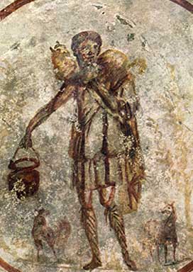
- This is very common in depictions of Biblical and mythological figures. For example, compare this third-century catacomb painting of Jesus as the Good Shepherd with modern takes on the same subject by Gail Rein, John Snogron, and an unnamed French artist.
- Taken to greater extremes as Christianity spreads around the world, where Jesus will often be given a Race Lift in the local church to reflect the local culture.
Tabletop Games
- Dungeons & Dragons gets this a lot, but probably the worst victim is the Demon Lord Demogorgon; the consistant part of its appearance is that it has two animalistic heads and tentacle arms. Its bulk, amount and color of hair, skin texture, number of tentacles (varies between one and two on each arm), arm structure, and the species of the animals its heads are has varried over the years, between hyenas, baboons, and mandrills.
- Magic: The Gathering artists can't seem to reach a consensus on what Lim-Dul looks like. Dark Ritual shows him with black hair and ram's horns, his own card has him white-haired and with his horns out of the picture, and the comics draw him bald and with antlers.
- Sajan Gadadvara, Pathfinder's iconic monk, is supposed to be from Golarion's equivalent of Southeast Asia. He usually looks less Southeast Asian than some variation on the theme of Ambiguously Brown.
- Before 4th edition Dungeons & Dragons, all Tieflings (the result of interbreeding between humans and demons) looked different, with the only constant being that there was some physical sign of their non-human heritage. Fourth edition standardized their appearance in theory - now all Tieflings have horns and tails - but artists vary widely in how human their faces look, whether their horns are curled like ram's or stick straight up (and whether that's random, consistent, or varies by gender), whether their tails are thin and flexible or thick and ungainly like a dinosaur's, etc.
- In a strange case of Depending on the Author, the Eberron modules The Delirium Stone and Freely Given, which are written by different people as RPGA modules often were, have a recurring NPC supporting character called Charisma. Charisma is described as "an exotic elf with long, silver-blonde hair and golden eyes" in white clothes with skin with a golden glow. For whatever reason the two modules recommend completely different looking miniatures for her. Further neither matches her description all that well beyond "white clothes" as both are black skinned and one is male.
Toys
- Bionicle had this so much, that eventually the writer simply came forward and said everyone is free to choose which kind of character design they want to see as "the most real". Thankfully in some cases, like for the shape-shifting race of beings called Makuta or the Mask of Life, most of the variations were canon-justified. Though a lot still had to be chalked up to the occasional Unreliable Illustrator, or artists not being supplied with sufficiently clear guidelines.
Video Games
- To make it short, Touhou has been subjected to this as a result of ZUN's art compared to Tasogare Frontier's as well as the fanarts.
- This seems to be an issue with Castlevania Judgment, an attempt at making a Castlevania fighting game. One of its major selling points, in theory, would be the Fan Service of having characters from different branches of the franchise come together to battle each other—but the character designer, Takeshi Obata (of Hikaru no Go and Death Note fame,) made most of the characters look drastically different than they did in their original games. For instance, this is Eric Lecarde in his original appearance. This is him in Judgment.
- Speaking of Obata's work, one of the DS Death Note games gave Matt blue hair. Sky blue, to be exact.
- Castlevania character designs were all over the place long before Judgment. Simon Belmont's character design specifically wildly varies between installments - his hair has been red, blond, brown, black, and blue - not to mention switching from a Conan the Barbarian look in the early games to the more recent Castlevania-style Bishounen.
- Final Fantasy has just...tremendous examples of this. It's most obvious when dealing with the older games, which have been ported and remade and all that good stuff countless, countless times, but it exists in all of them, especially since the release of Dissidia.
- Dissidia Final Fantasy is an interesting variation of this, as it contains characters from lots of different Final Fantasy games that have very different art styles (compare the Steampunk aesthetic of Final Fantasy VI to the sci-fi Cyberpunk/BioPunk style of Final Fantasy VII to the standard Medieval European Fantasy fare of titles like IV and on and on and on and on...) and makes them all conform to one art style for purposes of internal visual coherency. The style in question is done by main designer Tetsuya Nomura (quite obviously, to anyone familiar with the man's other works), but incorporating the Signature Style of the series' other main designer/illustrator Yoshitaka Amano—and this "Amanoization" applies as well to characters that were originally drawn by Nomura, such as Tidus and Squall. The overall effect is ...interesting, and subject of great debate among the fandom.
- And then the game does it deliberately and pushes it further with the Summon spells, which are represented by a variety of artwork—from the original concept art (like Malboro) to completely new designs (such as Carbuncle), all of which span the entire 20+ years of the series. For an example of this trope taken literally—the "auto" Bahamut summon shows the dragon as designed for Final Fantasy X by Tetsuya Nomura, while the "manual" Bahamut shows the same dragon...as he was drawn by Amano for Final Fantasy V.
- The recurring mascot critters, enemies, summons, etc., often vary wildly between games. Although, since each game takes place in an entirely different world/verse, it's not as straight an example as it could be.
- The Moogles: In the early series they're vaguely catlike white-or-light-colored furballs with a pom-pom and tiny purple wings, like so. From VII-X, they look like plush-toy versions of the above basic design (and in some cases are actual plush toys). The Kingdom Hearts and Dissidia moogles look like the plush-toy variants, but more so and, most notably, with a comically oversized head and big round clown nose, as can be seen here. In the Crystal Chronicles spinoff series, moogles are like the "original-flavor" moogles, except even fluffier and overall less feline and more rodentine in appearance, a look shared with the moogle cameo in Final Fantasy XIII. Forelimbs are optional. And then the Ivalice moogles (Final Fantasy Tactics Advance, Final Fantasy Tactics A2, and Final Fantasy XII among others) are completely different, as you can see.
- The Chocobos: The in-game appearance of the chocobos has varied surprisingly little over most of the series—large, usually yellow flightless birds of varying degrees of cuteness/realism (XII-edition chocobos are probably the most realistic yet, while IX-edition are probably the cutest). Except...when Yoshitaka Amano was asked to draw a flightless bird as a mount for Final Fantasy II, his original concept was this surreal specter, which was then forgotten about...until they made an OVA sequel to Final Fantasy V. Behold.
- Bombs: Since their initial appearance in II, Bombs have had a fairly standard appearance: floating fireball with eyes, a mouth, and tiny little arms. Then came Final Fantasy XIII.
- Flans: The standard Final Fantasy flan is a vaguely-cylindrical blob with eyes and a mouth, limb-like "appendages" optional—but in their first appearance, they take on an almost myconid appearance, which is later echoed in some of the Crystal Chronicles flan designs.
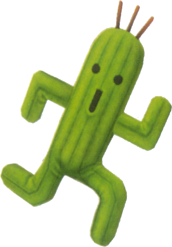
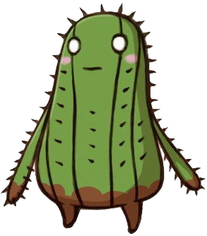
- Cactuars: Cactuars, the cactus-people-enemies, were virtually identical from VI through X—then came XI's take, followed by the Ivalice interpretation.
- Bahamut is usually drawn as a huge black dragon...for Final Fantasy X, his design was distinctly more fabulous.
- Final Fantasy V had many examples of this. Every character has their concept as drawn by Yoshitaka Amano, their little pixeled map sprite, their battle sprite, their menu portrait, the super-deformed chibi official art based on the sprite, and a 3D render. Internal consistency between any of those is the exception, not the rule.
- Final Fantasy II also gets it pretty bad, due to two main factors: The first is that it has been remade/ported no less than six times, usually with an updated graphical look (Firion is basically identical to Fighter in the NES version and doesn't begin looking like a different, unique character until the Playstation version) and sometimes with new official art by a new artist in the Feelies. Then there's the renditions of the main characters and villain in the FMV opening of some versions of the game, where they are utterly unrecognizable. Secondly, there's the little fact that Amano apparently could not decide how he wanted to draw Firion. Practically every concept piece features a very different-looking Firion, and a similar thing applies to art of the Emperor. It's so bad that Nomura's rendition of Firion for Dissidia, which incorporates elements from practically all the official arts and recent sprites, looks more like "Firion" than "Firion" does.
- Final Fantasy IV has some particularly Egregious examples. Among some prominent ones is the Nintendo Power art created from, apparently, whole cloth to, apparently, sell the art to Americans. These depictions of Rydia, Rosa, Edward, Kain, Cecil and especially Palom and Porom aren't very true-to form. In-game, the character Cecil gets it particularly bad, getting different art for the original concept, the DS remake, the sequel, and yet another for Dissidia, in addition to the miscellaneous pixeled sprites "chibi" artwork, 3D renders, and inconsistent depictions of the exact color of his armor and skin. Really, he is rarely depicted the same way twice, even in the same game.
- Dissidia Final Fantasy is an interesting variation of this, as it contains characters from lots of different Final Fantasy games that have very different art styles (compare the Steampunk aesthetic of Final Fantasy VI to the sci-fi Cyberpunk/BioPunk style of Final Fantasy VII to the standard Medieval European Fantasy fare of titles like IV and on and on and on and on...) and makes them all conform to one art style for purposes of internal visual coherency. The style in question is done by main designer Tetsuya Nomura (quite obviously, to anyone familiar with the man's other works), but incorporating the Signature Style of the series' other main designer/illustrator Yoshitaka Amano—and this "Amanoization" applies as well to characters that were originally drawn by Nomura, such as Tidus and Squall. The overall effect is ...interesting, and subject of great debate among the fandom.
- Many Fighting Games include this trope. Characters inexplicably change appearance from one game to the other, and then may retain their oldest attire or not.
- Mortal Kombat, The King Of Fighter, Tekken, Soul Calibur...
- As the picture at the top of the screen shows, the Street Fighter series has undergone a lot of artists over the course of the last twenty-plus years. The one in the lower-right is a bonus - it's from Capcom vs. SNK, and was drawn by the artist from The King of Fighters.
- Star Fox has historically done this a lot.
- Between the Vaporware (but leaked) Star Fox 2 and Star Fox 64, the Star Wolf characters changed dramatically in appearance, with Wolf standing out the most. Not only does he have an eye scar instead of his later patch, but it's on the opposite eye.
- Katt is another extreme version of this, becoming an artistic The Other Darrin in Command.
- Most of the other characters have had very noticeable design alterations to some degree. Falco's beak constantly changes shape between games and comics, the entire shape of Peppy's and Slippy's head has changed significantly, Pepper lost his Cool Shades and got black eye patches instead, and Fox's eye color shifted from blue to green. Wolf's eyes are usually violet, but they were grey in Command, then violet again in Brawl.
- The eye color of the Original Mega Man and his sister Roll is oficially blue, but are often drawn green by different artists. Given that the rest of the heroes in the franchise come with green eyes, the confusion is understandable.
Web Comic
- Abstract Gender went through several different artists, each with their own style and character design
- One of the biggest problems with the comic was that even the individual artists couldn't keep the character designs constant.
- Gender Swapped went through this, the new artist's change in style made the characters look completely different.
- Each page of Heroes Unite is drawn by a different artist, and each artist has their own style. This can cause characters to change appearance during the same scene.
- Living With Insanity. When Paul Salvi became the artist, he redesigned all the characters so that the only ones who look like they did when David Herbert drew them are the goth girl Sally and Afro guy.
- Exploited Trope in Melonpool, suggesting that Lyman and Uncle Max (two notable Chuck Cunningham Syndrome characters) are actually the same character.
- The regular characters in Lightning Made of Owls are drawn by the different contributing artists in all sorts of ways. Sometimes they're highly realistic, sometimes they're stick figures. Sometimes they're not human.
Western Animation
- One show that deliberately invokes this trope is John Kricfalusi's The Ren and Stimpy Show, due to his strict rule that the artists were never allowed to draw a character with the same pose or expression, or even draw the character the same way, twice.
- Probably the most notable example in the history of ever is the movie based on the game Dante's Inferno, each level of hell is animated by a different studio, and Dante himself changes looks each time sometimes gaining or losing equipment and his hair and scythe in particular were all over the place.
- As one noted in the DVD Commentary of Avatar: The Last Airbender, whether Sokka and Aang are lean but muscular or just flat-out scrawny-looking changes depending on the animator.
- Similarly, Captain Fanzone from Transformers Animated has Eyes Always Shut in the episodes animated by The Answer Studio, but not by Mook. This is probably because they came up with different interpretations of his official character model, which has him squinting, although it's debatable if it should always be like that.
- With Looney Tunes, how a particular character looks depends almost entirely on who is in the director's chair. Although their general appearance remained constant, it was easy to recognize a Chuck Jones Bugs Bunny from a Friz Freleng Bugs Bunny. A big reason for this was the fact that at Warners, it was the director's job to do the character layouts (the key poses that serve as guides to the animators), and thus these followed the director's individual drawing style.
- In the earlier Robert McKimson directed Bugs Bunny cartoons for whatever reason Bugs was really chubby and fluffy, it is said that Jean Blanchard designed this version.
- This was most apparent during the mid-1930s, when the animators were still fiddling around with the designs. Porky Pig in particular varied greatly; in some cartoons, he was only somewhat portly, while in others he was fat to the point of obesity. It wasn't until about 1938 that director Bob Clampett came up with the character we now recognize as Porky.
- Similarly, Elmer Fudd didn't have a consistent look for a while. He varied from the big-headed guy he is now to being a guy with a normal-sized head and big nose. He also had a brief period in which he was fatter than Porky.
- The Marvelous Misadventures of Flapjack loves this trope. Every storyboard artist has their own style, and it shows.
- Whatever you were used to seeing in the animation of Tiny Toon Adventures, A Pup Named Scooby-Doo and Darkwing Duck, Kennedy Cartoons would turn it into a messy and odd squash and stretch show.
- The Fantastic Four: World's Greatest Heroes cartoon artist(s) seem to have given Johnny a chin you could put a eye out with.
- Gorgonzola from Chowder is possibly an example of this. Most of the time he's only drawn slightly chubby, not much.. but sometimes he is drawn almost as large as Chowder but on quite a few other occasions he's drawn really thin. (sometimes resulting in him looking like a baby with a unusually large head) Not to mention the disappearance and reappearance of his monobrow. The other characters are subject to this kind of thing (not necessarily weight, though)
- Froggo from Histeria! also falls into the whole "sometimes fat, sometimes thin" thing.
- Prominent throughout Danny Phantom where the main trio (especially Danny) can either look ridiculously scrawny or look as though they got some meat in their diet and gained some muscles. Thought the series eventually progressed or gotten stiffer, they flip-flopped around often between these two kind of art styles throughout the run of the show. Then there was that brief "loose" style they had for the better part of Season One.
- American Dad - is Stan muscular, a bit tubby but still somewhat buff, or obese?
- Ranger Smith constantly changed his appearance in the original Yogi Bear cartoons, even becoming a blonde in one episode of Yogi's Gang.
- Parodied in the Spumco-made shorts, where he changed appearance between shots.
- The art style varied greatly in the An American Tail movies. The only two with similar animation styles are the direct to video sequels, and even then Tanya still somehow managed to look completely different in both movies (she's the character who goes through the most extreme design changes from movie to movie).
- X-Men fans will remember the different character appearances in the final episodes.
- Family Guy: Poor, poor Meg Griffin. In some episodes she simply happens to have a wide body type but a stomach most real life girls would kill for, while in others she's got a muffin top.
- Much like The Marvelous Misadventures of Flapjack, the storyboarders of Adventure Time very freely let their own style show in their episodes. This is usually most prominent in how Finn is drawn- sometimes he's a little more chubby or thin, his hat may or may not be rounded and more dimensional, his limbs may be more wiggly, etc. Jake's appearance widely varies too, but he may not count, being a Shape Shifter.
- Kahn from King of the Hill. In scenes where he ends up shirtless, his body is portrayed in a wide variety of ways. Sometimes he looks similar to the other guys and has a slight gut, in others, he has a flat stomach and good pecs, and a few times, he's been shown with a six-pack.
- Spike from My Little Pony Friendship Is Magic. His color scheme varies from episode to episode. Sometimes he's a light pinkish color, and sometimes he's a darker purplish.
Other
- Invoked with Jenny Everywhere - she's an open source superhero with a very vague description, so anybody can interpret her anyway they wish. The most common interpretation has her wearing aviator goggles and a scarf, and the official description calls her "Native American or Asian."