Off-Model

 |
"I wish the art was good throughout the whole series, not just in the final episode." —A bunch of ninjas in the final episode of Ninja Nonsense.
|
 |
Animation is expensive. Really expensive. An average 22-minute episode of an anime costs around $123,000, when American shows tend to be about $300,000.[1]
When a production company decides that the important episodes (i.e. pilots, whams, and finales) of a show get priority, other episodes (like Filler) will, to conserve production costs, be drawn with only the bare minimum of framework that they absolutely must have.
Long running shows suffering from budget issues will start resorting to thinly veiled camera tricks. The movement and even design of characters will start to slip, especially if the show is bothering to animate heavy action scenes. When they are animated, fight scenes will become Fight Unscenes.
The prevalence of computer-inked animation in recent years merely assures that colors stay consistent. Off model refers to the character model (on a model sheet), which is what the animators are supposed to base their drawings on. Another important step is animation checking, which may be skimped on when time or money is short.
Fans are typically not pleased, and it is very common for companies to announce they're fixing up things for the inevitable DVD release.
However, Tropes Are Not Bad. Cartoonist John Kricfalusi has repeatedly stated that "staying on model is only for wimps and communists", or more subtly, if you don't break the character's model to emphasize some emotions, it'd be just as good done live action. Squash and stretch can be considered off-model, but it is one of The Twelve Principles of Animation. The result of staying true to off-model animation is fantastic, in Kricfalusi's case. Walt Disney Animation Australia, Carbunkle Cartoons and Star Toons are also examples. However, their use of it is Depending on the Artist taken Up to Eleven, rather than accidental off model.
See also Uncanny Valley and Deranged Animation. Contrast Animation Bump, where the animation is suddenly much better made than usual. Compare Special Effect Failure, a similar trope, but with live action (and with animation that mixes more than one form of it). For animation studios that screw up constantly unintentionally, see AKOM, Studio DEEN, Dong Woo Animation, Studio Shaft, Sunrise, Actas, Tokyo Kids,[2] and Toei Animation (mainly their unit the The Philippines).[3] For a studio whose supporters and critics often argue about whether their animation is this, see Kennedy Cartoons.
Note: If a show has constant instances of Off Model, then list notable examples of it. In addition, try to avoid typing Zero Context Examples.
Advertising
- Every single one of the Pakistan Happy Meal ads. All of the Sonic characters are missing defining traits and ending up looking butt-ugly, Neo Cortex looking like a creepy terrorist (and missing the N on his forehead), Hello Kitty looking fat and having a mouth, and so on.
- And then notice how the McDonald's mascots keep changing their looks throughout each commercial.
- The USA commercial for Rayman 3: Hoodlum Havoc has an off-model CGI model of Rayman, with a very oddly-shaped torso and inaccurate eyes. (View the commercial in HD here.) Just compare [dead link] how he looks [dead link] in the game [dead link] to how he looks on the commercial.
- This commercial for a Korean Nintendo ad. Not only does it manage to make this the video game commercial equivalent of Cartoon All-Stars to the Rescue, the animation studio (Dai Won) manages to screw up Ryu, Chun-Li, Bowser, Krillin, Goku, Raphael... Pretty much everyone except Mario and Buster.
- As if the show, comics and toys were not enough, the commercials of Transformers G1 also end up falling into this trope. Two in particular stand out; the very first one, using entirely different models for The Ark, Megatron and the Seekers. And this one, which truly showcases how much of an Expy Jetfire was. This Chile commercial also contains a grutatious amount of this trope, though this is because neither Toei or AKOM provided the animation.
- An M&Ms commercial from Madagascar (the country, not the movie) has horrible-looking models of the M&Ms mascots; they're completely hollow on the inside with no tongues and they appear lumpy whenever they move their limbs.
- An Italian ad gave Yellow a set of teeth.
Anime and Manga
- A lot of well-animated anime (or individual high-budget episodes of otherwise cheap shows) tends to feature looser artwork than usual, as a way to show off the style of each individual animator and give the scene more of a "soul", so to speak. These inconsistencies as a result of animation directors treating individual animators as artists as opposed to mere cogs in a machine is often seen as "low quality" or a "lack of budget" by anime fans, who tend to value detail-per-frame and consistency above all else. A lot of "notoriously bad" episodes are actually the impressive work of an above-average good staff.
- Spirited Away features this intentionally, as the proportions of Yubaba's head continually change depending on the mood of the scene. Miyazaki has said being able to go intentionally off-model is one of the things that appeals to him about traditional animation over CGI.
- Likewise, Howl's Moving Castle. Even before it changes color (once through a dye accident, and then by magic, the length and style of Howl's blonde hair subtly changes several times.
- The anime of Ginga Densetsu Weed is practically legendary for this among the fandom. Here is forum topic centered around posting these so-called "bombs". It should say something that the thing is over a hundred pages long.
- The car chase scene in episode 7 of Shinkyoku Soukai Polyphonica (which spawned its own meme, being dubbed the "QUALITY VAN") is one of the most infamous bits of Off Model in anime. Note the inflatable pool toy on the roof of the car that can't decide whether it wants to be a shark, a dolphin, or a different shark. Window's broken, now it's fixed, now it's broken again...now there's two?!
- Gravion character Mizuki Tachibana had her breasts drawn in such a way in the second season (during a moment of upper body nudity) they not only looked impossibly large, even by Gag Boobs standards, but they didn't even look naturally attached to her chest, and this was particularly obvious during a brief Gainaxing animation in the same scene.
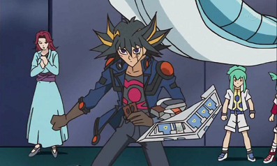
- Several memes stem from the show Naruto. Several major battles suffer from strikingly different (though not necessarily lower quality) animation. As well, most of the episodes afterwards (the filler arcs) suffer from poorer animation. The reason for this is that the show, at any given time, has more than a dozen studios producing the animation. Many dedicated viewers can identify different studios just by the drawing of characters.
- One of the good things about the dub (and most foreign broadcasts in general) is that they always use the redone version to avoid the often craptacular moments (especially individual frames) of off-model animation, like one where Naruto was depicted without his head. But when that does happen, at least Naruto looks kinda cool.
- The team responsible for the major fight in the Valley of the End has wildly inconsistent character design. What is lost is gained in the fact that their animation makes for some of the fastest, most fluid fights in the series.
- A good example of Off-Model animation in the anime version of Naruto and Sasuke fight at Valley Of The End has to be the face Sasuke makes when Naruto hits him in one scene as well as that one scene where Naruto's clones act as missiles. Notice how stretched out and fishlike their faces are.
- The manga has one major example in chapter 430, where the artist had to submit the chapter when some pages had a full stage of the drawing process left to keep up with his schedule. Thankfully, this was cleaned up for the volume release.
- The Pain Invasion arc is nearing its end at episode 167. Episode 167 is by far the best combined example of Animation Bump and Off-Model (because the animation style used is meant for extremely fluid motion, which helps in the fight scenes it's used in) the series has ever seen.
- Also noteworthy was the unnaturally-drawn style of Hinata's hair- a surreal neon blue with foggy highlights (as opposed to clear white), and her Hime Cut seemed to be one big chunk with no visible lines distinguishing the individual hairs, as though it was the plastic-molded hair of a cheap action figure.
- For some reason Kushina's eyes and hair were darker in her initial appearance than in later appearances.
- Gamahiro, one of Jiraiya's toad summons, changes color after his first anime appearance as well.
- Sailor Moon's first episode sometimes had the characters drawn with no eyes. This is quite noticeable in Sailor Moon Abridged where the eyeless Serena eating lunch has become commonly used.
- Sailor Moon also made use of several different animators with wildly varying levels of quality. The animators were excellent to decent, but there was one particularly horrible animator that was on the staff until at least the end of Sailor Moon S. This got to be particularly annoying when the characters would change their appearance right in the middle of a two parter or have a flashback to an episode where they looked completely different. Later in the series, the animators had styles that were similar enough that this jarring disconnect stopped happening so often.
- There's even a reference sheet of all the different artists.
- The final season/series was noticeably different from the first and some of the others as well. Everyone had fuller faces, the crescent on Sailor Moon's head became tall and thin (having been previously short and wide), and everyone had larger foreheads, which was noticeable in scenes where their symbols appeared on their heads before their tiaras faded away via magic to make room.
- A couple of episodes in Samurai Champloo suffer briefly from this, most noticeably in how Mugen and Jin's faces are drawn. The art is usually crisp and flawless, but during these episodes the eyes and facial features are simplified to the point of being quite ugly.
- Mugen's sword would change in length, width, and curvature, sometimes it'd almost be a BFS, other times it'd look like a scimitar.
- Ergo Proxy, also a Studio Manglobe project, suffers from this same problem.
- Ninja Nonsense's last episode has the ninjas discussing how annoying this is while watching the end to an anime.
- Incidentally, the entire second half of episode 9 was animated in a different art style from the rest of the show (Compare Shinobu's eyes, chin, and hair from the first half). Incidentally, the artwork was actually somewhat better. It might have been done to simply see if anyone noticed.
- Nadia's infamous "Island/Africa" arc resulted from a decision to extend the show. Like most filler, it fell victim to a slipping animation budget and rather bizarre "cartoony" visuals in certain episodes.
- Mahou Sensei Negima's chances for a second season were crushed by Off-Model Episodes occurring way too early in the show for viewer tolerance. The closest we got was Negima!?, which turned out better (art-wise) anyway.
- The entirety of episode 19 of the anime Genesis of Aquarion is off-model, both to indicate a world that isn't quite real, but also in the "real world", where everybody simply looks... odd. Considering that it's an important Arc episode, this is quite an anomaly. It's an anomaly for deliberate reasons, though, since the episode had arthouse animator Satoru Utsunomiya as guest director/creator. Click here for examples.
- The DVD sales for the second season of Minami-ke got cut in half by the power of QUALITY among other things.
- Dragonball Z had extremely varied animation quality. During the Saiyan Saga and most of the Frieza Saga, animation was high quality up until around the point Goku goes Super Saiyan. After that the animation style and quality begins to vary significantly and is most noticeable during closeups of Trunks upon his first arrival and throughout most of the Cell Saga. The quality of animation continued to vary throughout the the rest of the series (going from pretty bad to very good) but was less varied in the Buu Saga and Dragon Ball GT.
- Cell is missing one of the purplish lines on the side of his face after he and Goku are worn down in Episode 165: The Fight Is Over.
- The opening for Dragon Ball Kai somehow manages to forget the spots that appear on Krilin's forehead 22-27 seconds in Also, since this is the third opening, the same mistake happens again towards the end. Some animation upgrade huh Toei?
- The first Hellsing TV series was notorious for this. Despite only being 13 episodes long, any episode that wasn't an excuse for awesome vampire battles was done pretty shoddily.
- Only the first episode of Yoake Mae Yori Ruriiro na Crescent Love has any kind of quality; the later plot-important episodes are a little worse, but the filler is legendarily terrible. Its absolute nadir was in the third episode, when a cabbage was made perfectly spherical, like a bowling ball. The ballcabbage became emblematic of the series, to the point where, when they cleaned it up for the DVD release, fans are divided on whether it was an improvement or not.
- The Greed Island Final OVA of Hunter X Hunter is noticeably Off Model, with lots of still frames and scaling of static "sprites" replacing actual animation.
- Moetan lampshades this in its first episode's ending segment, when Pastel Ink teaches the viewer how to say "It's great that the animation staff go all out with the quality of an anime's first episode."
- Baki the Grappler sometimes falls into this, mostly in the second season. It's pretty easy to tell, because the faces begin to border Nightmare Fuel. Thankfully, it also tends to be back to normal within in episode or two.
- Magical Girl Lyrical Nanoha does this a great deal, resulting in substantial reworking for the DVD. In one case, though the off model animation actually changed the meaning of a scene entirely: the White Devil training incident, where Nanoha Barehanded Blade Blocks two students and, after calmly telling one student to "cool her head", blasts her out of the sky. Judging from the DVD version, she was supposed to have done that with a concerned yet stern look reminiscent of a disappointed parent, but on the TV version she has a scrunched-up look reminiscent of someone in Higurashi going insane.
- The first season also has its share of Off-Model animation. During the first season, when Arf confronts Nanoha for the first time, Suzuka is drawn without a face. The animation for that whole episode was weird. It was drawn in an entirely different style from the rest of the series, like they called in the animators from a totally different show to do that episode for them.
- The fourth episode of Tengen Toppa Gurren Lagann marked a huge departure in character design and animation from the both previous and future episode. However, this wasn't due out-sourcing animation, but because it had a completely different storyboarder/director/lead animator, so it could be considered more of an full-episode Art Shift. This generated vast controversy on the Japanese Image Board 2channel, culminating in the show's producer (and co-founder of Studio Gainax) resigning from Gainax's board as a result of disparaging remarks made against the fans. Yowza.
- Samurai 7 used a blatantly intentional Art Shift in its seventh episode, which some fans assumed was a mistake or the result of budget issues.
- The original television broadcast of episode 5 of Katekyo Hitman Reborn is particularly infamous within the fandom for its Off-Model animation, but later got cleaned up for the DVD release; this image, while technically a shop, depicts just one of the memorable goofs. It even gained a Japanese fanlisting!
- There's no way, Hibari Kyoya can make a face like this!. see lower left panel.
- Rozen Maiden suffered briefly from this in the eleventh episode of the first season. In one shot, Suigintou was depicted with six fingers, though this was fixed for the DVD release.
- Sonic X must have had seventeen different art styles in this show. While it was easily noticeable early on that artwork in episodes differed from one another drastically, as the series progressed the characters became increasingly hideous and repulsive.
- This is because of bad outsourcing, as the third season done by 4Kids rather by Sega themselves like with seasons 1 and 2, as season 3 was mostly done in Korea.
- Pokémon has gotten rather obvious at this with the Diamond & Pearl saga. Every once in a while an episode will pop up with noticeably poorer animation. This is very evident in the faces of Ash, Brock and Dawn, leading to the term "eyegarbage animation" used on one Pokémon-related forum. Episode examples include "Dawn of a New Era", "Wild in the Streets" and "Malice in Wonderland".
- In "Spinarak Attack", Ash, Misty, and Brock were thrown in a web, and as they're bouncing, Brock disappears completely in one frame of animation.
- In "Buizel Your Way Out Of This!", when Zoey checks on her Glameow after losing to Buziel, she suddenly loses her left arm for a half-second.
- In Hold The Phione!" as the trio walks through the local fair, Brock, just as the picture in this page, gains a sixth finger.
- Yusaku Takeda's episodes still can't produce any facial expression beyond Dull Surprise.
- Not as noticeable, but May's breast size kept changing an awful lot, too. Maybe she uses padding?
- In her appearance in the DP arc, she seems to be just as flat as Dawn.
- In Hoenn, the animators also never seemed to be able to decide on the length of her hair.
- In the episode "Take this House and Shuppet!" a flashback is seen, intended to show that May really does care about Max. At the end of the flashback, for a full five seconds, May's eyes inexplicably turn green. It's especially odd since it's very different from her actual color; far more intense.
- Similar, but the animators tend to switch between Misty's eyes being green or blue. The games and most manga have her with Blue Eyes, though.
- Despite usually being one of the most well-rendered Hentai series, Bible Black has a glaring moment of cheapness in the second episode. During a sex scene, one shot is quite clearly the camera repeatedly moving around a still picture from the original H-game with sound effects dubbed in...
- There are actually some very cheaply animated scenes in the first season overall, though not as noticed. The Darker and Edgier second season improved vastly in terms of quality and smoothness, as well as the studio's other works by that time.
- Several episodes of Super Dimension Fortress Macross suffered from incredibly bad and off-model animation in places, which was an even bigger problem for Macross as it had no filler episodes, so a lot of very important episodes and scenes end up looking like total garbage; most infamous by far is the Max/Milia knife fight, which should have been a Crowning Moment of Awesome but ended up an embarrassment as Milia was never on model for the entire fight and looked like she had been snorting cocaine for an hour straight prior to the scene and neither of them ever had their eyes drawn right (they're always focused like they were looking at something much farther away than they were and several times Max looked like he had his eyes pointing in opposite direction). As a whole, the series was very prone to sudden and inexplicable animation errors, such as one character's uniform changing colors between different frames in the same shot and random objects (and in one case, one of the non-character people in the city) simply blinking out of existence.
- Another blatant example can be found in Episode 3, when the cockpit section holding Hikaru and Minmay underneath Roy's Valkyrie suddenly morphs to Roy's gunpod.
- A third major error had far-reaching complications: In the episode "Virgin Road" (the same one that also gave us the infamous knife fight mentioned above), some of the Valkyries are shown firing lasers from the nosecone. The fittings they fire from are officially the attachment points for the legs when the Valk is in Batroid mode. This bit of Did Not Do the Research on the part of Star Pro (a farm studio foisted on the production by Tatsunoko) became canon for Robotech, especially in the licensed Palladium game, which lists the "weapon" as standard on the craft.[4]
- The more recent Macross Frontier also has some minor problems with this; the series never ends up looking totally awful per se, but it's pretty clear which episodes are outsourced even before they run the credits. Even the main-team episodes can look a mite odd in places, though.
- Yu-Gi-Oh! suffered seriously from this. The first two seasons have a consistent art style, but all the others suffer from dozens of different art styles (especially in the fillers). Some of them do make the characters look better (almost Moe-like), but some of them are just horrible. Sometimes the body parts get out of proportion, sometimes the face-lines are way too exaggerated (making the characters seem to be pretty sleepy), and sometimes the girls' girly parts are randomly enlarged/shortened.
- Here's a run of Yami Yugi in some episodes, and here is a run of Yami Bakura in some episodes. Bakura suffered a little less, since he stayed out of all the fillers, but still had quite a change from his first appearance to later episodes.
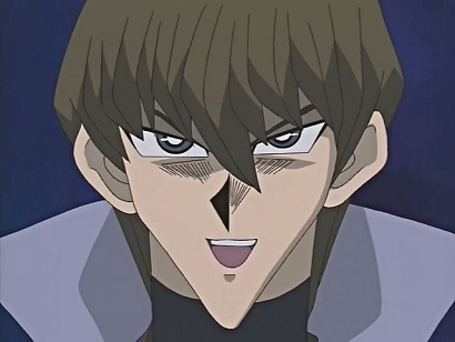
- For further amusement, Yami and his small feet from episode 160, Black Tristan from episode 43, and most infamously, Seto Kaiba's pointy chin from several scenes of the anime.
- Yu-Gi-Oh!: The Abridged Series, naturally, mocked these errors as Yami looks at Kaiba and notes that the latter's nose is Off-Model.
|
Yami: It's like the animators didn't even care! |
|
- Yu-Gi-Oh! 5D's suffers from this for one scene in episode 41, where Yusei, Lua, Luca and Aki's mom appear REALLY BADLY DRAWN with minimal shading and lack of detailed features. And yet when the camera pans out to see Aki's dad standing in front of Yusei, he appears normally drawn...
- This was fixed for the DVD release (or at least the 4Kids dub anyway), but Stardust Dragon's tail remains shoddily drawn.
- Here's a fun thing to laugh at. This ending scene of Episode 81 has something missing. What could it be?
- Bleach has often been afflicted with "quality animation", especially in Filler arcs.
- Despite the Viewtiful Joe anime adaptation's severe animation-saving techniques, the character designs appear to change from episode to episode.
- The animation in Musashi Gundoh just screams QUALITY.
- One episode of Mobile Suit Gundam was actually removed from circulation by specific request of Yoshiyuki Tomino for containing lots of very egregious Off-Model shots.
- And keep in mind the rest of the show was rampantly Off-Model at times. The infamous "wide Gundam", for example, or the time the Gundam mysteriously became huge...
- Rumor has it that the major model flaws of "Kukurus Doan's Island" (the episode in question) was not the only reason the episode was pulled. Apparently the episode's director and Tomino had a catastrophic falling out (and all Tomino will say about it is a cryptic statement to the effect of "he knows what he did") and Tomino had the episode put into Canon Discontinuity partly for that reason.
- This was one of the major criticisms of Transformers Armada. This is actually less about outsourcing animation than it was about Executive Meddling forcing them to rush. This happened with both Armada and its sequel Energon, where several episodes aired in America first before the animation was even finished, and they had to drastically alter the scripts trying (and failing) to salvage the plot, making entire episodes utterly incomprehensible (whereas the Japan got the original scripts with completed animation). It didn't help that the first episodes were animated using completely different animation models for Optimus Prime and Megatron. Energon was worse about it, though Armada infamously has a black spot on the screen with wings in the place of Starscream for a sustained period in one episode. This series could possibly give even an AKOM animated Generation 1 episode a run for its money.
- Take a look at the quality of animation on the robots in episode 1, then compare it to 2- a significant dip is obvious. Then go to episode 3, and that's where it starts to get painfully out of control. However, the show rebounds in later episodes, and by the final episodes, the quality of the cel-shaded animation is breathtaking, especially the Grand Finale.
- Energon is brutally chewed out on the Transformers Wiki for having CGI models that emote Dull Surprise at all times, outlines that don't change with size perspective, several missing scenes as aformentioned, and even having the guts to blatantly go back to cel-shaded animation for scenes that require fluid animation. One wonders what the show would've been like if the animation wasn't massacred by the choice to switch to CGI. Worse, the scripts have been mangled in the US dub, so much so that the same wiki above has a "Pain Count" for each episode- every instance where a moment of dead air is filled with a random stock phrase, or prolonged groans {such as "uhhhh") to keep the ball rolling. Notable are episodes 30, 31, 43 and 49 (the last two on that list are technically 44 & 51, but episode 33 was skipped on the English Dub for unknown reasons), where cel animation is downright glaring.
- Transformers Cybertron; despite not having the company used for Armada still falls into this. Thanks to hiring two studios (GONZO and Sunwoo Entertainment) that are better, but not by much. Dull Surprise is less prevalent, but it's fairly obvious there's still trouble going on trying to make the CGI models show particularly deep emotion.
- In the early stages of production, it wasn't clear if Cybertron would follow Energon's storyline. Eventually, Word of God said no- but one episode had Alexis appear out of the blue on stage- an unintentional Freeze-Frame Bonus- when she wasn't part of the plot.
- In a bizarre turn of events, Hasbro actually tried to string Cybertron's continuity with Armada's and Energon's and ignore the discontinuity, thereby creating the so-called "Unicron Trilogy." In the final episode, they added several shots that actually had competent animation of Rad, Carlos, Alexis, and Kicker- but they screwed up when they tried to depict the characters with the Transformers they grew most attached to. The Armada kids (now adults) had superimposed images of High Wire, Sureshock, and Grindor in the background... straight from the wildly innacurate Armada boxart. As for Kicker, an image of Hot Shot was placed in the background, but Kicker's partner during Energon... was Ironhide!!!
- The scene in SHUFFLE! episode 1 where Asa grabs Rin's arm by the lockers and the scene in episode 24 where Asa also grabs Rin's arm by the lockers are suspiciously similar, from the way Kaede and Rin stand in the scene, and the way Asa waves at Rin before departing, except that she had longer hair in episode 24 because Rin forced her to use her magic to save him and the long hair was a side effect.
- The one-shot "sequel" chapter of Death Note looks noticeably different from the original manga, and often a bit sloppier. It's worth noting, however, that Takeshi Obata apparently may not have had a part in this.
- The anime adaptation had its fair share of QUALITY when it came time to adapt the second arc, though some examples were present in earlier episodes (with Misa being a notorious one). It seems that besides cutting the story up for anime format, They Just Didn't Care about how characters looked in some episodes. Misa and Mello were both hit badly with this, and Mogi and Aizawa even had their ENTIRE FACES disappear in a scene.
- Weiss Kreuz suffered terribly from Off-Model animation.[5] Not only do the characters' faces and hair length change from show to show, a character's sunglasses are at one point drawn off-model and subtly shift back to a more accurate design as the scene progresses. Characters wearing single earrings frequently have them switching from one ear to the other - or even to both. The show seems to take a demented delight in going off-model to the extent it becomes distracting, and not only does the art quality vary wildly from episode to episode, it randomly degenerates in the middle of episodes as well.
- Fate/stay night is generally a very good-looking show, but the animation takes a hit in a few episodes, such as the final confrontation with Caster. And no discussion of "off-model" in the context of anime is complete without this ghastly Chinese figure of Saber, which fans have nicknamed "Sader". Much fun has been had with the idea of Saber encountering this thing. In fact, there's a whole doujin about it ("Variant Tabi J").
- In the Lucky Star OP, when the four girls are talking and all you see is their legs, the normally significantly shorter (by half a foot) Konata has legs that are the same length as the other girls'. This has been spun off into at least one piece of fanart showing the full scene... where Konata is standing on a crate. Or two books. [dead link] Or getting hung by that one hair from the ceiling.
- More than a few scenes in the Black★Rock Shooter OVA suffer from missing details, misshapen faces and stubby limbs being common symptoms.
- In Tokyo Mew Mew, the ending theme had a problem with Minto's height. This is fixed starting episode 12.
- The animators also have a continuous problem of forgetting that Ichigo's garter is on her right leg and everyone else's garters are on their left.
- Lost Universe episode 4, Yashigani Hofuru (Coconut Crab Massacre) had lots of problems in its original TV broadcast version, including off-model characters, extremely slow frame rates, and ridiculously unrealistic motion. In this scene, for example, Canal points to a blank screen (which isn't supposed to be blank), then repeatedly disappears and reappears on the opposite side of the room. Also, in this screen shot, Millie's thumb is turned at an impossible angle to her other fingers. This led to "yashigani" becoming a nickname for bad animation.
- Welcome to The NHK suffers from this in places.
- The entire thirteenth episode of The Third: The Girl with the Blue Eye is incredibly poorly animated compared to the fairly high quality of every other episode.
- Happens occasionally in Fullmetal Alchemist, both the 2003 anime adaptation and Brotherhood. Though the shows have excellent art and fluid animation the majority of the time, there are a couple episodes (47 of Brotherhood, for example) where it's obvious that they didn't have their best directors on the job.
- Brotherhood is definitely the worst about this, though. Compared to the 2003 series, which had fairly consistent look throughout, many episodes look very off in comparison with the better artwork. Examples include, episode three the fight with Ed and Cornello looks so poor that it detracts from the rest of the episode. The worse offender is definitely Al though, especially in the last episode where he returns to Resembool. He's supposed to look like a slightly unhealthly 14 year old, but in Brotherhood, he looks like he's in his thirties.
- The Manga's also not immune, as Riza's eyes can sometimes change from having irises or having completely black pupils (and no iris). This can happen from panel to panel in a few pages later in the run (This can be jarring to some as she's never really shown to expressively emote without moving from the black eyes). They were switched to brown in the Anime proper.
- The Sacred Star of Milos received lots of negative backlash. The redone character designs and looser animation, courtesy of Tokyo Godfathers' Kenichi Konishi and an all-star animation cast, was attributed by the fanbase to a lack of talent or budget. In reality, the movie was very well animated and the art style was completely intentional and arguably fit the new look quite well.
- The first season of Code Geass had uneven animation quality during a couple of episodes, which wasn't an issue for the majority of viewers, but throughout R2 there were many instances of the same. Most usually went by too fast or were too small to notice unless you looked hard enough (as in hitting pause to look at Cornelia's face right when she walks into a room), but Off-Model character designs were definitely a common problem. Thankfully, the DVD release had many of the affected scenes redrawn or reanimated and thus the overall quality was improved. There are so many possible comparisons between the TV and DVD versions throughout the second season that it's not even funny, but episode 20 of R2 was probably the worst offender.
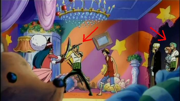
- Similar to the Naruto example above, a handful of episodes in One Piece are drawn in a rougher, less detailed style to allow for greater expression and impressively fluid fighting animation. While the character models are actually closer to the manga's artwork than most of the show, this does inevitably result in some rather bizarre drawings on occasion, such as in episode 404, where Chopper's neck mysteriously becomes as wide as his head during frontal closeups of him in Walk Point.
- Zoro has a twin.
- The Higurashi anime often suffers from off-model. For one, the characters' heads always seem too large in comparison to their bodies. The second season fixes a lot of the mistakes of the first season, but towards the end of the season you can clearly see mistakes (though, in the final episode there aren't many). The third season is on-model, but it is just five OVAs. However, there are some errors in the OVA's. The most noticeable is that Mion is missing her tattoo in the first one.
- Some episodes, like 26 of the original series, featured intentionally ugly, psychotic facial drawings and animation courtesy of popular animator Seiya Numata which, like most popular examples of "bad animation" in anime, were mistaken for animation errors due to their loose nature despite the fact that they were completely fitting within the context in which they were used (literally characters going insane).
- The Umineko: When They Cry anime looks to be continuing the QUALITY, though in different ways thanks to the different art style. Some examples [dead link].
- The Umineko manga also has some really strange artwork in places.
- Mai-Otome had some QUALITY issues starting with episode 10, where some characters' faces would be drawn out of alignment (particularly noticeable during Shizuru's battle against Midori, and especially bad in one scene during episode 16, where one minor character's facial features are almost non-existent). Episode 20 (the one with the Tomoe/Shizuru bedroom kiss) was a mess across the board, though some of the issues were fixed for the DVD releases.
- Hell Girl had lots of issues with character's designs in the first season. Eyes end up different sizes, different heights, looking it two different directions at once, bodies suddenly become a lot skinnier, etc. The second season vastly improved the quality of the animation.
- The anime adaptation of Urusei Yatsura had several cases of off model animation, most notably in the early episodes. The entire series had a total of 28 animation directors, and it would appear that only two of them (Asami Endo and Akemi Takada, respectively) actually attempted to remain true to Akemi Takada's character designs.
- Something similar happens in Ranma ½. The first season was very well animated, but the second season suffered a real drop in animation quality in general (and with some episodes, like the final part of the Phoenix Pill arc, being truly terrible), and this lower quality went on for a good portion of the third season as well. By the fourth season, though, the general quality increased considerably, though there were still a few "off" episodes right up until the seventh season, which—despite using more angular, less rounded character designs—was just as good as the first otherwise.
- An early episode of Mobile Suit Gundam 00 depicted the people within a crowd shot as looking like nothing so much as Q-tips; rather than being a freeze-frame thing, however, this was a several-second wide angle shot. It was corrected in the DVD release.
- There were quite a few quality shots all the way through the series, especially in season 2. Fixed for DVD, of course.
- The Hakkenden series of OAVs suffers from drastic ups and downs in art and animation quality. The first two episodes, for example, are gorgeous—then the third makes you wonder if you got a cheap knockoff by accident. The episode Hamaji's Resurrection goes off-model intentionally, opting for an infinitely more realistic style, in an attempt to portray the more serious tone of that particular story.
- In fact, a great deal of the Off-Model stuff is intentional—each individual episode of Hakkenden was directed by a different animator, with the characters redrawn in the unique style of each.
- Besides the fact that Hentai and QUALITY are practically synonymous, hentai series Bondage Game have an extremely obvious continuity error: in episode 2, during Yayoi's Breast Expansion scene, her now humongous breasts appear naked. But mere seconds later, she appears to wear an leathery apparel around them, who disappears in the middle of the scene as suddenly as it appeared.
- R.O.D the TV had a noticeable drop in quality in the later episodes of the TV version. Substantial reworking was performed for the DVD releases.
- The earlier seasons of the Slayers anime were a bit cheap in the animation department, swinging from very good to piss poor. The "piss poor" end is mostly blatant in the third season, where the characters are deformed for extended periods of time for no apparent reason. The spotlight episode on Jillas the fox is particularly terrible; although the colors for that season were richer, they actually clashed against the frequent still shots of the characters (all very off-model), which in turn contrasted poorly against painted backgrounds. The first season's animation quality also slipped during the last few episodes, but managed to come around for the final episode.
- The belated fourth and fifth seasons were of a better quality overall, regardless of the newer animation.
- The hentai production Sailor Moon & the 7 Ballz (NSFW) is the absolute epitome of this trope.
- The Mirai Nikki manga has some rough spots in the early chapters.
- Tenchi in Tokyo was already the redheaded stepchild of the various Tenchi incarnations. Further exacerbating this problem was that the animation followed the off-model parabola to a T. The first and last episodes are very well animated, with fluid motion and consistent characters. Every episode in the middle is a bumpy road, with the biggest jars coming from episodes plagued with weird camera angles that distort the characters noticeably.
- Also, from the last episode of the original series, the last scene with Mihoshi, Washu and Ryoko in Washu's lab was almost surreal in its poor quality. With cels that are visibly not animated and loud cookie-cutter sound effects, it is obvious that this scene was completed in an entirely different style at great expense and at the last minute.
- Bakemonogatari episode 10 was aired half-finished. While the still images were mostly fine, there was very little actual animation, to the point of accidentally averting Filming for Easy Dub by having the characters speak while their mouths were closed. Unlike the page quote implies though, they did fix it for the DVD and added about twice as much animation as had been previous present. And they also completely re-animated episode 9 for some reason, even though it didn't have any glaring errors in the first place.
- You're Under Arrest is quite infamous for this. It actually switched between Animation Bump and Off-Model with each episode, much like the Batman or Transformers examples below... Which makes you wonder whether or not AKOM was given a few episodes by Studio DEEN to work on and not getting the proper credit. It Got Worse.
- In the Full Throttle season, (episode 19 to be precise) there's an entire scene where Miyuki's bare hands are colored white (Yes, you read that right, she's supposed to have gloves on at that time). The opening also gives us a literal instance of Magic Brakes.
- Maria-sama Ga Miteru had inconsistent animation quality.
- The anime version of Axis Powers Hetalia, due to its low budget most of the time, is infamous for having some instances of this. One notable example is a scene in the second episode where the younger Italy ("Chibitalia") is shown with his brother. Except the other child looks nothing like his brother and happens to be missing the sclera in his eyes along with his Idiot Hair.
- Next time you watch Hamtaro, look at Penelope; her size never stays consistent across episodes, sometimes being almost as large as Pashmina and others looking like a yellow spot next to her. Similarly, her shape is never consistent, sometimes being round like a ball and others looking tall-ish.
- Also, at times, Laura's hair will not be shaped right.
- Like with Sonic X, this is because of bad outsourcing.
- As if her personality wasn't terrifying enough, the title character from Video Girl Ai is frequently off model. Every shot of her that isn't straight-on in the second episode makes her look deformed.
- Some episodes of the original Science Ninja Team Gatchaman suffered this, especially when it came to different animators' attempts at handling more complex character designs such as Joe's (what with his craggy features). Sometimes the characters looked downright frightening.
- If that weren't enough, the first Macekre adaptation known as Battle of the Planets added in filler animation done by Gallerie International to fill in the spots left by censorship, which included the grating 7-Zark-7 sequences...along with a sequence chock-full of QUALITY animation known as the "Ready Room", where all five members of G-Force were practically unrecognizable and looked like something out of a rejected Hanna-Barbera show.
- Neon Genesis Evangelion slips into this with more regularity than most people care to remember, due to the general lack of money. Episodes 6 and 17 stand out in particular. In Episode 6, try drinking every time someone goes off-model. You'll be comatose.
- Lupin III, particularly in the second (Red Jacket) and third (Pink Jacket) series. In the former's case, it was due to several directors having episodes in production, a requirement since the show debuted a new episode every week for three years. There are some episodes ranging from all-over excellent animation (including two directed by a pre-Ghibli Hayao Miyazaki) to some where the characters are constantly off-model and the animation is sketchy at best.
- Chargeman Ken was made so low-budget, half of the time the mouths don't move at all. There are other far worse errors that just add to its So Bad It's Good quality.
- The company that produced Chargeman Ken, Knack, was pretty notorious for its QUALITY animation. Some of their other titles include the animated version of Gekkou Kamen, as well as Dame Oyaji, Don Chuck Monogatari and Yaruki Manman.
- MM!! is at it in the first episode legs just don't bend that way
- Space Carrier Blue Noah had noticeably awful animation, even for a 1970s anime.
- Shows up in just about every episode of Togainu no Chi. It really says something about the QUALITY issues when the fandom rejoiced after hearing that the release date for the first DVD was delayed 3 months.
- The second season of Black Butler had some instances, like in episode 8 where Hannah looked distinctively like a flat paper doll at one point.
- And this little gem from episode one, where They forgot to draw Claudes waist...
- Bakugan has this problem with the humans, to the point that watching three minutes of one episode feels like watching 14 different anime.
- Again, like Sonic X and Hamtaro, this is because of bad outsourcing, as most of Bakugan is done in Korea and later, Japanese studios like Bee Train and Mook DLE (though for whatever reason, the outsourced studios are not credited in the English dub. That seems to be a thing with most TV anime dubs as OVAs and anime movies when dubbed tend to list the full staff).
- Julie's body is asymmetrical, and she looks like she's trying to dance.
- Dan gets a problem with 6 fingers.
- Puella Magi Madoka Magica really doesn't have that much of a problem with it (and the instances tend to be from distance shots), but it's absurdly popular so it's a meme anyway. (Spoilers for the entire series!)
- Parodied in a segment on Liquid Television: A Humongous Mecha team is sent a memo stating that overspending on missiles means they must cut corners by looking away from the camera when they speak.
- A right leg turning into a left leg. [dead link]
- Wandering Son typically has good design, however sometimes the mangaka slips up. In a few volume 12 chapters, Maho was rather off-model (especially her hair, which for some reason is black underneath). Nitori is sometimes portrayed as being too lanky, and other slight anatomical errors.
- Soul Eater has these sideviews. The length of their snouts change.
- Some episodes of Crayon Shin-chan are drawn in a rather weird style, with the characters looking "wavy" and mouths coming from people's chins (most noticeable on the kids and their big faces, which end barren except for the mouth in a corner) and worse, float on air as they speak. Around the Sore Crotch Apartments Arc they start using this horrible studio more and more often.
- In some episodes of Saiyuki, notably episode 2 in Saiyuki Reload Gunlock, the characters look so different you could easily think they were from another show with a less deliberately attractive cast.
- Tiger Mask, a classic late-60s/early-70s wrestling anime, has some wonky physics and bizarre body proportions in its intro. (most notable at 0:16 to 0:30 in the video)
- Like most Toei Animation long-running series, Digimon has a bit of a problem with this trope. The extent varies drastically depending on the series in question; Digimon Savers is the most notorious for it, with wildly different art styles, the Digimon regularly but not consistently depicted with thicker outlines, and with the girls literally spontaneously going up a few cup sizes in some of the worst-animated episodes. Also, Digimon Tamers has the misfortune of having been whacked with the Off-Model hammer for its final episode, resulting in Dukemon in particular having some pretty ridiculous proportions at times in what otherwise is a fantastic climax.
- And in Digimon Xros Wars, by the time of the Death Generals arc, they start combining this with Art Shift. It's so bad it hurts to watch.
- Pandora Hearts suffers terribly from this affliction in the anime. There are so many instances of this happening that there is an entire blog devoted to it.
- Persona 4: The Animation is of generally good quality, except where background characters not meant to be viewed closely are concerned. In one case, Yosuke's entire face is drawn very badly; in another Chie is in the background making a face that looks to be taken directly from Hiimdaisy's famous parody comic.
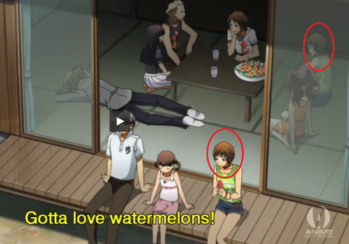
- Near the end of episode 13 during the summer vacation watermelon eating scene, look at Chie. She's sitting outside on the deck with Nanako and the Protagonist... and she's sitting inside next to Rise.
- Mawaru Penguindrum's episode 10 [dead link] (the one where Shouma is at the hospital and later is kidnapped by Masako) is infamous for its horrible animation. A certain shot of Shouma's face is... particularly popular.
- Episode 19 is so badly animated that the scene where Masako confronts and verbally bitchslaps Himari ends up totally ruined due to how HUGE and shiny their foreheads are.
- Rinne no Lagrange is usually consistent, but in Episode 7 someone's recently coffee-stained collar magically becomes clean for about half a second. Amazingly, it happens during a shot where you can't see much besides coffee-stain-guy's head and shoulders, and a background character pops into existence in the middle of the screen during a pan-back a few seconds later...it seems like they completely forgot to QUALITY-check that scene.
- In Hero Tales, the strands of hair on the front of the main character's hairstyle keep changing inbetween shots. In one shot there will be six, in the next shot there will be seven, in one there will be five, and so on.
- Similar to Naruto above, Yu Yu Hakusho had a few episodes with incredibly fluid animation at the cost of any consistency in the character models. Notably, one of those episodes was during Yusuke's battle with the Doctor, and the off-model work served to make him look much, much scarier.
- Revolutionary Girl Utena sometimes had this due to the show's low budget. For example, some characters would be without a nose in some scenes in the anime.
- A lot of Boys Love in general suffer from bad anatomy, so much that the term "yaoi hands" was created.
- In the Berserk anime during the infamous scene in the Eclipse where Femto appears before Guts and rapes Casca you see Guts pupils briefly being out of sync with one another.
- Also, when a bunch of demons approach Casca after Judeau dies we see her pupils also go out of sync.
- As much as the series had its fair share of errors; the You're Under Arrest manga slipped up on a few occasions.[6] While the art was, thankfully, much more consistent. These [dead link] two [dead link] examples stand out (Note that the watch present in the first example only appears in that one panel it's in).
Comic Books
- Artists Randy Elliott and Stuart Sayger received much criticism for their work on LEGO's Bionicle comics. Randy notoriously drew humongous shoulders on many of his characters, sometimes gave them very small and thin heads, and in the case of two of the Toa Metru gave them obscuring visors instead of bothering to draw their eyes (which weren't even the right colours). Sayger, on the other hand, practiced a unique, sketchy style which—while probably very serviceable in any other work—simply did not work well with the types of intricate character designs present in BIONICLE. He proportioned the characters in so many different ways that a whole Off-Model gallery could be filled with them. And in one instance, he literally used the wrong model for a certain character—instead of Mata Nui's correct, originally planet-sized, bulky and blocky robot body, he drew the mortal form that he took on one hundred thousand years later, which (apart from also being a humanoid) looked absolutely nothing like his former body.
- There's also a panel in the last 2008 comic (drawn by a different artist, Leigh Gallagher, whose work is far more well-regarded) in which Turaga Dume is drawn based on his design from the second movie, whereas everyone else is modeled after their toys. This would have been acceptable (because it was really well-drawn) if Elliott hadn't drawn Dume based on his toy back in 2004 (incidentally, that too was also off-model in that it wasn't even the right colour).
- Colors have always represented a rich source for off-model moments, going back to the very first issue. The random color accents which weren't there on the toys themselves varied from panel to panel, and often whole bodies appeared sporting the wrong colors (fully dark green Nui-Rama, striking red Lewa, and perhaps most infamously, green Nokama and blue Matau). There were instances when the glowing effect used for the eyes were placed to the wrong spot, although granted, this mostly happened to beast characters, which tended to have eyes that didn't really look the part.
- Rob Liefeld's artwork is frequently accused of this. His highly stylized art often deviates from the model sheets used by other artists.
- Pat Lee's work on the Transformers comics when Dreamwave held the license was a severe case of this. With Dull Surprise and inconsistent proportions abound. It gets worse when you also include his covers for this series. Combine that with him using ghost artists, you get an artist that's not only worse then Liefeld, but also lazy and greedy (apparently, much of the funds that should have went to the other artists instead went into the company's Porsche).
- Before this however, Transformers Generation 2 and the original comic series exhibited this. The Original had several artists and thus, different styles for each (The early issues also had several unused models for a few characters like Megatron). G2 on the other hand only had two artists - Derek Yaniger and Manny Galan; The latter would ape the former in terms of artwork to... not much success.
- During his run on the first Transformers series, Jose Delbo was determined to stick to the character models, so much so that he inadvertently made Starscream particularly off-model - by dropping the "vents" from the right side of Starscream's head (in the model sheet, it was obscured by his shoulder fin). Subsequent artists restored Starscream's right vent-"ear".
- The artwork of The Beast Within is just horrendous and trying to look like Pat Lee's (as talked about above) does not do it any favors at all. The second issue is better, but not by much.
- What exactly is Carlie Cooper's character design supposed to look like? To hell if the rotating staff of Spider-Man artists know! Led to a cringe worthy and hilarious scene where she was preparing to sleep with Peter and look scarily like Mary Jane (Carlie is Mary Jane's Replacement Scrappy as main love interest in the book). A Lesser example is how colorists couldn't decide how dark Lilly Hollister's skin tone was supposed to be in her intial arc.
- At one point in Volume 9 of The Walking Dead, Rick's hand somehow magically grows back.
- Poor, poor Bart Allen. After he became Kid Flash, a lot of people started coloring his hair red, like he was Wally, despite one of his main physical traits being that huge poofy brown practically-a-non-curly-afro on his head.
- A Moment of Archie Sonic is a Tumblr site devoted to showcasing Off Model shots in Archie's Sonic.
- For a time, Sonic the Hedgehog took Depending on the Artist to such extremes that there's a rumor going around that until recently the comic's quality control was turned off to speed up production - though with panels like this going from pencils to printing apparently without comment, it's hard to tell whether it's true or not.
Film -- Animated
- Max Fleischer's Gulliver's Travels is extremely unstable in its animation quality. Some scenes are fairly well drawn and animated (the first scenes with the Kings, Gulliver's meticulously rotoscoped animation) to absolutely abysmal (i.e., the scene where Gabby falls into Gulliver's hand early in the film, some of the crowd shots). This was undoubtably a result of its rushed deadline, plus the mixed influx of East Coast and West Coast animators working on the film, some of whom were literally hired off the street and given animation cram courses in a matter of hours before getting to work. As such, the film suffers not only from a mix of sloppy and professional animation, but also floaty, mushy inbetweens and sloppy inking. There are even some design-wise off model moments (i.e., Gabby's eyes tend to be drawn differently depending on the artist). There's a reason Walt Disney quipped that "We can make a better film that that with our second string animators."
- One example would be a scene in Disney's Pinocchio. When Pinoc sets his finger on fire and Gepetto tries to put it out, watch his cap—it disappears and reappears several times throughout the scene!
- During the first chase scene from The Aristocats, one of the two dogs attacking Edgar mysteriously gains a collar just so he can be yanked upwards by the windmill's blades.
- Also, at the end of the film, during the scene where the cats stuff Edgar into the very crate he was going to use to ship Duchess and her kittens to Timbuktu with, and later pushing said crate out the door, there is no lock on the crate's lid as it was already removed by Roquefort the mouse, but when the movers finally come to pick it up and take it away, the lock for some reason was already back on the crate's lid!
- Ralph Bakshi's The Lord of the Rings starts to become inconsistent and more filtered live-action once Boromir dies.
- Merry and Pippin switch between blonde and brown hair
- Humans outside the main cast are poorly animated
- Gandalf the White briefly returns to his old clothes before entering King Theoden's palace
- Gollum gets really skinny looking at the end of the film
- When the animals escape from the fire in Bambi, a mother raccoon pauses after emerging from the river to lick her baby dry. The baby disappears. However, this was fixed for the DVD releases.
- Some prints of the movie have said baby raccoon suddenly reappearing in another random spot in the shot, lessening the Fridge Horror, but still looking a little tacky.
- Prince John, the Big Bad of Disney's Robin Hood, constantly gains and loses rings throughout the entire film.
- Lampshaded by Prince John at the archery tournament.
|
Prince John: No, no, I lose more jewels that way... |
|
- Also, Maid Marian for some reason becomes unusually tall for a fox whenever she is dancing (guess which film they got her dance moves from!).
- The circus locomotive from Dumbo for some reason, actually gains and loses train cars as it is travelling across the countryside. The only time we actually see the locomotive with the correct number of train cars is when it is crossing the bridge before climbing up the mountain. Also, during the scene where the circus train get loaded up, a circus wagon on one of the train cars changes color, as with one of the crewmen's outfits.
- Also, during the scene where the Delivery Stork that is carrying Dumbo is looking down at the Southeastern United States, there are no clouds above the map, but when the stork finally descends, clouds inexplicably appear above said map.
- And at the end of the film, when Mrs. Jumbo is released from captivity and riding inside her and Dumbo's private train car, the ruffles on her hat actually disappear just right when Dumbo flies into said train car and into his mother's trunk.
- And let's definitely not even get us started on how many elephants were used for the "Pyramid of Pachyderms" scene.
- One scene from Pocahontas shows a closeup of John Smith's boots (Meeko the raccoon is standing between them). For some reason, there's an empty void on the heel of Smith's left boot!
- Flit's wings disappear in one scene.
- During the "You Can Fly" number from Peter Pan, when Peter Pan and the Darling children fly away from the Big Ben clock tower before finally arriving at Neverland, Wendy Darling's face actually disappears for a split second.
- Toward the end of The Hunchback of Notre Dame, Phoebus' armor mysteriously vanishes just right after being pulled out of the water by Esmeralda.
- That was deliberate. Plot-wise, Esmeralda worked it off underwater because it was too heavy and she couldn't swim with it on him. Unfortunately, they skipped the underwater part due to time constraints.
- A more straight example would be the fact that during the same scene, when one of Frollo's henchmen shoots Phoebus off his horse, making him fall into the water, the arrow is in the back, but when Esmeralda pulls him out, the arrow is in the front!
- Snow White and The Seven Dwarfs. Interestingly, it's not quality that suffers in this example - the animators seem to just forget what they're supposed to be drawing. When the forest animals are following Snow White into the Dwarfs' house, a rabbit hops behind another rabbit and comes out as a squirrel! Disney was so embarrassed it had a demo video taken off YouTube.
- The Thief and the Cobbler: The sequences added after the firing of creator/director/writer/animator Richard Williams were done on a much lower budget by several different animation studios around the world. Particularly bad, as the original animation by Williams had extreme effort put in it, making the cheaper scenes look terrible in comparison.
- At the end of Cars during the final race scene, the King's eyes actually change from brown to blue when he is crashed by Chick Hicks. His eyes then turn back to brown just right when he is helped by Lightning McQueen into crossing the finish line.
- At the start of the race in Japan in the sequel, Lightning mysteriously gains his party wheels at the starting line for a few seconds, but is wearing his racing wheels for the remainder of that race.
- During the first Elephant Patrol scene from The Jungle Book, Colonel Hathi accidentally breaks his bamboo cane, but in the next scene, Hathi's cane is inexplicably repaired!
- Happens to Gaston's face for a few seconds during the song "Gaston" from Beauty and the Beast. 'Cause no one's off model like Gaston!
- The Bionicle movies combine this with Special Effects Failure with tiny Nuju in the first film, the disfigured Visorak in the third film, and the robot body of Mata Nui in the fourth film; It's both lighter in color and smaller than in other media featuring it.
- Happens a lot of the time in Transformers: The Movie, despite having a higher budget than the series itself. Most egregious examples include Unicron's overall size in comparison to a planet (I.E he's able to stand on top of Cybertron in one scene while in the previous scene he was bigger then said planet), several miscolorings (Starscream's chest when mocking the fallen Megatron, Rumble being the same color as Frenzy in one scene) and characters being in a place when they shouldn't be (Swoop's leg at Autobot City, Thundercracker and Skywarp at Starscream's coronation, the Insecticons in several scenes) amongst several others.
- Unicron's appearance noticeably changes as well, as his first transformation sequence had been completed before his iconic robo-bearded face was finalized.
- Cinderella, for some reason, actually doesn't have any toes. However, the third movie gives her feet proper details in a scene of Foot Focus.
- Also, at the end of the film, Cinderella's wedding dress is supposed to have long sleeves, but when she and Prince Charming get inside the carriage, her dress has short sleeves like her ballroom gown.
- The Lion King has Nala's eye color switching from Green Eyes to Blue Eyes during the same scene.
- Just about every single Disney deleted scene ever made (with the sole exception being the "Viking prologue" from Atlantis: The Lost Empire, for obvious reasons) will all inevitably suffer from this.
- Speaking of Atlantis, pay very close attention to Kida's bracelet. When she loses it at the very beginning of the film as a result of her mother the Queen pulling it off her wrist so that the Crystal can sacrifice her, the beads are arranged as pink, blue, pink. When she finally retrieves it at the end of the film shortly after saving Atlantis from a lava flow and transforming back from her crystalline form, the beads on her bracelet are now arranged as blue, pink, blue (similar to the feathers attached to the backs of the tiaras worn by the queens). Also, during the finale the patterns on Kida's dress actually shift just right after the stone face representing her late father flies away in the sky, and the sash hanging down from the front of her dress mysteriously vanishes shortly afterward.
- This shot from Aladdin managed to spawn a Tumblr meme around this trope as it applies to Disney films. (Look up "DIDNEY WORL".)
- The Secret of NIMH 2: Timmy to the Rescue features a scene where Timmy hugs his mother in a way that would only work if Mrs. Brisby's neck had the ability to be stretched back while her head and body stayed in the same place.
- An American Tail, of all places, does this briefly during the scene where Fievel finds himself in a bottle. Right after Fievel sees a partially finished Statue of Liberty and before washing up on shore, he doesn't look much like himself and his fingers are bigger.
- The sequels to All Dogs Go to Heaven are inconsistent with the dogs' toe pads. Sometimes they have them, and sometimes they don't.
- The SpongeBob SquarePants Movie does this intentionally, with Spongebob and Patrick spending most of their screentime off model to make humorous expressions.
- Despicable Me has one instance - In the scene where the girls are packing their things, look at Margo's shadow. It's like they animated the scene with a different model, changed it then forgot to re-animate the shadow.
- Some of the cars appearing in the song "Worthless" from The Brave Little Toaster aren't even moving their mouths as they are singing after the Magnet drops them one by one onto the conveyor belt leading to the Car Crusher.
- Mulan starts off being drawn with long eyelashes and thin eyebrows, but when she cuts her hair to complete her disguise as a male soldier so that she can join the war against the invading Huns, her eyelashes disappear and her eyebrows grow bigger. When Mulan changes back into more feminine-looking clothes for the final battle against Shan Yu in the Imperial Palace, her eyelashes grow back, but her eyebrows still remain huge and bushy.
Documentaries
- Many of the creatures in Walking with Dinosaurs and its kin go through some drastic changes in appearance when the shot switches from a CGI animal to a puppet or an animatronic, or vice versa. The ones that stand out the most are the Postosuchus with its rubbery head; the freakish closeups of a Leaellynasaura puppet whose jaw slipped to the side; the Smilodon who seemingly can't open/close their mouth; and the Megaloceros that, upon dying, looks like it instantly became some huge stuffed animal toy. Then, there's that insect that goes from being a CGI ant to a live cricket.
- Pure CGI goofs include: The 3 year-old indricothere calf that still uses its newborn animation model, even though an other, same-aged indricothere already looked like an adult; and (though this could be intentional) the Allosaurus at the end of Walking with Monsters who is at first represented by the allosaur model from the 2001 TV adaptation of The Lost World (okay...), but then suddenly becomes a true Walking with...-brand Allosaurus (phew, that's better). As for various other off-model moments, freeze-framing reveals the animals tend to get heavily distorted during particularly fast movements.
Film -- Live-Action
- A rare multi-million dollar live action example: the live action Transformers movies, despite having the talents of Industrial Light and Magic involved, They still have their moments:
- There's three major examples in Revenge of the Fallen - Towards the beginning during the Shanghai battle, Mudflap and Skids switch voice actors. During the Desert battle, Ironhide ejects his gun at one point and in another scene has it back on; and the CG Predator Drone doesn't look like anything like its real life counterpart; which also happened to be used in the film. These can also be considered Special Effects Failure or Did Not Do the Research.
- A couple more occur in Dark of the Moon during the standoff between Ironhide, Sideswipe and The Dreads. In one shot after Ironhide drops his guns, his CG model depicts his back guns still attached, in all other shots in the scene, they're not present.
- The Asylum, dear God The Asylum. They fall into this trope so much it's not funny. Mega Piranha, 100 Million BC and Transmorphers are quite possibly the worst cases from them. Which is a shame when you consider that Synapse FX (responsible for the effects in Transmorphers) actually made fairly detailed and complex models (roughly about as complex as Wheelie or Frenzy from the Transformers films) of the titular robots (only one shown, but you get the drift) [dead link].
- The Matrix, specifically Reloaded. Watch the Burly Brawl scene. Most of the fight is CGI and if you can get a close enough look at Neo's face you can tell that it looks absolutely nothing like him. Though most people probably wouldn't see it the first few times they watched it.
- Occurs in The Black Scorpion, whenever said scorpion gets a close up on its face. Making it look nothing like the stop-motion beast that Willis O'Brien animated.
- The Ed Wood film One Million AC/DC. Ignoring the fact that this is a porn, the (Laughably fake) puppet looks nothing like the toy dinosaur used. Tragedy is done indeed.
- The Xenomorphs in the Alien vs. Predator movie switch between Animatronics and CG. The reason as to why this is on here? The CG Xenomorphs add a joint in the ankles, something the on-set ones lack.
- While Dragon Ball: Fight for Victory, Son Goku! is largely based upon its source material some of the non-human characters (mainly Puar and Turtle) get slight color changes (Turtle having a rather obvious seam on his beak and Puar being a plush toy aside). On the poster however, is a rather odd-looking Shenron that is shown wearing sunglasses for whatever reason (In the movie itself, he fares better design-wise, but is only a glowing green outline).
- Not even the 1933 King Kong is immune. Close up shots of the beast that don't involve the stop-motion model makes him look like a cartoon character instead of the semi-real gorilla he's supposed to be.
- In the first Spider Man film, both Spidey and Green Goblin's costumes seem lack certain details when as CG creations. Green Goblin's helmet is also different, not showing Norman's mouth, something the physical costume does. This ends up carrying over to the action figure.
- The original Godzilla films exhibit this trope during any water scene, using a costume from a different film instead of the one presently used. Gets worse throughout the late 60s and all the way through the mid 70s when the budgets were very low. To the point where one costume started to fall apart during the filming of Godzilla Vs. Gigan.
- Watch Mighty Morphin' Power Rangers: The Movie, then watch the series proper. If you notice that the CGI abomination of a Ninja Mega Falconzord looks absolutely nothing like the costume; you are not alone. Apparently, they modeled the CG one after a smaller version of the toy.
- In-Universe example: Terminator II: Judgement Day when the T-1000 dies.
- The theatrical release of Star Trek: The Motion Picture has some horribly drawn mattes of the USS Enterprise's saucer when Kirk and company emerge from it to walk over to V'Ger. This was fixed in the 2001 Director's Edition, which redid the scene to match Robert Wise's original storyboards showing the formation of the walkway, and used a CGI rendering of the original filming model of the Enterprise.
- In Star Trek V the Final Frontier, there's a scene when the USS Enterprise is depicted as a hand-drawn image that doesn't look like the model and makes Filmation's version of the ship look creditable.
- Jurassic Park's lead T-Rex has a slightly squarer jaw between the CG model and animatronic.
- In the first scene of the rock scorpion battle in the 2010 Clash of the Titans remake. Said rock scorpion's missing part of its tail.
Literature
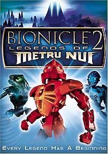
- The entire body of Toa Vakama on the cover image of the Bionicle movie adaptation novel, Legends of Metru Nui, is seriously disfigured, and the head is especially misshapen. Surprisingly, the two characters in the background are both perfectly on-model. As a comparison, here's how he is meant to look, as seen on the movie's poster.
Live-Action TV
- In-Universe Example: During the "Into the Comics" serial of Ghostwriter, the gang is able to identify that the comic they are to analyze for contest clues is, in fact, a fake by noticing differences in the art-style from the previous installments.
- An odd example not involving artwork or animation: in the Doctor Who serial The Power of the Daleks, the Dalek army is represented by Louis Marx toy Daleks. The problem was that Marx's Daleks were a subtly wrong shape, which became more obvious when intercut with the three real Daleks.
- In season three of Mighty Morphin Power Rangers, Titanus was reintroduced. Though as there was no footage of the character in the series footage was being taken from (Ninja Sentai Kakuranger), Saban used the toys of him, the Ninjazords and Shogunzords whenever featured. Unfortunately, they never took into consideration that the Shogunzord used by the White Ranger in the original was repainted pink for America.[7]
New Media
- In 2007, Gaia Online decided to take advantage of their new cinema feature and enlisted an animation company to animate their Halloween plotline. After teasing us with works from 3d animation companies during the film festival, "MMVII Part 1: White Eclipse" was released. Even if you ignore the awkwardly implemented plot and horrible voice acting, you can't help but noticed how one of the characters appears to have come down with a horrible case of hemorrhoids. There's also the fact that after the Vampire protagonist kills a wolf and drinks its blood, they put plenty of blood on the inexplicable midsummer snow, yet forget to put it anywhere else. The Vampire's mouth, and the wolf's corpse are both blood free. And this is only in part one. Needless to say, Gaia reverted to a comic based story line, undid most of what happened during the animated shorts, showcased the best parodies of the shorts, and then tossed them into the bin of "Things we'd rather forget".
- Unfortunately, some of that stuff still happened canonically. Vladimir seems to have been Killed Off for Real. Moira and Louie have been having some sort of light-switch relationship since then. So as long as we have plot coming out of that damn thing, there are going to be people who have to watch it for that material... unless, of course, Gaia has it remade as a manga in their usual art styles (hint, hint, Gaia staff).
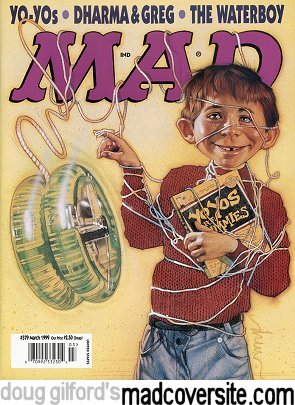
- Mad used to let several different artists draw the front cover, which almost always has mascot Alfred E. Neuman on it. Once, they let movie poster artist Drew Struzan do a cover, which turned out nightmare-fuelingly off-model. Sergio Aragones' two covers didn't fare much better.
Newspaper Comics
- Charles Schulz's simplified style confused some printers at first, leading to "corrections" that were more usually the opposite - erasing a character's eye after mistaking it for a misplaced ink blot, for example.
- A strip of Prickly City had a glaring miscoloration that made the punchline hard to understand. The strip ended with Winslow being beat up between panels, but in the final panel, his color palette has been switched with that of Carmen. You can tell it's Winslow because he has a snout and tail.
- This happens a lot in colorized strips. Full-color strips Monday-thru-Saturday are still a novelty that only some papers bother with, so for the most part these strips are produced only in black and white just like in the old days, and the colorization is farmed out by the syndicate. It's not publicly known who they farm it out to, but there's strong support for the theory that English is not their native language. Exceptions mainly include big-name strips that are already produced by entire studios, and Non Sequitur, which is not colorized at all at the artist's insistence.
- From about September 2000 to January 2001, Garfield was very jagged and angular in every aspect, particularly Garfield's face. This could've owed to a new inker or penciler taking over and not being as familiar with the "house" style.
- Also in many strips between 2005 and 2006, Garfield's ears were smaller. Do they look right to you?
- In a couple of Pearls Before Swine strips, Rat's nose was much longer than usual.
- Pearls Before Swine also parodied this once, in which the colorist deliberately colored the last panel wrong to be an ass to Stephen Pastis.
Toys
- The Fall Out Boy talking plushies suffer from this. Ironically, they were made by SOTA Toys, which churned out the on-model action figures a while back. (Yes, Pete Wentz's face DOES work that way.)
- Transformers Generation 1 may have had a reputation of being this trope in both comics and cartoon, but it should also go with saying that the figures themselves are not immune due to their heritage of being from different lines:
- Ironhide and Ratchet for instance, have proper heads in all non-toy related material, but their original action figures don't. This is because the original figures were made in Japan for a different purpose- before the concept of Transformers came into play. Those figures were meant to be "armor" used by human pilots, but the idea was shelved when the toys were re-worked into transforming robots. In fact, there are even Bot-con and fan surrogate modifications that can be applied to these toys to give them actual heads.
- A lot of Takara-made Transformers toys will receive accurate paint jobs, but Hasbro, being the cost-efficient harpies they are, will often use similar, but cheaper paint to substitute the more expensive colors they might need- justified if the toy is made from a material where paint won't adhere to it unless it's a special kind, or if the paint is deemed toxic.
- Even worse; many third-party unofficial companies will resort to making knock-off Transformers- they share the same specs as the die-cast originals, but are made with much crappier, much less durable plastic bodies, boxed in a "legit" package that does its best to lie to your face with a moneygrubbing smile, and worst of all... the stickers WON'T STAY ON!!!
- Some other noticeable ones include Swoop not being the same color as his cartoon model (he was in the predecessor line Diaclone however), many characters (Trailbreaker, Bumblebee, Mixmaster of the Constructicons) having mouthplates instead of proper mouths, Jetfire going from his VF-1 form to a generic jet between the toy release and show and Galvatron being grey instead of purple (This was corrected in a re-release in 2005).
- Even though this was intentional, the characters in the first three Bionicle movies (touched upon above) look nothing like their original releases.
- Usually invoked with Plush toys due to their chibiness. Often shown with a lack of a nose or simplified eyes. Still played straight sometimes though.
Video Games
- A lot of old Nintendo 64 games had blocky, jagged, and akwardly disproportionate 3-D models of game characters that didn't match up with the offical art, a result of the primitive software. Such lacked the proper graphic and resolution potential used to sculpt the in-game builds. A few good examples:
- Super Mario 64- One of the first games for N64, and the modeling was very rough for the characters. Mario's eyes were almost completely rectangular, and his mustache lacked the trademmark ruffles that give him originality. Likewise, Bowser suffers from an oversized head (maybe it's just the ego) and T-rex-size limbs. Princess Peach even looks as though her head is a bloated turnip. When the Nintendo DS remake came out, graphics were on par with the character designs.
- The Legend of Zelda: Ocarina of Time: Not as rampant as the earlier N64 games, but jarring in some places. Link's eyes are a touch too small in both child and adult forms, and the Master Sword is incorrectly designed with a fatter, shorter blade rather than the slim, rapier-like shape it should have. Certain enemies in the game also seem different from their artwork depictions. Notably, the Re-Dead, already frightening enough to make you whip out your brown pants, had circular holes for mouths and vague skeletal features on their bodies, instead of having teeth bared in a grimace and severely emaciated body parts. Worse are the Guay- you might mistake the birds for flying origami. In the case of in-game collectibles, pieces of Heart lack beveled edges, along with many other item models being improperly designed. The Nintendo 3DS remake faithfully fixes all the errors, and even adds extra flair and detail to the graphics that turn them into Scenery Porn. Let's just say that you'll be gaping in awe at the detail of the final room of Ganon's Castle, let alone the now far more ornate rainbow bridge that forms when you have all six Sage Medallions. However, the game seems to fail to switch from the Hookshot to a model of the Longshot when you obtain the replacement item.
- Infamously, The Legend of Zelda: Phantom Hourglass, a sequel to Wind Waker, gave the characters fingerless mittens for hands. The spiritual successor, Spirit Tracks, would do a decent job correcting those hideous mistakes, but the "mittens" pop up every now and then in the game regardless.
- "Weegee", the off-model Luigi from Mario Is Missing.
- Note that this is only the PC version, though, as the console versions used sprites from Super Mario World.
- The cutscenes from The Legend of Zelda CDI Games are infamous for this.
- "Squadalah! We're Off Model!"
- Likewise with Hotel Mario. "You know what they say, all toastas toast toast!" was one of many scenes that made the Plump Plumber a bit too plump.
- Same with the familiar "no" shot.
- I.M. Meen, done by the same company who produced the CD-i Zelda animation, doesn't fare much better.
- [[Mutant Rampage: Body Slam]], also by the same creators, is a little bit better (mostly because it shamelessly reuses most of its footage), but even there, the difference in quality between scenes is noticeable.
- When Mario enters the castle at the end of the original Super Mario Bros''s World 4-3, the castle is big, but when he leaves it at the very beginning of World 5, the castle is tiny!
- Final Fantasy VII:
- During the motorcycle chase FMV, there's a brief shot of the guards on the highway reacting to Cloud gunning the bike out of the Shinra building. Cloud is properly proportioned and carefully rendered and looks fantastic. The guard is just his overworld map form.
- There are also several cutscenes near the end of Disc 2 and on Disc 3 where everything is pre-rendered FMV with great particle effects, but all of the party members are blocky overworld models. Apparently, those were done first in development.
- Actually, these were intentional and done rather late in development, as the scenes were not originally meant to be part of the game but were added in to cover CD load times.
- Final Fantasy X has a mild version of this going on: Tidus and Yuna's character models in FMVs are noticeably different than their non-FMV counterparts, whereas other characters' FMV models are pretty much spot-on.
- In Final Fantasy XII, Vaan's abs are a bit... strange-looking in his non-FMV model.
- With the release of BlazBlue: Continuum Shift, there are now more cutscenes done by DEEN than its predecessor. When said cutscenes got leaked onto the internet, everyone started complaining that the quality was worse. Just look at what they did to Hazama. Even his animation trolls us!
- Fighting Games, particularly those with the Capcom Sequel Stagnation, suffer from this, with Super Street Fighter II and Super Street Fighter II Turbo being the first two major examples. In the former the four new challengers were obviously better drawn and had more animation frames, while in the latter almost everyone had a few new moves, and the sprites for those are more fluid in animation but have slightly worse shading and detail compared to the older sprites.
- Also, the numerous Crossovers between Capcom and other franchises. Starting with X-Men vs. Street Fighter, where Cyclops, Wolverine and others had much smoother, visibly different-styled sprites comparing to the Street Fighter Alpha ones. But this is acceptable compared to Capcom vs. SNK where Sagat, Morrigan and some others who had their sprites ripped from older games looked REALLY Off-Model, since the game had fairly high-resolution sprites.
- Morrigan only went to get a new model when Tatsunoko vs. Capcom came out. Yep, not counting Chibi Morrigan, same sprites since 1994 (and Capcom might still be using the same sprites if they hadn't gone from 2d to 3d graphics).
- SNK's games suffer from this as well, usually due to reusing old sprite animations. The biggest offender is in SVC Chaos: SNK vs. Capcom which used a sprite style similar to The King of Fighters series. In particular, the sprites for Terry's Buster Wolf DM is Terry sprite from Garou: Mark of the Wolves redrawn in Terry's classic outfit. The same holds true with Mr. Karate (aka Takuma Sakazaki) who's uppercut DM is Marco's sprite (also from Garou) redrawn as Mr. Karate. The effect is extremely noticeable due to the different art styles.
- The opening cinematic of Vanguard Bandits was clearly made without a big budget to help. Even if you ignore the abuse of still-shots, nothing forgives Bastion (the main character) being older/younger depending on the shot, his nose becoming huge in a side-shot, or little sparkles coming from a girl's wrist. Like Spider-Man.
- The DS versions of Phoenix Wright: Ace Attorney maintain the original (GBA) versions' sprite resolutions. Which makes it weird, particularly in the DS-only Apollo Justice: Ace Attorney, to see them paired up with the higher-resolution artwork of the DS-specific episode in the first game. Thankfully, everyone's properly redrawn in both Apollo Justice and Ace Attorney Investigations: Miles Edgeworth) due to them being created for the DS.
- They did however make all the sprites taller in the DS versions by extending and showing more of the character's waist/lower body, though in courtroom scenes they just extended the benches for the lawyers rather than the lawyers themselves.
- The early Pokémon games had a severe case of this.
- Compare the Red and Blue Koffing sprite with its HeartGold/SoulSilver sprite, for example. Ekans' Japanese Red/Green sprite also deserves mention; this is supposed to be a snake.
- The worst part is that while the Blue Koffing had the skull-and-crossbones in the wrong place, the Red/Green sprite didn't.
- Golbat in Red/Blue is not only off-model, but downright... creepy. Even though it looks completely normal in all other games.
- Golbat's evolution, Crobat, seems to be getting a lighter shade of pink in its shiny form in each gen. It's brighter pink in gen 2, whereas in gen 5 it's such a light pink that it's almost white.
- The second generation was generally a lot better, but still had its share of off-model sprites. Most, if not all, of them were fixed in Crystal, though.
- While the third generation made a huge graphical leap in most areas, many of the sprites for new and old Pokémon were also quite awkward-looking. With the advent of the fourth generation, this was finally averted for good.
- On a much more minor note, Deoxys and Mewtwo's heads seem to be getting a bit smaller each generation.
- Human sprites often have colors that don't match their artwork, due to palette problems. Noticeably are Iris, the Sinnoh protagonists, and Volkner. Iris's skin-tone is quite darker in her artwork, the protagonists' hair is a navy blue in the artwork but a bright blue in their sprites, and Volkner isn't quite as bright blond in his artwork (not the sandy blond his anime version has, but not the shade his sprite has).
- In Persona 3: FES (or more specifically, The Answer) Aegis has an extra hand and forearm when her eyes go blank.
- Yukari's hair is a Schrodinger's Cat that responds to the viewer's moods and atmospheric pressure. One minute it's short-cropped (in-game model, character portrait,) another it's shoulder-length (several anime cutscenes,) and later still it has become a mullet (rest of the animated cutscenes.)
- Not even Team Fortress 2 is safe from this. Some examples:
- From third-person view, Heavy's default gloves are dark brown, but in first-person, they're black.
- In first-person view, a BLU Engineer will have orange gloves just like a RED Engie, but yellow in third-person, official art, and the Meet the Team shorts.
- In the short "Meet the Spy", when BLU Spy brings in Sniper's corpse and sets it on the table, the corpse does not have glasses on. But later on in the short, when Spy says the line "You've seen what he's done to our colleagues", the camera pans down to Sniper's corpse and his glasses are now on.
- In third-person, Sniper wears a fingerless glove only on his left hand, and a watch on his left arm. In first-person, he has gloves on both hands and doesn't wear the watch.
- Character mugs in the first three Mega Man Battle Network games are surprisingly deformed, most notably- MegaMan.EXE's eyes are miscolored brown.
- The Shooting Star Rockman game takes this into consideration and replaces a few of the old mugshots (of the main characters) with proper renditions of their faces.
- Asura's Wrath: Episode 11.5 has tons of this (most of deeper lines of Asura's body look like paint and the rings on his back are made into circular protrusions, he bleeds and spits out Black Blood, Wailing Dark starts off intact instead of being broken near the handle and isn't seen to extend before that, etc.) but since it's made into a crazy insane action packed episode, its very forgivable. Helps that's directed by a key animator from the team behind FLCL.
- Avoided in episode 15.5, however, as the animation style stays much more consistent than 11.5's, although it's still somewhat obvious that the animations are based on earlier designs of the characters since the Dojis look a lot more human-like, the tips of Yasha's fingers aren't covered with rings and Deus uses a normal nunchaku instead of a more elaborate one with a beam of lightning as its chain.
- Burgerpants from Undertale is deliberately drawn off model for each one of his facial expressions
MMORPGs
- Second Life avatars are frequently off-model, thanks to the long loading times for many sims.
Web Comics
- Parodied in Buttlord GT:
|
Snowflake: You fool! Do you realize what you have done?? |
|
- Also parodied in one Badly Drawn Kitties comic.
- In Homestuck, no one really has any idea of how Aradia's horns are supposed to work. If you look at "[S] Make Her Pay", they're all over the place. In his now defunct Formspring, Word of Hussie claims this is partially intentional:
|
A curly ram horn is actually a pretty complicated object. I draw fast and loose and a lot of times emphasize gesture and stylization over precision. If you're looking for rigid fidelity to a couple of loopy horns I am afraid you're barking up the wrong tree! They curl whatever way looks best for the scene. |
|
- When her ancestor is introduced, her horns quickly got bored of these shenanigans and left her head entirely. This was swiftly corrected, though.
- In the 6/12/2011 update, there was a group shot of six of the trolls including a distorted-looking Karkat off in the distance[8] which looked as if his entire body was made up of a pair of legs. Upon noticing the goof, fanartists leapt into an enthusiastic Pantskat party including lots of fake sprites and wiki vandalism. And then the memetic longpants actually appeared in the comic for real, as an article of clothing alchemized by fedoraFreak, and as the legwear of Karkat's ancestor.
- Sonichu: characters' body parts and change proportions and length so often that it's not a stretch to say that no one is ever drawn the same way twice. The art improves somewhat starting with Issue 5, but not by much.
- The Alt Text in the Splash Page of The Adventures of Dr. McNinja where the Pirate ship is blown up goes, "So long, ship I drew slightly differently in every panel!"
- A number of the Kevin and Kell Sunday strips appear to be colored completely differently from the dailies. In addition to the colors appeared noticeably flatter, many of the characters where the wrong colored outfits or in the case of Kell and Rudy, go from brownish-grey fur to bright beige. This has persisted to some of the book covers as well (such as Honeymoon 2.0).
- Misfile has a few instances, while most of these are in the earlier parts of the series. Some still tend to pop up, like these two pages.[9]
Web Original
- Neko Sugar Girls is basically a Stealth Parody of this trope. Everyone is off-model, and it's done to an extent (combined with Gratuitous Japanese, hideously annoying voice acting, and nonexistent plot) that the whole video series is obviously a parody.
- This YouChewPoop topic is determined to find all examples of this. It's got more than 200 pages (using the default post-per-page setting).
- If it's not traced, then the animation in Elemental Goddess is this.
- In Pre Game Lobby, a question about why the characters armor keep changing between scenes, with armor changing when the local Troll keeps asking when he's ever changed his armor. Can be seen Here.
- Found in Girlchan in Paradise, as part of the series' Stylistic Suck.
- Some characters in Happy Tree Friends are prone to "flipping" errors, such as Russell the otter's hook hand/eye patch, Nutty's lazy eye and Lumpy's inverted antler, which change from side to side even within the same scene. They also tend to give Toothy the "normal" buck teeth the other characters have instead of his trademark huge, gapped ones.
- In one scene in "Flippin' Burgers", they managed to attach Cuddles' arms to his cheeks for two seconds.
- The Homestar Runner animation "In Search of the Yello Dello" is definitely full of these, especially with both Homestar and Coach Z's designs for this animation.
- Powered By The Cheat toons tend to be off model as well, though this is due to Stylistic Suck.
- The entire point of Dumb Running Sonic, in which internet artists animate Sonic the Hedgehog doing an incredibly stupid walk cycle. The end results must be seen to be believed.
- Quasi-intentional in a few episodes of Extra Credits: occasionally Allison Theus (the main artist) is unavailable that week, and they get another artist to draw it, who will usually have an entirely different style.
Western Animation
- Star Wars: The Clone Wars is filled with capes, lots of capes, which flow behind characters and ripple in the wind and get ripped to shreds and take lots of time to animate. Occasionally the capes will completely disappear for a few frames when an animator got lazy.
- Also, near the middle of an episode of Season 3, Ventress mysteriously loses her skirt after her ship has been damaged and retrieved by space pirates before hijacking their ship and flying to Dathomir. However, this was intentional, as the person animating Ventress found out that her skirt is just too diffucult to animate, and as a result this episode marked the last time Ventress will ever wear a skirt in her entire life.
- Jem had some extremely jarring examples. The best three: Pizazz's mouth moving to the wrong part of her face while she talked; the Misfits having a concert while wearing horizontally striped stockings, with inconsistent, shifting colors that made it appear they were wearing barber poles on their legs; and Eric Raymond appearing on TV as a talking head...with part of his head extending past the borders of the TV screen, Sadako style.
- This site lists some of the shows "bloopers".
- In a similar manner to the Ninin ga Shinobuden example, one episode of Taz-Mania has Axl & Bull going about their day, casually noting common animating mistakes and Off-Model situations.
- The Czech-produced Tom and Jerry cartoons directed by Gene Deitch are pretty surreal compared to the originals. This was parodied in The Simpsons episode "Krusty Gets Kancelled", when Krusty lost the license to show Itchy And Scratchy cartoons, and instead showed Worker & Parasite, a surreal, poorly made Eastern Bloc knockoff.
- The Looney Tunes TV specials and feature films produced in the '70s and '80s tended to suffer from this, seeing as how they were essentially clip shows that would string together scenes from a bunch of individual theatrical shorts (many of them produced years apart, by different director/animator units, etc.) and "link" them with newly produced filler animation (which was typically far cheaper and more limited than the original material).
- Also, the late '60s Looney Tunes directed by Alex Lovy featured some utterly butchered versions of Daffy Duck and Speedy Gonzales. Daffy in particular looked as if none of his body parts were properly attached to each other, and while Speedy looked a bit better he seemed to have gained 100 lbs. since his heyday.
- John K's philosophy on good off-model animation was directly inspired by the animation in the old Looney Tunes, those by Bob Clampett in particular, where the animators would invoke Depending on the Artist to the extreme and intentionally break model in order to convey emotion and play up their own artistic strengths.
- Tiny Toon Adventures' animation quality was very uneven, ranging from abysmal (Encore) to gorgeous (Tokyo Movie Shinsha), depending on the studio working on a particular episode. Since episodes were often composed by 2 or 3 separate and largely unrelated (or very loosely related) shorts, the quality could decline (or increase) within a single installment.
- Most notably, Kennedy Cartoons got fired after Season 1 due to their inconsistent quality (some portions of the debut episode, which they animated, had to be re-drawn). Many fans of the show consider the Kennedy's animation the worst of the series, disregarding some worse studios. One studio that managed to do even worse than Kennedy was the aforementioned Encore Cartoons; little is known about them (they were allegedly a domestic company) because, after three episodes of Tiny Toon Adventures (one of which credited Alan Smithee as a director) they did nothing else, ever.
- The early Golden Age Woody Woodpecker cartoons prior to Shamus Culhane and Dick Lundy (but mostly Dick Lundy) taking the directorial reign were really prone to going off model, or just suffering from very mushy, sloppy animation in general.
- In Danny Phantom, the animation varies wildly. It improves from the blocky look of the first season and a half, getting muscle tone, better lighting, and overall better quality fight scenes, but there's always some odd animation cropping up from time to time. For example, a scene in which Danny falls on the floor, everyone looks down and laughs and Danny stand up again. However, everyone else is still staring at the floor. Or in one girl's case... his crotch.
- The German animated film The Magic Voyage has very inconsistent animation quality. At times it looks almost Disney-quality and sometimes it looks like a TV cartoon.
- The third season of the Transformers Generation 1 cartoon was notably plagued by animation errors, especially in less continuity-important episodes. "Carnage in C-Minor," in particular, is notorious for this.
- Amongst those errors is that Broadside was drawn with the wrong model! They used an old design instead.
- There were many incidents of similar-looking but differently colored characters (Starscream, Thundercracker, and Skywarp were the main victims, being as they are identical in appearance) being colored the same.
- Let's not forget all the instances of dead characters showing up in the backgrounds of third season episodes. Even "Call of the Primitives", lauded as one of the best-animated episodes (presumably done by TMS, no less) of the series, was not exempt from this problem.
- This actually led to a semi-serious fandom "movement" that claimed that Brawn (who died in the shuttle massacre in the movie) was not dead, since he was only shot in the shoulder and appeared in several later episodes—on the Decepticon side, oddly enough.
- Brawn actually showed up inappropriately on one Marvel cover - issue 32, which had the Combaticons and Protectobots facing off, with Brawn inexplicably behind Combaticon leader Onslaught. It's likely the illustrator got Brawn mixed up with Brawl, one of Onslaught's subordinates, and that the animators who included Brawn in Decepticon scenes in season 3 made the same mistake.
- And to top things off, inconsistent animation quality can already be found in season 2: You have beautiful artwork and animation (regardless of the occasional cel errors, such as two Optimus Primes in a single frame) for episodes such as "Atlantis, Arise!" or "Auto Berserk", then you have various levels of mediocrity... and then you have three of the biggest stinkers of the entire show in terms of animation quality, "The Core", "City of Steel" and "The Autobot Run", with Hanna-Barbera-esque animation and numerous borderline off-model characters. The fact that one of the show's producers not only credited Japanese studio Toei and Korean studio Akom, but also an unnamed studio based in the Philippines for season 2 somewhat explains the results.
- The ultimate example comes at the end of the season two episode "Child's Play". The whole thing is a mess of mis-layered cells and segregation of script and animation, but that damn cat...
- And then you get the rampant scale issues, where no one seems to remember how big the characters are relative to each other. I could excuse most of these, but then there's the one in the upper middle... (worth noting is that these are probably from the same episode) Also worth noting is that they can't seem to agree on where Devastator's right knee is...
- It turns out that a number of what most people tend to view as animation errors are actually the faults of the Rhino DVD sets, which contained unfinished animation in certain episodes, because the original masters were in a very bad shape. Episodes like "Heavy Metal War" and "SOS Dinobots" fared horribly and are barely watchable or understandable because of this. Though yes, the original, finished animation contained errors like the characters missing limbs too.
- Gentlemen, I give you blue Optimus Prime.
- The single-most nefarious animation error of Transformers- Optimus Prime with no mouthplate!!!
- It gets much, much worse. TF Wiki gives animation errors as part of its trivia list for each episode. When AKOM (Responsible for the many off model episodes in Batman: The Animated Series, X-Men and Exo Squad as well as taking over duties on Muppet Babies *See below*) is on the case, it'll become multiple pages long, even for the important episodes that the good animation would be used for. The challenge isn't spotting them, the challenge is finding one scene where everyone looks like they're supposed to, and everything matches up when we switch camera angles.
- Inconsistency did not only occur between different shots, but from frame to frame too. Often the mechanical detailing on the robots would shift around during movements, and at times they ended up looking totally different from how they started. In More Than Meets the Eye, Part 3, when the Autobots help the fallen Optimus Prime up, take a look at his thigh, and how it changes design.
- Beast Wars had a few times where they used the wrong 3D model (Rattrap during Dinobot's funeral for example.) Of course that's a different kind of "Off Model"...
- Transmetal Cheetor walking in the background when he was already a Transmetal II. Another common mistake was the disappearance of certain body pieces (most notably, the back kibble), or in some cases, the characters being animated with someone else's parts (Rampage has Depth Charge's legs for one shot). Very rarely, the animation models went through bizarre changes during movements. A notable example is when Primal's neck and head grow really long, and he talks without moving his lips.
- Though really, every incarnation of the franchise has several off model moments (G1 and Armada, the latter of which is already explained in the Anime section, are possibly the worst offenders though...) Some other fine examples:
- The sequel to Beast Wars, Beast Machines took it Up to Eleven when the drastic Art Shift it took made everyone think virtually everything was so off model the characters were unrecognizable. A monstrous Hatedom emerged with a vengeance- the kind that's so pissed off... it's hell-bent on murdering you.
- In Robots In Disguise, there's a recurring error with Sky-Byte's mouth being colored like a regular mouth instead of a mouth with feet and a gun inside. There are others, but are mostly minor in comparison.
- Energon has trouble deciding on whether or not Unicron's planet shell kibble ("kibble" is the fandom term for parts on a Transformer that seem to dangle from the body like a shell with no apparent purpose, instead of using ingenuity to devise some sort of clever gimmick to avoid such) should be part of his body or not, often leading to mind-boggling confusion. On the toy itself, the kibble is removable, but throughout Armada, it seemed as though the kibble was permanently attached to Unicron.
- In Transformers Animated, there was the time when Ratchet (in Pre-Earth form) was drawn with his Earth form gut, the time when Snarl's face was gray, another time when Prowl's bike mode was three times its usual height, Yet another time when Optimus Prime's insignia moved to the underside of his arm when gesturing, another time when not only was Megatron three times the size of Prime, but also Ratchet had regeneration abilities and had his broken off arm on him several times... Look, it's easier to go on TF Wiki and search them up for yourself.
- The animators at Polygon Pictures can never decide whether Arcee's non-blue bits are pink or translucent, or what Bumblebee's eyes look like.
- Clerks the Animated Series references this trope in one episode, announcing that the remainder of the episode was outsourced to a Korean animation studio. Instantly, the tense courtroom drama is replaced by large-eyed, poorly animated caricatures of the characters against abstract backgrounds, throwing a "Big American Party". And that's not telling what happens after.
- "Who's driving? Oh my God, bear is driving! How can that be?!"
- The last few seasons of Muppet Babies suffered greatly from this. In the first seasons the animation was being handled by the venerable Toei Animation studio, which generally did a good job of keeping the characters on model. When they switched to a lesser Korean studio (AKOM in this case), the drawing was less than adequate. Piggy and Gonzo in particular were hit pretty hard by this.
- Gargoyles suffered from this very often due to being shipped out to many different foreign animation studios (including AKOM, which is otherwise completely avoided by Disney); some episodes had to be nearly completely redone, and others needed to be but couldn't be. Particularly bad in the episode where Macbeth is introduced, as well as "Upgrade".
- Check out the end of Season Two, "Hunter's Moon". The Hunters are amazing gummy with super-stretchy arms that pretty much ruins their dramatic blood oath scene.
- And for your amusement, a few screen captures from Macbeth's introductory episode.
- This gets even worse in the third season The Goliath Chronicles, especially in the episode "Seeing Isn't Believing".
- The DCAU suffered from several moments of characters being off-model - especially after the Art Evolution, but the last season of Superman: The Animated Series has one of the most egregious examples: Jimmy Olsen's eye lids weren't painted when he closes his eyes, leaving them black. And there's also the still of Metallo being hit by Lois's car - making Metallo look more like Plastic Man, and Lois's car like Speed Racer's Mach 5.
- Both AKOM and Sunrise often went off-model in their episodes for Batman: The Animated Series. While Sunrise generally produced animation, AKOM tended to give characters wildly different proportions, made characters look like balloons, and even drew Batman with moobs at one point. The Company's work on the episode "Cat Scratch Fever" was flat-out terrible, so much so that it got them fired. And while Sunrise had a reputation for drawing characters with "sausage fingers", they pulled off a difficult sequence in "The Cat and the Claw, Part 1" that even Bruce Timm was shocked; considering how much they usually failed at simpler tasks, it's no surprise and much like AKOM, were eventually let go due to animation just as bad for the lion's share of their episodes. A shame really, especially considering that both companies did better work elsewhere.
- One studio, Dust, was used for only a single episode, "Beware The Gray Ghost", because their work was so terribly off-model. It's obvious that the animators couldn't understand English, which is particularly noticeable on the notes left by the Mad Bomber - the first note Gordon receives reads "Pay up or day the consequences", while a flashback mistakenly uses the text from the "real" Mad Bomber instead of the text from the fictional version (i.e. references to the fictional "Piedmont" read "Gotham" instead). Spectrum Animation is credited for the episode, though an Animato Magazine from closer to the production of the episode discusses Dust instead.
- Despite being an excellent episode, Harlequinade has some Off Model moments that were not ignored by the commentary. Examples include Batman's incredibly pointy pointing fingers, and the legless piano player.
- In The Mechanic, near the end, Batman's mouth suddenly wrenches open and his eyes dilate, going in opposite directions. This lasts a good second or two.
- The Adventures of Sonic the Hedgehog series was prone to this, especially the "Sonic Sez" segments at the end of each episode.
- This may have been intentional, since Milton Knight, the character designer, gave instructions (for Robotnik, anyway) to be drawn expressively, not well. He actually refers to this concept by name, and adheres to the assertion of Kent Butterworth (the producer of the cartoon): "If you can recognize the character, it's on model."
- The worst episodes, animation-wise, would have to be the first one ("SSSSS Squad") and the second-last one ("Robo-Ninjas"). Their animation was quite grotesque.
- A glaring instance from the episode "Over-the-Hill Hero"; Sonic's mouth area disappears entirely for one frame.
- The Sat AM Sonic the Hedgehog show had its moments too. Especially in "The Odd Couple". Also, despite the episode "Sonic And Sally" being excellent as a whole, there's one instance were Sonic rescues the robotic Sally and runs away from the guards chasing them, and his mouth area is completely blue, making him look almost like a ninja.
- Buzz Lightyear of Star Command was farmed out to different animation studios and can look different every episode. In fact, this was true of most series in the 1990s, not only from Disney but from Warner Bros as well.
- Done intentionally on The Ren and Stimpy Show, with the characters changing appearance between scenes. It seems to fit the mental instability of the show's cast.
- John Kricfalusi has repeatedly stated that if you don't break model to emphasize the character's actions, you might as well be doing live action.
- It was brought Up to Eleven with the release of Adult Party Cartoon, where the characters would completely change appearance scene to scene, as seen here (most prominent with Ren). As John Kricfalusi put it, "Everybody draws different in Spumco. And we sort of encourage that. Unless you're going to draw wimpy".
- However, the earliest Ren and Stimpy episodes have some geniunely off-model moments, such as one scene where Stimpy inexplicably has pupil eyes for one scene.
- Ed, Edd 'n' Eddy increasingly used the Looney Tunes/John K-style of off-model animation as it went on. Seeing as the character designs were mostly pretty ugly, pushing the off-model expressive style did wonders for the show.
- Exo Squad suffered greatly from this trope to the point of varying within the same episode. In part, this was due to a change in animation studios; Sunrise was originally supposed to animate it (as seen by the ending credits test-animation), but they had to bail out to make Gundam Wing and the series ultimately ended up in the hands of AKOM.
- And speaking of Gundam Wing, that series had plenty of its own moments- this still started a meme: SAUSAGE FINGERS.
- All of the various versions of the Super Mario cartoons had their fair share of... problems.
- Then there's the one-off Indiana Jones parody who has no face for the entirety of the episode. Given the lack of reactions from the other characters over this fact, it's probably an error too.
- This was more likely because They Just Didn't Care than anything else, considering how many corners they cut on that show as a whole.
- In an episode of Animaniacs, Yakko is drawn very off model as he is introducing a special guest, his forehead is enormous, his eyes are tiny dots, and the tufts of hair around his mouth stick out really far giving him a sort of Albert Einstein-like appearance.
- Since there were more than one animation studio working on single episode in the series, this sort of thing was bound to happen often; even TMS Entertainment had their moments (However in TMS's case, it's because of bad outsourcing under their contract).
- To most fans, AKOM and Freelance Animators New Zealand are considered the worst (the former for expected reasons, the latter for its slow melted style).
- Near the end of the song "Yakko's Universe", Yakko's spaceship actually changes appearance for a few seconds.
- Mercilessly parodied in the Garfield and Friends episode "Mistakes Will Happen".
- If "Screaming With Binky" is any indication, scared cartoonists cause the same effect.
- Played straight with several ink & paint errors throughout the series though.
- Miscolored or incorrectly drawn things are fairly common in most episodes of Scooby Doo.
- On at least one occasion, Fred's head was animated on an existing still of his body, with the result that his head was on entirely backwards.
- Avatar: The Last Airbender's animation is, overall, usually moderately good to very good and shows improvement over its three season run. However, it has some moments of this trope, though they are few and far between. A minor example is in "The Awakening", when Zuko confronts Azula in her bedroom, her hair length changes in each shot, but most were too distracted by the Brother-Sister Incest vibe to really notice.
- In "The Firebending Masters," in which, just before the dragons envelop Zuko and Aang in a cyclone of rainbow fire, Zuko's scar is drawn on the wrong side for just a second.
- Action scenes are not immune. Arms do not bend this way. [dead link]
- This one [dead link] is only one frame, but it tops them all.
- Behold, the mask that [dead link]emotes. [dead link]
- In episode 15 of the first season most of the main characters look subtly different from how they're usually drawn. Most noticeable with Sokka.
- In Season 2 there are quite a few episodes in between like "The Desert", "Lake Laogai" and "The Guru", where the animation detail and character designs are very noticeably lower in quality. Especially made obvious by the episodes immediately following them, which give the impression of an Animation Bump.
- The same thing happens in the first episode (and only the first episode) of Season 3. Animation Bump really takes over from there on.
- The sequel, The Legend of Korra generally has far better animation all around, but even it's not immune to this trope—the most prominent example so far would probably be the flashback shot of Toph in which she is briefly shown with six fingers.
- Which co-creator, Bryan Konietzko, responded to with this Tumblr post.
- While the USA Network's Street Fighter cartoon wasn't known for being a paragon of quality, with character designs changing from episode to episode, occasionally some more typical goofs were made. One case in particular had Bison's evil grin marred by having his teeth painted the same color as his skin, changing a Slasher Smile into a really big-lipped smirk.
- You can't talk about bad animation in the Street Fighter cartoon without also mentioning the exploding bacon roof and tiny Dee Jay.
- This may have to do with the fact that Madhouse did several season 1 episodes before the producers had Sunrise do the rest of the series.
- The first produced but thirteenth aired episode of The Simpsons, "Some Enchanted Evening", is infamous for the hysterically poor quality of the animation. Stories range far and wide on why, from tight deadlines, farmed-out animation, to poor communication and lousy (or non-existent) model sheets. The episode was even sent back for revision before airing and was still horrible. AKOM's excellent work at its finest.
- And who directed that episode (well, co-directed until he was fired)? Kent Butterworth, producer of Adventures of Sonic the Hedgehog.
- In the commentary for the season 11 episode "Pygmoelian" it was actually admitted that people normally didn't care too much if Moe was a little off-model - given that he's mostly a minor character and pretty ugly anyways.
- In the episode "Today I Am a Clown", Patty and Selma appear in one scene with off-model noses: pointy instead of their usual button noses.
- "Fat Man and Little Boy" parodies it. Homer criticizes the quality of Korean animation. His mouth promptly shifts across the screen for two seconds.
- In the episode "Homer's Odyssey", Smithers is black. Sherri and Terri were also (briefly) drawn without bodies in the same episode.
- The old Simpsons arcade game was made by Konami when the show was in its first season, and the sprites for some characters retain the animation mistakes. Black Smithers and blond Barney come to mind.
- The Simpsons (at least the episodes that used traditional cel animation [from seasons 1 to 13; 14 to present use digital ink and paint) has so many off-model moments that the trope should be renamed "Epic Animation Fail." Go on snpp.com, click on the transcript of any episode and you'll see a laundry list of animation and continuity mistakes.
- Near the end of the episode "Bart's Comet", Apu is yellow for a few seconds.
- How do we get this far without remembering all the times bart's head would face the other way from his jaw? Eyes on one side, mouth on the other.
- This trope becomes less unexpected when you realize different studios (i.e. the aforementioned AKOM, Rough Draft and Anivision, the last of whom which merged with Sunwoo in 1999, hence no longer working on the series, probably to focus on Family Guy) work on the show.
- Happens a lot on SpongeBob SquarePants, particularly in the first season, though the most noticeable example may be in a Season 2 episode, where at the end, Patrick loses his face for about a second.
- The Home Sweet Pineapple example is one of the most noticeable examples of Off Model. Squidward was drawn normal and proportionate for most of the episode, but the end when he wakes up and goes out to see Spongebob moving away, he becomes HUGE and his legs are giant.
- Although it does not necessarily result in poorer quality, the animation style for 'Goof Troop' varies considerable from time to time. Most noticeably with Pete, whose appearance can change greatly from episode to episode.
- Captain N: The Game Master was replete with animation errors. One especially infamous example is an episode which was sent too early and had backgrounds missing in some scenes.
- Chip 'n Dale Rescue Rangers despite being an excellent show definitely had their moments of this. Some such episodes includes "Risky Beesness", "Bearing Up Baby", and especially "An Elephant Never Suspects", which really takes the cake here.
- And in one scene in the Five Episode Pilot, Gadget's pink nose was BLACK at one point.
- Darkwing Duck had the same problems as Goof Troop and Gargoyles. The characters didn't even stay on model from moment to moment, let alone scene to scene—Darkwing himself sometimes looks like a bunch of colored balloons filled with water and glued together.
- Not to mention the instances in which Darkwing was miscolored to look like his Evil Twin Negaduck, like when he is supposed to be the one to escape from the dimensional gateway at the end of "Life, the Negaverse, and Everything".
- His hat also likes to change size a lot.
- Superfriends was notorious for some low grade animation, as were most cartoons in the 1970s. Often Hawkman's costume would change one episode from another, and even within the episode. Acceptable. There were times where Green Lantern's ring would produce inconsistent objects, sometimes even making yellow ones. Alright. But HOW does one accidentally put three arms on Green Lantern!!??!
- About the same way you put three arms on Paul McCartney.
- The worst offender had to be Black Vulcan. His costume was black and yellow, but exactly which parts were black, which were yellow, and which were exposed flesh literally changed from shot-to-shot within and given episode. Sometimes he would be seen from the front with a yellow neck, then the perspective would change to show him from behind and his neck wouldn't be covered at all. Sometimes he wore tights, sometimes shorts with bare legs. The only thing consistent was that his mouth was flesh colored and the lightning bolts on his mask were (almost) always yellow. And since the character was created for the cartoon, there's no pre-existing material to judge what his costume is supposed to look like.
- Phineas and Ferb, like Gargoyles and Darkwing Duck, has multiple animation studios with a wide degree of quality spread between them; there are some episodes, such as "Elementary My Dear Stacy", with beautifully fluid animation, but there are plenty of others with a noticeable drop in the number of transitional frames and numerous borderline Off Model moments.
- Synergy Animation (one of said studios) must have really gone off model, because the Yodel Odel Obey Me song was animated in Flash (presumably to replace the off model animation).
- The rest of "Bubble Boys" is quite off model, too, including a frame in which Dr. Doofenschmirtz's hand disappears.
- Some common mistakes include placing Ferb's larger eye closer to the camera, the shape of Phineas' head, and Candace's eyes retaining shape when narrowed or closed.
- As well as Isabella being of various heights during the series' run. During Summer Belongs to You, her height would vary from scene to scene (from just above Phineas to almost a head taller than him).
- In "Excaliferb", there is one scene in which Phineas's eyes vanish for a split-second.
- During the episode "Once Burned" of Batman Beyond, Melanie's arm disappears completely for a millisecond as she turns Terry's face towards hers. Either that's QUALITY animation or his sexy gaze was so hot that it evaporated her arm for a moment...
- Certain episodes of The Real Ghostbusters. The DVD sets makes them rather easy to spot. Some episodes—notably the earlier ones—came out with moderately good animation (KKC and D Asia), sometimes gorgeous animation (Tokyo Movie Shinsha). But when the DVD sets starts getting into showing the much cheaper looking episodes (like from from Plus One Animation and Saerom in South Korea), the animation quality really goes to the dogs. And the episode "Station Identification" sees Peter Venkman briefly become blonde in one scene for no very good reason.
- And the earlier episodes didn't always come out looking too hot either. Watch "When Halloween Was Forever," which looks like the Japanese studio out-outsourced it to a really bad Korean sub-subcontractor.
- The 1990s X-Men cartoon has some notable errors, especially as time goes on. For instance, in the episode "Nightcrawler", Rogue's clothes change between shots several times. Even after switching to Philippine Animation Studio Inc (then again to Hong Ying for the final episode) from AKOM, mistakes were still abundant.
- Also in the last season, Jubilee's eyes are changed from brown into blue.
- The old 1987 version of Teenage Mutant Ninja Turtles, classic though it was, had quite a few instances of this.
- April seemed to suffer it a lot. At one point, she and a turtle switched faces. And her boobs seem to change size with every shot.
- April's expanding bust was probably more of a way to sneak in some G-Rated Fan Service. After all, the occasional Gainaxing that occurred with her breasts definitely wasn't a coincidence.
- There were also episodes where there more than four turtles in one shot like in the very first episode (like the one scene in "Turtle Tracks" that had two Raphaels running on the roof), as well as plenty scenes that had more than one turtle with the same colored headband or scenes where one turtle would be speaking with the wrong voice.
- There's also the sequence in the next episode "Enter The Shredder" where there are several consecutive attacks by different turtles in red masks when they fight Bebop and Rocksteady at the zoo.
- Although it's not as bad as some of the other examples on this page, towards the end of Lilo and Stitch, Jumba's head seems to keep changing size in different shots.
- This occurs quite a lot in Street Sharks, particularly between the few times the heroes are human. In one episode, Streex's human design changes quite a bit.
- The Beatles features this -- The Beatles themselves look like horribly disfigured caricatures, and they fare better than the background staff...
- The Beatles cartoon is quite an early example of farming out animation to other studios. Most of the episodes were done in England, but a few were shipped off to be animated in Canada, Holland, and Australia. While the Canadian and Dutch episodes slip off occasionally, the most egregious offenders were the Australians, and for good reason. At the time the cartoons were produced, the Australian animation industry was in its infancy, and its animators very inexperienced, hence the wobbly drawing-style and frequent off-model nature of the Fab Four in those episodes.
- The Family Guy episode "Let's Go to the Hop" infamously features Peter's head shrinking while he dances on a table during the musical number. This is pointed out by the staff during the episode's commentary, with some noticing it for the first time.
- One studio, Koko Enterprises, only got one episode: "E Peterbus Unum".
- In general, episodes from the first three seasons contain a good amount of paused single frames, as the outsourced animators did not animate the pauses between phrases and jokes long enough. Some episodes also included sped-up footage for the same reason.
- The first episode was particularly bad; because every so often you'd get very weird frames where characters' eyes would grow to the size of dinner plates. And there is one weird tongue motion where the tongue seems to stick to the roof of their mouth - exactly what sound that's supposed to represent is a mystery.
- A straighter (and more subtle) example would be in the DVD movie. When Quagmire is tied to a bed, for some reason his hair is on the wrong model. For whatever reason, the animators used the Quagmire model from a previous episode (more specifically a flashback) where Quagmire is shown in the navy with short, buzzcut hair. This is mentioned in the commentary.
- In a similar example, the episode "From Method to Madness" has Olivia dressed in purple for the first half of the episode and the second half has her in a blue dress with lipstick on. When Stewie and Olivia perform their duet in their class for the first time, Olivia is in her purple dress, but she somehow magically switches to her performance blue dress and lipstick model after Stewie slaps the teacher when they got their grade.
- One episode had Stewie walk from the background to the foreground, but his eyes stay the same size.
- In the episode "The Son Also Draws", the boss of the Native American casino has his neck colored differently from the rest of his skin.
- The episode "Back to the Pilot" has Stewie and Brian travel back in time to the pilot episode and make fun at all the animation flaws the show used to have.
- During all of Henry and June's hosted blocks on Nickelodeon, their appearances were a bit off-model. Henry's hair was a bit lower/shorter, and June's ponytail was longer and curvier. Her sweatshirt also didn't have any dots on it like usual, and it was cherry-red instead of red-orange.
- In "A Nut in Every Bite", the kids had very off-model appearances, making them look like anthrophomorphic dogs.
- Has happened several times in Winx Club, apparently there was once an instance where the animator forgot to draw Flora's mouth.
- One episode of the The Legend of Zelda introduces an evil Zelda clone who's wearing different-colored clothes from the real Zelda. Naturally, the animators couldn't keep the two straight from scene to scene.
- Parodied and lampshaded in Freakazoid!. There was an episode where a small portion had the title character speaking, but he was given obviously bad lip-syncing. The frame froze, and Freakazoid popped up on the screen.
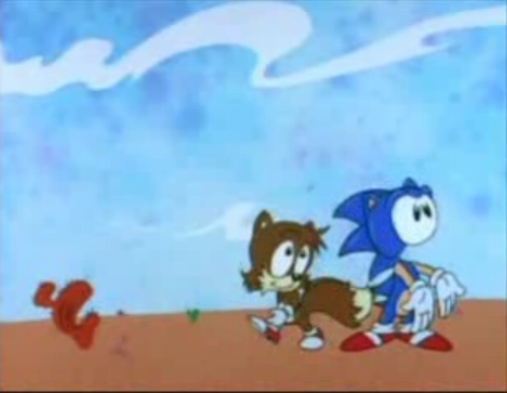
|
Freakazoid: Oy, let's watch the lip-sync, alright? |
|
- Because they wanted to be able to have improvised lines, Freakazoid recorded the voices, then did the animation to match. That means this trope actually got invoked. But hey, they also invoked some of the live-action equivalents (such as the boom mike getting into the shot) despite it being animated.
- The original closing sequence of The Flintstones shows Wilma asleep in bed...with no mouth!
- Jimmy Two-Shoes: In "Carnival Lucius", after Heloise packs up her model of the carnival, she has two mouths. Also done intentionally in "Hair Brained Idea", where Jimmy's nose moves to the side of his face to make him look more like Lucius.
- The Cyberchase episode "The Poddleville Case" is similar to the TTGL example above - the animation isn't necessarily bad, just different and more cartoony-looking than usual.
- Also, the show itself switched to Flash, leading to a large-scale shift in animation.
- A frequent problem with shows produced by Filmation in the 1970s. A specific example: many of the musical scenes from The Brady Kids, on account of the heavy use of rotoscoping to save time and money on animation. Note especially the clip to "I Believe in You," where close-ups of Jan's face make it appear as though her right eye has caved in! Their microscopic budgets should have come as a warning.
- Hanna-Barbera falls victim to this quite a bit. This scene from the first episode of The Amazing Chan and The Chan Clan looks...primitive, at best.
- It even happened in their later works, as several of them were sent to many different studios (Tom and Jerry Kids, for example, was farmed to Wang Film Productions, Fil-Cartoons, and Mr. Big Cartoons).
- The short-lived Gravedale High sometimes looked this way. In "Frankenjockey", Hoover, the horse that escaped in the episode, switches between white (his actual color) and brown. In "Fear of Flying", Max Schneider is wearing a lab coat, but in the first act, the animation switches between the lab coat and his usual beige jacket.
- The Tick (animation) had some rough animation direction. While the drawings looked fine, the composition of the drawings was flimsy. The first episode was full of oddly timed scenes, characters interacting badly with the background, and lip syncing problems. At one moment - after The Tick crashes into the ground - he speaks an entire line without moving his mouth.
- Then the episode "Evil Sits Down for a Moment" where the fairies' arms come off for a frame http://www.youtube.com/watch?v=V 2 ozi 7 g 4 xs A
- How many fingers does Frosty the Snowman have?!
- Star Trek: The Animated Series. In addition to incredibly Limited Animation, One of the producers was colorblind, so everyone but Sulu and Uhura was absolutely chalk white. Colors of things established in the live action series would be altered so you'd wind up saying "what do you mean that episode had Orions?" The Kzinti - a warlike enemy race who'd supposedly plagued mankind for a hundred years or more - dressed in very Narmful hot pink uniforms. A lot of notorious animation errors require the pause button, but this ain't that. The animation was farcically bad throughout every episode ever. Yeah, it's good that Star Trek doesn't die after all, but dude. Can we at least leave the color decisions to the guys who can see colors?
- For the Looney Tunes short "Bugsy and Mugsy", for whatever reason in this short Mugsy looks completely different from how he usually looks, this is how he normally looks, this is what he looked like in that short.
- In the short "Oily Hare" in one scene where the oil tycoon tells his assistant Maverick to lower him into Bugs' hole his body disappears for a few frames leaving him a talking head.
- In "Rabbit Rampage", the trope is intentionally invoked for laughs as the cartoonist ( identified at the end as Elmer Fudd) insists on drawing Bugs incorrectly to torture him. When he turns Bugs into a horse, Bugs angrily informs him, "Okay, wise guy. My contract SPECIFICALLY says I am always to be drawn AS A RABBIT!" He later draws Bugs as a grotesque caricature of himself, prompting Bugs to comment, "Continue to draw me like this, buddy, and we'll both be outta work!" When the cartoonist draws him right, Bugs quips, "So I'm me again. What a novel idea. Sure you wouldn't like to turn me into a grasshopper or something? No, no, I take it back!"
- Rocky and Bullwinkle was plagued with this throughout its run, as a result of outsourcing to a very cheap Mexican animation studio. Some have argued that it adds to the show's charm.
- In the Rocko's Modern Life episode "Short Story," this is lampshaded, (coupled with a Creator Cameo) when a cartoon version of Rocko creator Joe Murray (also voiced by him) tells Rocko, "You're off model, kangaroo boy."
- Even before having switched from Sunwoo to Rough Draft Studios, this trope is definitely played straight at times, although it's probably for the same reason as The Ren and Stimpy Show.
- In the second episode of Blazing Dragons, there is a moment when Princess Flame is in Evil Knight 3's armor and her tail is clearly visible at first, but then completely vanishes for the remainder of the scene. Which is kinda pathetic given that it was the TELL TALE (ahem) sign to Count Geoffrey that she was not Evil Knight 3.
- Terry Toons animator Jim Tyer is well-known among animation fans for this. His scenes are often considered to be the only good thing about the studio's outputs.
- Total Drama Island has some particularly jarring examples from time to time. Near the end of the first season, Heather receieves a Traumatic Haircut but, in the Season 2 premiere, she is accidentally shown with her old hair again for a few seconds (she remained bald for almost all of Season 2, and her hair wasn't anywhere near as long as it used to be by Season 3). There were quite a few other bad mistakes like this, but Katie being drawn without a right arm takes the cake.
- Foster's Home for Imaginary Friends has many background, minor, or unimportant characters often drawn in the wrong color, being out of proportion, or simply looking 'off' from what they usually look like. The worst offender would be a character known as 'The New Guy'. In his first appearance, he is downright huge, dwarfing most of the cast. However, in later appearances, he is much smaller. No explanation is given for the drastic shrinkage.
- At the end of Goliath II, the eponymous elephant is made the new leader of his herd after saving them all from an attacking mouse. As a result, he now rides on his father's head, who is fanning him with a small leaf. However, before that, when we see the elephant herd from the front, Goliath II isn't even on his father's head at all, and his father's trunk in still hanging from the front of his face!
- Earlier in the short, during one of Rajah the tiger's attempts to capture the titular elephant, when we get to see a closeup of his tail, the stripe arrangement is actually reversed (the tip of his tail is now colored orange, usually, it's black).
- A model example. The narrow gauge engines in Season 5 of Thomas the Tank Engine received larger scale models that looked vastly "off" from the original small scale models. The worst thing is, they used BOTH models every other scene in a few episodes, which makes the differences all too obvious.
- The entirety of the Recess episode, "Buried Treasure". The episode was sent to a different overseas animation department, which led to some odd scenes, such as inky-looking outlines, bordering on Thick Line Animation, as well as more cartoony animation. This was the only episode by this animation company, probably due to what happened to the episode.
- "The Legend of the Big Kid" from season one had some off model moments as well. The number of teeth the kindergarteners had (baby teeth that was falling out, if anyone's wondering) varied scene by scene, T.J. was noticably chubbier than he usually was (and had bigger eyes), and constant "derp" faces from Spinelli and Gus.
- There was one scene in "Jinxed" where it looked like T.J. had a mullet.
- My Little Pony had frequent, glaring Off-Model moments in both the original series and Tales. The most famous is the common error where pegasi were drawn with horns, thus the fandom called them "Unipeg".
- Arguably most of the first two series were Off-Model. The pilot was rather on-model, and The Movie (while not to the same extent) was so too.
- My Little Pony Friendship Is Magic had plenty of animation errors, in fact it has been catalogued in this over hour long video http://www.youtube.com/watch?feature=player_embedded&v=4b5ZjGdjz1k#! a common mistake is the many times Applejack is missing her freckles, especially when running.
- Since it's made in Flash, layering errors are very common. Cutie Marks appearing on the inside thigh and bits of the background visible through the characters' mouths are two of the more obvious.
- Derpy Hooves started out as this. She accidentally ended up cross-eyed in one scene of the first episode, which wasn't caught until after the episode aired. Fans quickly latched on to her and she is now more or less the mascot of the brony community. The creators, delighted with this response, now draw her cross-eyed intentionally and even script her appearances.
- Captain Planet's boots disappear entirely for some scenes.
- In A Charlie Brown Christmas, the order of words on Lucy's psychiatric help booth changes twice in under two minutes.
- Snoopy appears from nowhere in the scene where the kids start applauding Charlie Brown, and they switch positions instantly in the so doing.
- In the original VHS edition, while the kids all sing "Hark! The Herald Angels Sing", two of the girls in the background briefly flicker in front of the other children (though this seems to have been fixed, for modern television airings of this special at least).
- One episode of Dragon Tales taking place in the winter had Max and Emmy arriving there in their normal outfits. Ord gives them winter gear, but when we see them putting them on, the bottom half of Emmy's dress can be seen under her jacket. A few seconds later, Emmy is wearing pants, and has actually remained in them for the rest of the episode.
- The Raw Toonage episode "Badly Animated Man" parodies this trope, and Limited Animation in general.
- The animated section of The Star Wars Holiday Special made Luke look like this (where are his pupils?) and Han look like a horse. Brrr.
- Averted (for the most part at least) in Flash and CGI by the nature of the mediums: set character models are used for the animation, and outside of freak polygon/shape disappearances or clothing/hair malfunctions that never get seen outside of DVD outtakes, going off model just doesn't happen. If CGI/Flash is ever off-model, it's usually intentionally and often subtle; according to the DVD Commentary, one particular wild take in WALL-E when the title character gets struck by lightning actually required breaking the character model.
- Johnny Test suffered a rotten case of quality drop after its animation was demoted from traditional to Flash. For awhile, the show tried its best to make the differences unnoticeable, but inevitably, it became an Art Shift - now, the show struggles with animating depth to avoid a 2-D South Park feel, and the art style o the first season and the Flash seasons are veryd different. A few times, the difficulty of drawing in Flash has shown; circular objects are lumpy, movement is stiff, expressions are less unique and varied, and a few times, you can even catch the animators performing a copy-paste job with multiple objects, such as animals. One instance had a bunch of perfectly identical bunnies stacked on top of each other like a house of cards. It doesn't help that they're not even animated!
- Parodied in the Looney Tunes short "Invasion of the Bunny Snatchers". Bugs Bunny wakes up one morning to find out that Elmer Fudd, Yosemite Sam, and Daffy Duck have been replaced with pale stereotypes of their actual selves, all severely off model and badly drawn to boot, complete with poor lip synching - the knock-off Daffy even has a moment of Syncro-Vox. Bugs devises a plan to get the real characters back, but then discovers a evil ripoff of him is on his tail. Eventually, he finds out they were sent by Nudnik and casts the phony-baloney fakes into a black hole (er... giant space mouth), causing his old "frenemies" to reappear the next day. Further parodied when an animatronic Porky Pig tries to say "That's all, folks!" at the end of the short - Bugs kicks the fake to the curb and replaces it with the genuine Porky Pig.
- The characters in Yogi Bear would often change appearances from cartoon to cartoon, most notably Ranger Smith. This tendency was parodied heavily by John Kricfalusi in his Yogi Bear cartoons, A Day in the Life of Ranger Smith, and Boo-Boo Runs Wild.
- The animated adaption of Wyrd Sisters has some significant cases of characters going off model very early on in the first episode, and these issues continue throughout the rest of the 7-episode series.
- ↑ It should be noted that most of this is not spent on the actual animation (depending on the show, some shows will have a separate budget just for the animation, like with Disney's and Warner Bros' works in the 80's and 90's), however. Considering it's done overseas (mostly for western shows), for the most part.
- ↑ or at lest when the studio is outsourcing for TMS
- ↑ unlike the others listed, they still have a reasonable fanbase
- ↑ Actually, for those who are not familiar with Macross/Robotech, the lasers are supposed to fire from the underbelly of the Valkyrie, from a turret that becomes the craft's head in Batroid mode.
- ↑ This is the result of having a series co-produced by TMS and Studio DEEN
- ↑ There's plenty intentional ones for many reasons, Facefaults mostly
- ↑ It's explained in more detail on the Special Effects Failure page.
- ↑ the one in grey next to Terezi, the one in green and red
- ↑ For those wondering, look at Logan's hand.